Comprehensive Guide: What is The Scatter Plot
Create Your Scatter Plot NowWhat is the Scatter Plot?
A Scatter Plot is a straightforward yet powerful tool for visualizing data, which are new in this field of statistics and data science. Today we are going to learn everything about Scatter Plots.
So what is a Scatter Plot? Well, “A Scatter Plot is a graphical tool for visualizing the relation between two different variables of the same or different data groups, by plotting the data values along with a two-dimensional Cartesian system.”
The above definition will become more precise with the Scatter Graph below. Scatter Plots are also known as Scatter Charts or Scatter Graphs.
Image Source: gstatic.com
The above graph made is with two different variables; diameters (in centimeters) and height (in meters) for a group of trees. While the horizontal X-axis depicts the width, the longitudinal Y-axis represents the height with each dot specifying a tree. We can derive various correlations between the variables using such plots.
When to use a Scatter Plot?
A Scatter Chart or Plot analyzes the relation between two discrete variables. That is why when we plot the aggregate data, we find different forms in which the data presents itself. The most widely used application of a Scatter Plot lies, however, in finding out the correlation that exists or not between the two variables.
For example, say we know the values for one variable, best represented along the horizontal axis, and we need to figure out the best possible prediction for the vertical axis. A Scatter Graph is very useful at such an impasse.
A Scatter Chart can be useful in the following scenarios:
- For paired numerical data;
- In cases where the dependent variable has multiple values for a single value of the independent variable;
- While trying to find out the correlation between two variables, etc.
Pros & Cons of Scatter Plots
|
Pros |
Cons |
|
✔ They are straightforward to draw, even when the dependent variable has multiple values; ✔ It is easy to interpret and understand; ✔ Maxima and minima are easily isolated, so they do not affect the graph much; |
Calculation errors can lead to faulty plotting which in turn can lead to the wrong analysis of data; The precise extent of correlation cannot always get determined from them; Over- plotting is a big issue while working with such graphs as they can significantly lead to the discretization of the values. |
How are the variables of a Scatter Plot related to each other?
The term correlation defined as the nature of the relationship between two variables (in this case, discrete variables) in any statistical study or survey.
A correlation coefficient is a statistical measure of the extent or degree of this correlation. Positive, negative, and no correlation are the three types. Thus one can say that a correlation coefficient will be positive or negative or 0. We will look into these shortly.
The Line of Best Fit is drawn up according to previous data collected and is used to predict the ideal correlation between two given variables. It acts as a reference while plotting a Scatter Graph.
A. Positive Correlation:
When the value of the dependent variable increases with an increase in the cost of the independent variable, we say there is a positive correlation between the two.
B. Negative Correlation:
When the value of the dependent value decreases with the increase in the cost of the independent variable or vice-versa, then we say that the two variables have a negative correlation.
C. No Correlation:
In case we don’t find any apparent relationship between the two variables under study, we say there is no correlation between them.
Scatter Plot Examples
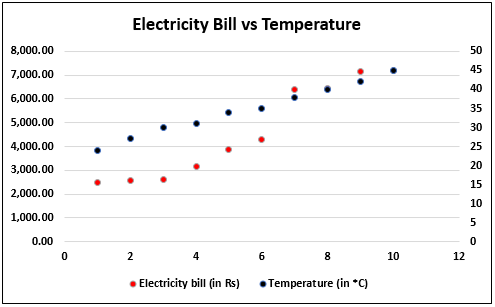
Problem: To find the relation between electricity bill and temperature;
Solution: The data is gathered and tabulated, and the values are plotted in a Scatter Chart as follows:
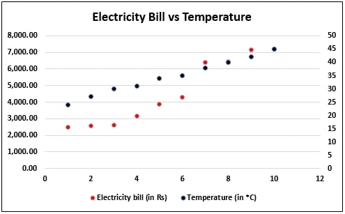
Image Source: wallstreetmojo.com
From the above Scatter Plot, we can see that the electricity bill is less when the temperature is comparatively lower. However, it rises with a rise in temperature. There are other factors included as well, which does not make a linear relation. Still, we can infer that there is a positive correlation between the rise in temperature and electricity bills.
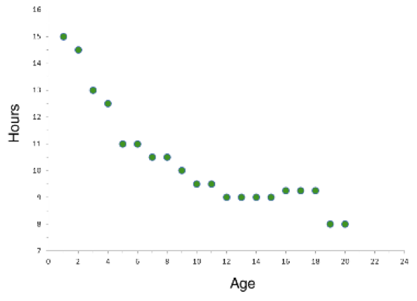
Problem: To find the relation between age and hours of sleep needed;
Solution: Once again, the data gathered is after survey, and a Scatter Graph created as follows:
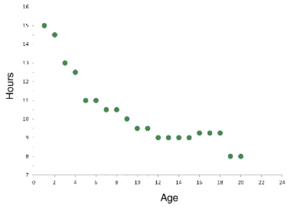
Image Source: shmoop.com
We can see from the graph that as age increases, the amount of sleep decreases. Thus we can say that there is a clear negative correlation. However, the data here gets restricted until the age of 20, which means the relation might or might not change for higher values of the age.
In such a scenario, there is no relation between the two variables, and we can see it from a Scatter Chart as there is no direction for the values. Here we have taken two independent variables like say height and hours of study. They have no apparent relation to the graph if drawn will look something like this:
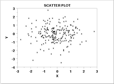
Image Source: gstatic.com
How to create a Scatter Plot with EdrawMax Online?
Nowadays, creating a Scatter Chart has become very easy. You no longer need to do it with pen and paper, even though it is how we learn. Then again, at a professional level, the best results are always seen when you use a diagramming tool like the EdrawMax Online, to create Scatter Plots. It is a great tool to have in your inventory. Moreover, being an online tool, you don’t need to download it on your computer.
Before drawing a Scatter Graph, you need to understand the different correlations and correlation coefficients as described above.
- “+1” means positive linear correlation;
- “0” means no correlation;
- “-1” means negative linear correlation;
- If the value of the coefficient is as 0<x<+1, then there is a positive correlation but not linear
- If the value of the coefficient is -1<x<0, then there is a negative correlation but not linear;
Secondly, get familiar with the interface of EdrawMax Online.
With that taken care of, let us see how we can create a Scatter Plot using the EdrawMax Online:
- Step 1: In your web browser open the home page and login with your credentials
- Step 2: From the ‘Graphs & Chart’ menu, select the ‘Scatter’ option, and a drawing window opens
- Step 3: To the left of the drawing canvas, you will find some predefined templates for use; select the one you want to drag & drop on the canvas
- Step 4: You can manually plot each data, or you can extract it from a saved file; for the latter, hover above the action button to the top-right of the chart and click on the ’Load Data from File’ option
- Step 5: Select the file in question; it supports .csv, .txt, .xls, .lsx, etc. file types
- Step 6: As you do so you will see the scatter chart change accordingly
- Step 7: You can show or hide data label and even change it by double-clicking on it; to do the former you need to select the same option from the action button on the top-right
- Step 8: You can add or delete a point from the action button as well
- Step 9: You can set minimum and maximum values from the same place
- Step 10: Once you finalize the chart save your work on the Google cloud
Common issues that you may face
- It happens when there are too many data values;
- It makes it hard to understand the correlation between the variables and as such the measure becomes difficult to calculate;
Solution: Do Random Sampling of the data values and plot these samples as it is a subset of the whole data set.
- Even though we can find a correlation between two variables it does not mean that they are responsible for each other behavior; a third variable can be affecting the action, and it can go unnoticed;
Solution: In such cases, different tools, such as Pearson’s Correlation Coefficient, comes in handy.
In this window, you can create your wiring diagram by choosing different wiring diagram symbols from the symbol library. There are various symbols available such as transmission path, qualifying symbols, semiconductor devices, switches and relays, and other necessary electrical symbols.


