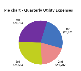
"Pie charts are one of the most public types of data visualizations. A pie chart expresses a part-to-whole relationship in your data. It is a type of graph that displays data in a circular graph. The pieces of the graph are proportional to the fraction of the whole in each category. In other words, each slice of the pie is relative to the size of that category in the group as a whole. The entire “pie” represents 100 percent of a whole, while the pie "slices" represents portions of the whole. As we all know, In accounting, the matching principle states that expenses are to be matched with revenues. In practice, this means that all expenses associated with the generation of revenues within a month (quarter, year) should be included in the income statement in the same period as the revenues. So here in this example, pie chart is used to effectively communicate the idea of how easily we can represent the Quarterly Utility Expenses.


 Desktop