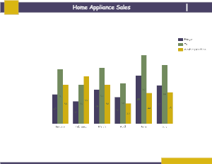
A sales column chart is an example of a clustered column chart showing product units like fridges, TV, and Washing machines are sold every month. A column chart is a data visualization where each category is represented by a cylinder, with the height of it being proportional to the values being plotted. A sales column chart helps in understanding which of the home appliances are doing better than the other. For example, months leading to summer show a significant rise in the sale of television units. Whereas as we start the year, we see the rise of washing machine sales than the previous fiscal year. With a home sales column chart, a company can make data-driven decisions that result in genuine revenue-boosting opportunities. The attached sales chart can also be represented as the sales growth graph that helps understand how much revenue each of the products has achieved in every month.


 Desktop