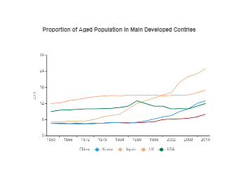
A line chart diagram is a graphical representation of an asset’s historical price action that connects a series of data points with a continuous line. Line Charts or Line Graphs are used to tracking changes over short and long periods of time. When smaller changes exist, line charts are better to use than bar graphs. As shown in the Aged Population Line Chart diagram, we can use line graphs to understand the proportions of the aged population in main developed countries like China, South Korea, Japan, the UK, and the USA. The attached Aged Population Line Chart shows the age difference over the consecutive years in more than one country.


 Desktop