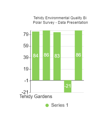
This is a column about tehidy EQ BI polar. Bar graphs are simple to comprehend, extensively used, and capable of displaying changes over time. This distinguishes them from other graphs that are difficult to understand or can only display a single data set. The data is divided into a small number of discrete categories, each with a single value. Small multiples, cluster column charts, and stacked column charts, as seen above, are best when there are multiple values per category.