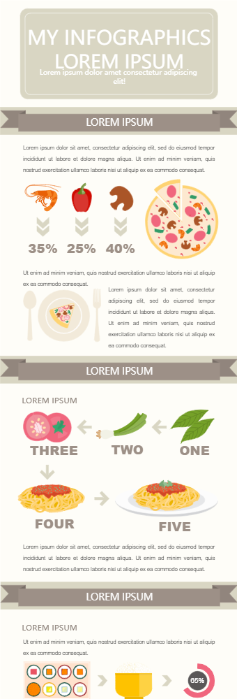
This infographic starts by showing the percentages of different portions to make it a healthy meal. The infographic is beautifully created and easy to covey the intended message. The next infographic is about different steps while preparing a healthy meal. Again, an easy and step-by-step is used to demonstrate the process for easy delivery. In the end, a comparison of different food items in terms of their health impact on the human body. The circle chart percentage chart can be used for health benefits or the amount of healthy nutrients in these items. The infographics use food items thus very easy to understand for everybody. Also, the overall color scheme is beautiful and visually attention-seeking. This infographic can be used by dieticians to spread awareness about healthy eating and cooking methods to lead a healthy life.


 Desktop