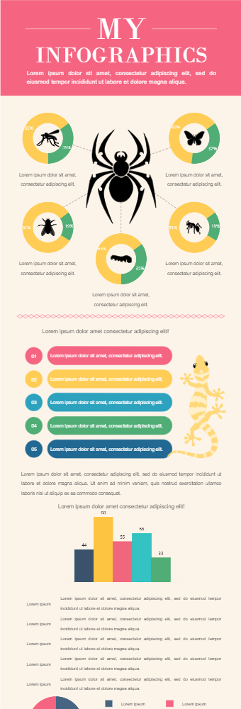
This infographic has an insect surrounded by other insects with a progressive circle chart that can be used to show the similarities and differences among them. The infographic is easy to tweak and can be adjusted to different ideas. The next infographic is bullets to explain points with a picture. Alteration can be made to both as per user requirements. Again, can be modified to fit different concepts. Then we have bar charts to compare. In the end, we have a pie chart to show the proportion of which can be used to the population in different habitats. The infographics are user-friendly and can accommodate a number of ideas.These infographics can be used by teachers and students to enhance their presentations and effectively deliver the idea.


 Desktop