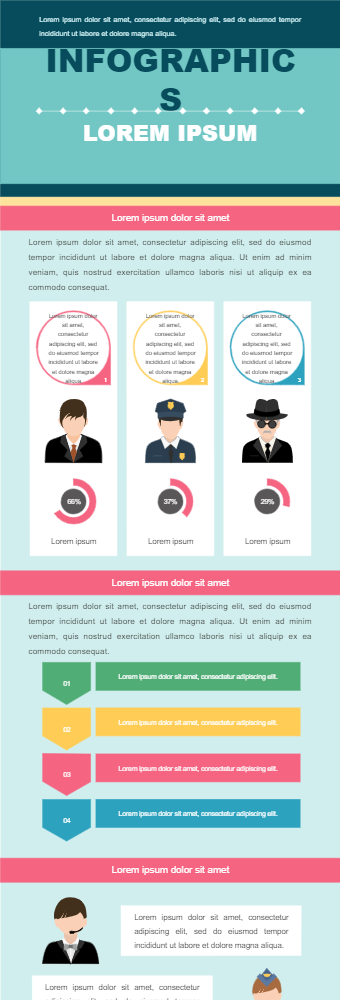
This infographic is an informative infographic. It can choose to show professions that are mostly closed by males or professional menexcel at. It has a great infographic to show different professions for men and a percentagewith it. The percentage is in the form of a progressive circle chart. It can beused to show the generally better performance of men in these professions compareto women. Above is a bubble that can be used to show which male attributescounted for their general better performance in these jobs. Next are arrowbullets which can be used to talk about the personality traits of males and females. The next section is for the professions that are better suited for females or they performedbetter in these jobs. A very detailed and engaging infographic to convey the message across.These infographics can be used by researchers to show their researchresults regarding different gender and job performance.