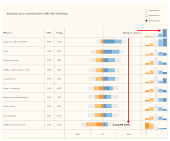
The following comparison, satisfaction, and agreement compare histogram diagram are created in EdrawMax Online. As the below diagram indicates, a histogram is a bar graph-like representation of data that buckets a range of outcomes into columns along the x-axis. The y-axis represents the number count or percentage of occurrences in the data for each column and can be used to visualize data distributions. As the below histogram bar chart suggests that the categories that the comparison between two aspects occur are exported to CSV and PDF, Price, Response Time, Ability to Filter Based on Role, Localized UI, Ease of Learning, Support for Mobile Devices, 24/7 Support, Ability to Customize UI, and more.