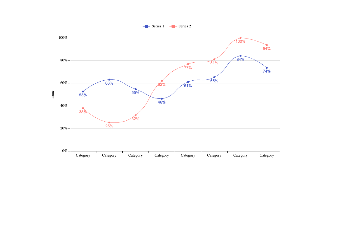
The Energy Line Chart between the two series visually represents the energy consumption trends of two different periods. The chart shows two series, each representing the energy consumption of a specific period. The chart is divided into different intervals, and each interval shows the energy consumption of that period. The two series are plotted against the Y-axis, while the X-axis represents the time intervals. By comparing the two series, users can quickly identify changes in energy consumption patterns over time. The Energy's Line Chart is a useful tool for individuals and businesses that want to monitor their energy consumption and identify areas where they can reduce their energy use. By analyzing the data presented in the chart, users can make informed decisions about their energy usage and take steps to reduce their carbon footprint. EdrawMax is the best diagramming tool to create similar diagrams. Download EdrawMax today and start customizing similar templates.


 Desktop