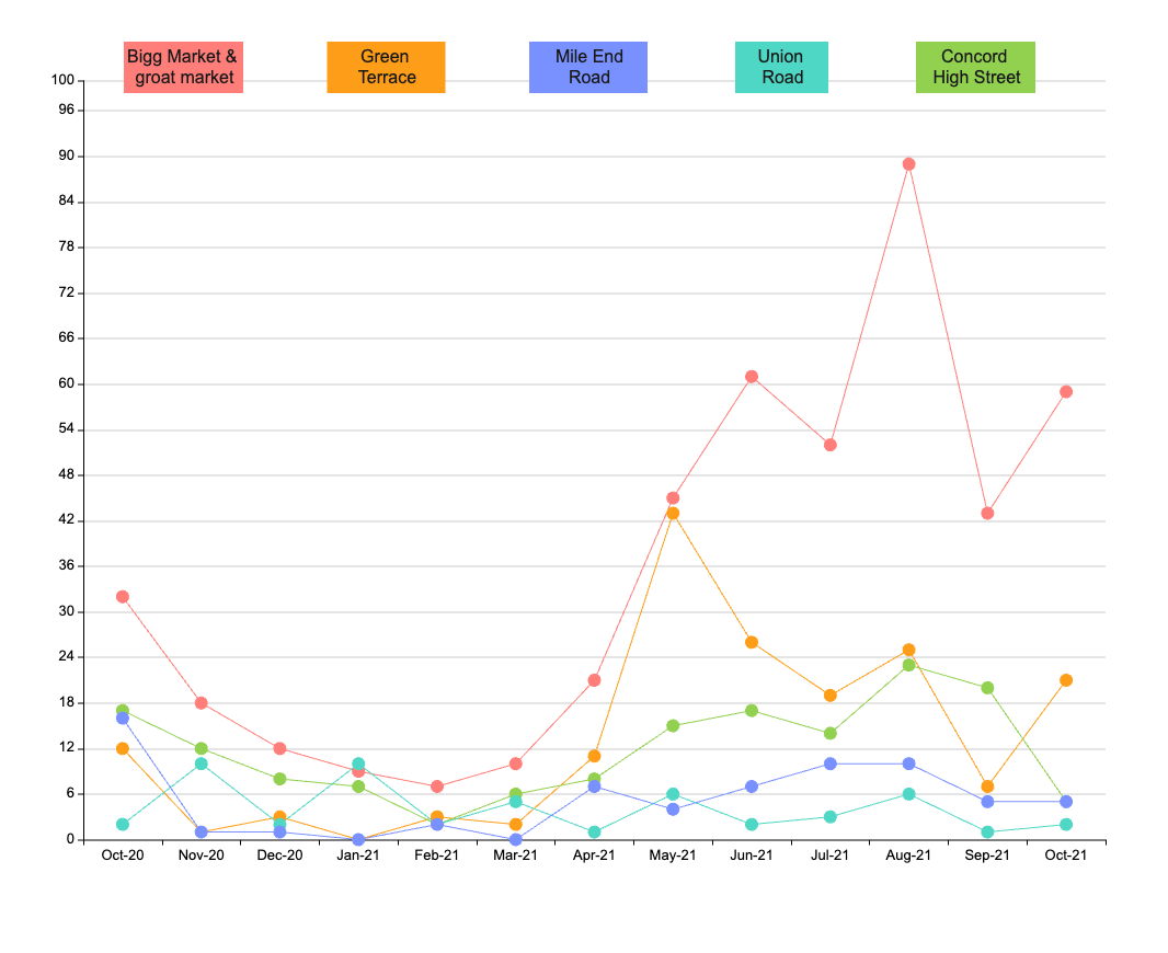
The Scatter Diagram for Drinking Hotspot Tyne and Wear Crime Stat illustrates the relationship between the frequency of crime and drinking hotspots in the Tyne and Wear area. The diagram uses a scatter plot to display the data, with the frequency of crime on the y-axis and the number of drinking hotspots on the x-axis. Each data point represents a specific location, and the data point size corresponds to the number of crimes committed in that location. The scatter plot provides a visual representation of the data, allowing patterns and trends to be identified. The diagram suggests that there is a positive correlation between the number of drinking hotspots and the frequency of crime in the area, highlighting the need for measures to be put in place to mitigate this issue. EdrawMax is the best diagramming tool to create similar diagrams. Download EdrawMax today and start customizing similar templates.