
Templates Community /
Coronavirus Timeline Diagram
Coronavirus Timeline Diagram
Community Helper
Published on 2022-04-06


Introduction
The timeline of the COVID-19 pandemic contains the chronology and epidemiology of SARS-CoV-2. The virus induces the COVID-19 and is liable for the pandemic.
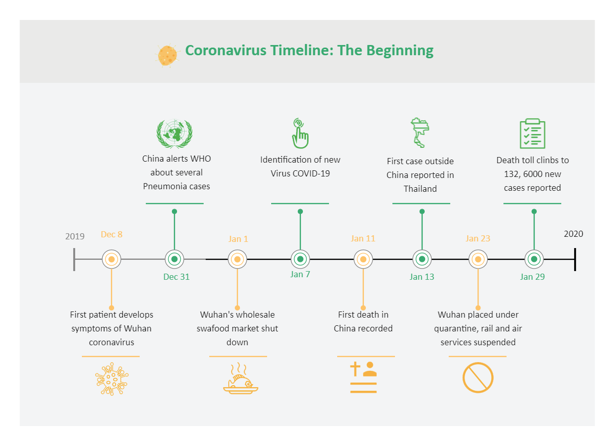
People can form the coronavirus timeline diagram in different ways. As seen in the chart, the timeline starts in December 2019, when the first patient developed symptoms of coronavirus.
As you keep reading the Coronavirus timeline diagram, you will notice the timeline proceeds with the mention of China's alerts to WHO about several Pneumonia cases, the shutdown of the Wuhan wholesale market, and the detection of the new virus of Covid 19.
Understand Coronavirus Timeline Diagram
The coronavirus timeline diagram also mentions when in January 2020, the first death was recorded in China due to coronavirus.
The first case outside China was in Thailand. While creating a diagram you can mention this particular fact. Next, Wuhan was under quarantine with air and rail service suspended.
How to Make a Coronavirus Timeline Diagram in EdrawMax Online?
Creating a Coronavirus Timeline diagram in EdrawMax Online is pretty simple. The free Timeline Diagrams maker has several features as you can instantly import the images or icons from your system or Google Drive or DropBox. The Timeline Diagram maker lets you import the data right from the .csv file, or you can also import media content, like images, icons, or symbols, right from your Google Drive or DropBox.
Login EdrawMax Online
Log in EdrawMax Online using your registered email address. If this is your first time accessing the tool, you can create your personalized account from your personal or professional email address.
Choose a template
EdrawMax Online comes with hundreds of free diagram templates. Select a pre-designed template by entering the Keyword in the "Search" section or exploring different diagram sets. In this case, you will find the Timeline Diagram under the "Basic Diagram" section under the "General" diagram types. Alternatively, you can simply click on "+" in EdrawMax Online canvas to create a diagram of your preference.
Work on your research
With time, the cases and the death toll increased leaps and bounds by the end of the last week of January. You can create a coronavirus timeline diagram to insert facts of your choice. The data must reveal how an unprecedented viral outbreak and its consequences disrupted the conventional scenario worldwide.
Customize the diagram
Customize your Coronavirus timeline diagram by changing the color or by adding more relevant data. Based on your research, you can also add or remove the data accordingly. Since it is about product planning, you can add more relevant data about different products and include their lifecycle.
Export & Share
Once your required Coronavirus timeline diagram is completed, you can share it amongst your colleagues or clients using the easy export and share option. You can further export the diagram in multiple formats, like Graphics, JPEG, PDF, or HTML. Also, you can share the designs on different social media platforms, like Facebook, Twitter, LinkedIn, or Line.
Important Tips
Coronavirus originated in the Hubei province of China in late 2019. However, after that, the cases increased by several thousand per day in China. You can mention this in the coronavirus timeline diagram. Apart from that, you can also mention how it reached its peak in late January and early February.
Since it plummeted in China, the global pandemic spread in South Korea, Italy, Iran, with a large outbreak, and propelled a spike internationally across more than 150 countries.
Conclusion
You can incorporate the coronavirus timeline diagram and frequently update the tracker of developments from the outset of the COVID-19. The timeline diagram is not always accurate, but it's a helpful tool with numerous uses. With the help of the EdrawMax Online tool, you can integrate your data to create your diagram. Use EdrawMax Online for making the coronavirus timeline diagram. It's a tool with remarkable features, including cloud space for the protection of data. Thus, ensuring privacy.
Tag
timeline
Share
Report
0
76

Post
Recommended Templates
Loading
