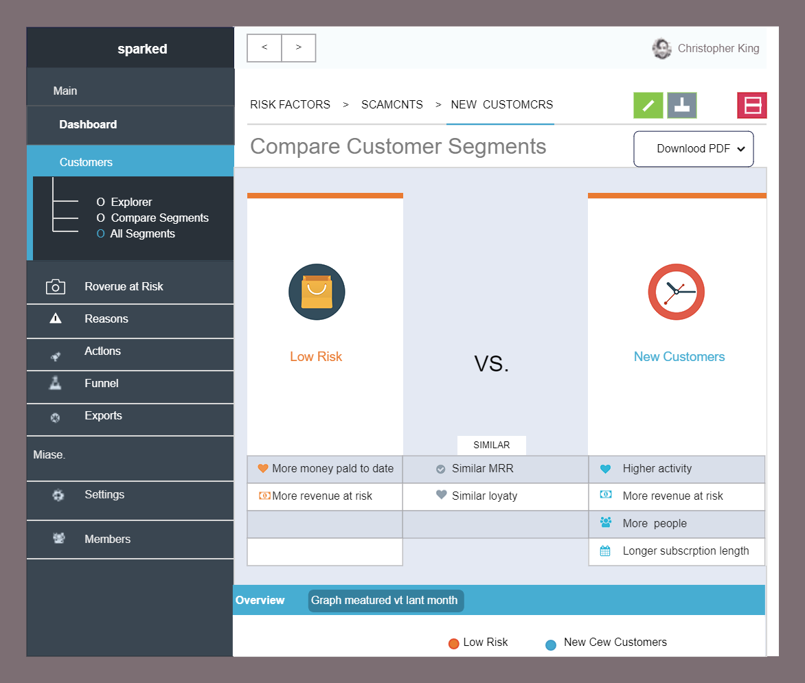
You can use this Dashboard Comparison Chart to represent the relationship between two or more variables visually. Comparison charts can help you make datadriven decisions more quickly. For example, if you're considering one or more variables, creating a comparison chart tile will provide you with a complete picture and assist you in deciding on the best option. Comparison dashboards are commonly used to demonstrate the differences between two entities or to show how far you have progressed since the last time you used them. The most frequently used charts and graphs in comparison dashboards are the column chart, bar chart, pie chart, doughnut chart, gauges chart, line chart, and comparison indicators. Create your Dashboard comparison chart by downloading the EdrawMax template.


 Desktop