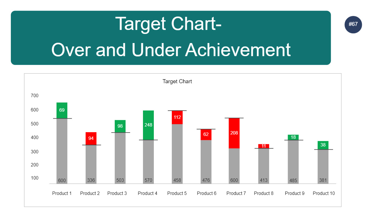
This Target Chart In Excel is a graph that displays data from a spreadsheet. This method represents a numerical value using the height or length of lines. The Yaxis typically represents an amount, such as sales, and the Xaxis typically represents a period, such as months. Individuals can use Excel bar graphs to demonstrate patterns and changes over time. It's also a good visual aid for emphasizing differences in amount, size, or volume. In an Excel bar graph, a target or goal line can be added to show how performance compares to the plan. This Target Chart In Excel can be created using the EdrawMax online template.


 Desktop