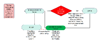
The image depicts a data flow diagram for a health information system specifically designed for tracking COVID-19 cases. The central component is the "DHIS 2 COVID-19 Server," which receives data from a testing center using "DHIS2 COVID-19 Tracker" or an "eASCOV capture tool." If a client is confirmed positive, the data is flagged in red and two pathways emerge:
The information flows to the "COVID-19 Analytic Platform," which visualizes patient-level data from facilities and the community. This platform is represented by a green ellipse, signifying its role in processing and displaying the data for analysis.
Concurrently, if the test result is positive, there's a condition that leads to "WelTel," with a note explaining that FIND supports the Ministry of Health through CHAI to integrate data sharing between "DHIS 2 tracker" and community treatment data capture tools.
Additionally, there is a dashed arrow pointing to "RHAP," which stands for a system that visualizes aggregated data from DHIS2 to HMIS system, indicating a supplementary data sharing capability via an API.
The diagram is structured to provide a clear understanding of the flow of information in response to a positive COVID-19 test result within a health information infrastructure.


 Desktop