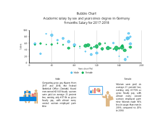
This bubble chart template for analyzing gender differences in German academic salaries is designed for scenarios such as gender pay equity research reports, sociological data analysis papers, academic data visualization, and workplace equity research courseware, serving as a professional data visualization tool in the fields of social economics and gender studies. Adopting the bubble chart type, the template uses years since PhD as the horizontal axis and salary level as the vertical axis, distinguishing male and female groups with different colors, and the bubble size can intuitively present the sample size, clearly comparing the salary trends and income gaps of scholars of different genders over their careers, paired with a background description module at the bottom to interpret the gender pay gap data published by the German Federal Statistical Office. Social economics researchers, gender studies scholars, HR professionals, and students can directly use EdrawMax to quickly edit the template, replacing salary data, adjusting color schemes, and modifying text content to adapt to various scenarios such as gender pay gap analysis in academia, workplace income equity research, sociological data visualization, and academic paper data display. Without designing charts from scratch, users can efficiently complete professional reports and teaching presentations, helping to clearly present multi-dimensional data correlations and enhance the professionalism and persuasiveness of gender equality research and academic presentations.



 Desktop