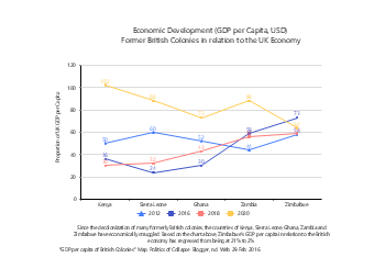
This multi-series line chart template for comparing GDP per capita of former British colonies is designed for scenarios such as macroeconomic research reports, historical economic analysis papers, academic data visualization, and teaching courseware production, serving as a professional data visualization tool in the fields of economic history and development economics. Adopting the multi-series line chart type, the template takes Kenya, Sierra Leone, Ghana, Zambia, and Zimbabwe as analysis objects, comparing the changes in the proportion of each country's GDP per capita relative to the UK economy from 2012 to 2020, intuitively presenting the economic development trends and differences of different countries, paired with a background description module at the bottom to clearly interpret the economic development status of relevant countries after decolonization. Economic researchers, history teachers, academic paper authors, and students can directly use EdrawMax to quickly edit the template, replacing country data, adjusting year ranges, and modifying color schemes to adapt to various scenarios such as colonial economic impact analysis, developing country economic trend research, academic paper data display, and classroom teaching economic case explanations. Without designing charts from scratch, users can efficiently complete professional reports and teaching presentations, helping to clearly present economic data change trends and enhance the professionalism and persuasiveness of academic analysis and teaching presentations.


 Desktop