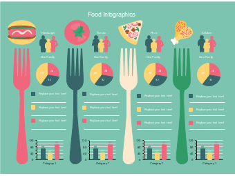
This food preference comparison infographic template is designed for scenarios such as catering market research data display family diet preference analysis food consumption behavior research and healthy diet science popularization material production, serving as a practical tool in the field of catering industry and healthy diet. Adopting a side-by-side design with colorful forks as separators, paired with four food illustrations of hamburger tomato pizza and chicken, each food module includes family figure icons proportion pie charts and comparison bar charts, which can intuitively present the consumption preferences selection proportions and population data comparisons of different foods in families, adapting to the integrated display needs of multi-dimensional data and analysis results of food preferences. Catering industry practitioners, market researchers, healthy diet promoters, and science popularization publicity personnel can use EdrawMax to easily adjust food types modify chart data and update text content to quickly adapt to various scenarios such as catering market research report production family diet preference analysis document typesetting food consumption behavior research display and healthy diet science popularization materials. The side-by-side comparison design makes the preference differences of different foods clearer and more intuitive, helping the efficient transmission of catering industry market analysis and healthy diet concepts.



 Desktop