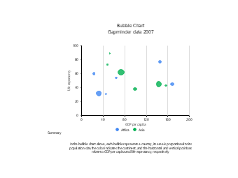
This bubble chart template for the relationship between GDP and life expectancy is designed for scenarios such as population economics research, social development reports, geography teaching courseware, and academic paper visualization, serving as a professional data visualization tool in the fields of macroeconomics and social livelihood. Adopting the bubble chart type, the template uses GDP per capita as the horizontal axis and life expectancy as the vertical axis, with bubble size representing population size and color distinguishing Africa and Asia, intuitively presenting the correlation between economic levels and health indicators of different countries, paired with a data description module at the bottom to clearly interpret the multi-dimensional data meaning of the bubble chart. Economic researchers, geography teachers, social science researchers, and students can directly use EdrawMax to quickly edit the template, replacing data, adjusting color schemes, and modifying text to adapt to various scenarios such as comparing economic and health indicators of countries around the world, analyzing development differences between continents, replicating Gapminder data visualization, and displaying multi-variable data in classroom teaching. Without designing charts from scratch, users can efficiently complete professional reports and teaching presentations, helping to clearly present multi-dimensional data correlations and enhance the professionalism and persuasiveness of academic analysis and teaching displays.



 Desktop