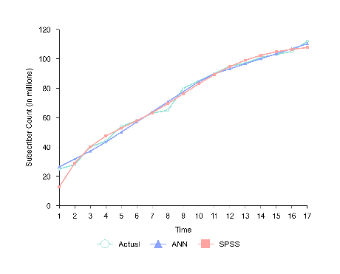
Designed with EdrawMax, this template is a line chart that tracks the “Subscriber Count (in millions)” over “Time.” It features three data series: “Actual” (represented by the light green line with circles), “ANN” (the blue line with triangles), and “SPSS” (the red line with squares). As time progresses from 1 to 17, all three lines show an upward trend, indicating growth in subscriber count. This chart is useful for data analysts, marketers, or business strategists. It provides a visual comparison of actual subscriber numbers against predictions made by Artificial Neural Networks (ANN) and SPSS, helping to evaluate the accuracy of these predictive models and inform decision - making regarding subscriber growth strategies.


 Desktop