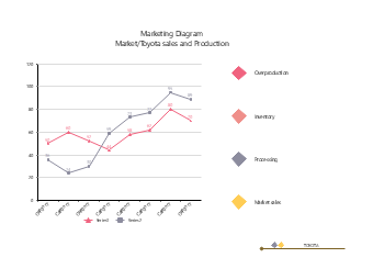
This Toyota sales and production line chart is a professional visualization template designed for the comparative analysis of automotive market sales and production data. It intuitively presents the changing trends of two sets of data across different categories, clearly marking data point values, series identifiers and legend descriptions, fully showing the application logic of line charts in market and production data analysis. The template comes with coordinate axes, data point markers and legend partitions, eliminating the need to design the framework from scratch, allowing for quick and professional typesetting directly after application. It is widely applicable in scenarios such as writing automotive market reports, demonstrating production and sales data trends, making classroom marketing data analysis teaching courseware, interpreting at automotive brand strategy seminars, creating market research graphics and texts, and assisting in production and sales optimization planning analysis. With this template, the changing trends and comparative relationships between sales and production data are intuitively presented, helping users quickly sort out the laws of data fluctuations, production-sales matching and market performance.


 Desktop