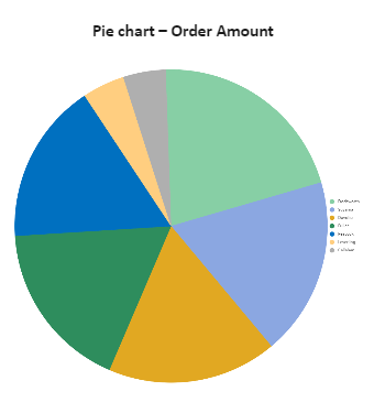
Here in this Pie chart template ‘Pie chart – Order Amount’, which reflects the data of the order amount of different people, here the order amount is represented with graphical representation and we can see, the order amount can be easily compared. Pie charts can convert one column or row of spreadsheet data into a pie chart. Each slice of pie (data point) shows the size or percentage of that slice relative to the whole pie. A pie is a chart that represents data in a form of a circle divided into triangular wedges called slices. Each slice represents a percentage that corresponds to a particular value. The default view of a pie chart includes the pie with the labels and the chart legend. We can increase the order to decrease the sections in the pie chart by adding a row or deleting a row in the data tab.