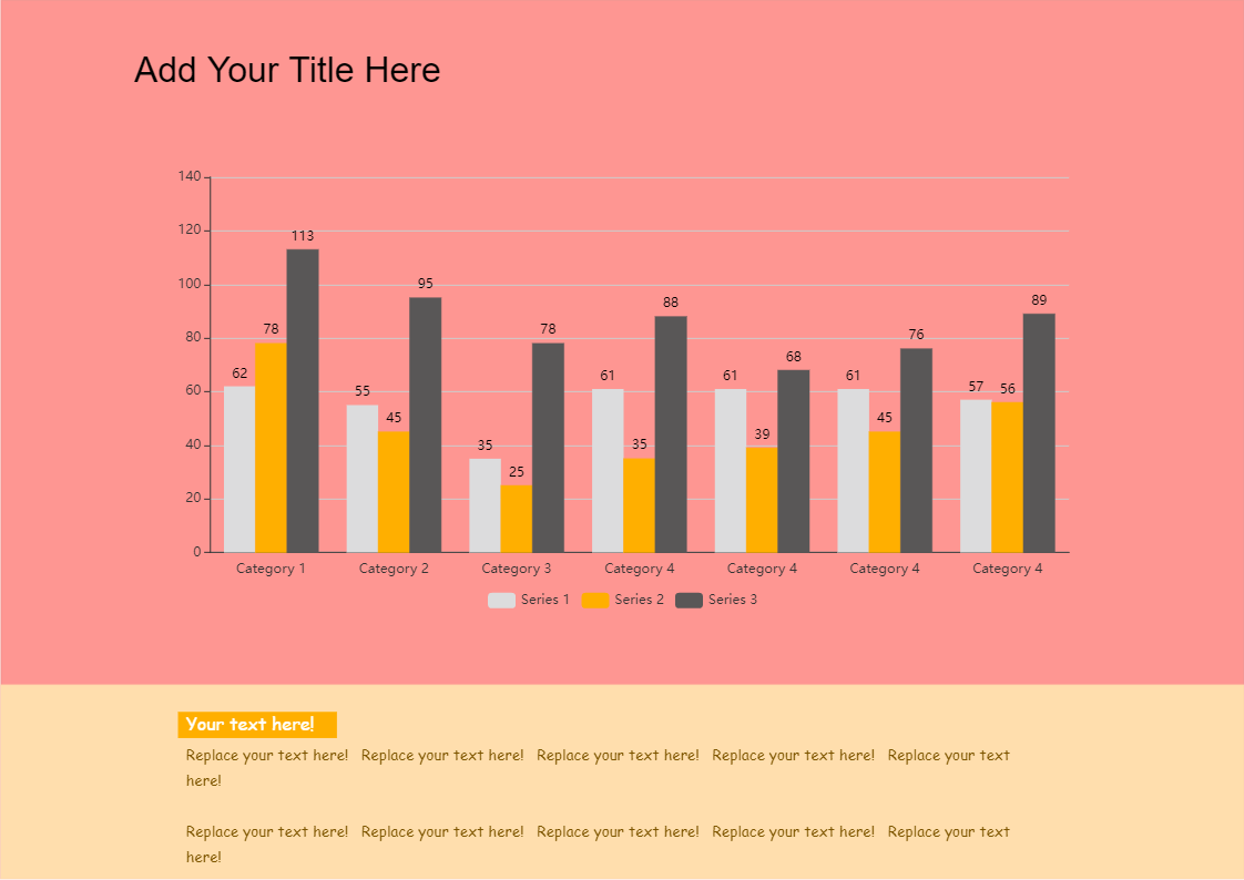
A column chart is a graphical representation or visualization of measured data in the form of vertical rectangular bars or columns plotted along two axes with the values representing the measure of that particular category of data. The values are generally expressed in units relating to the problem statement or in percentages. These types of charts are mostly useful for statistical comparison of data. A clustered column chart is useful for comparing value between different categories, each having several sub-categories. The following template is Clustered/ Grouped Column Chart. In this case, you cluster or group three columns under a single category. You can also map it against a 2-D coordinate system. And has seven different categories listed here. This particular column chart has been drawn using EdrawMax online. There is place provided at bottom of the chart to mention the details of the chart. All the dummy text in this diagram is replaceable, even the background colour and you can easily add or delete category, this intern changes the column chart. And also, EdrawMax lets you load data from existing file and set max values for axis and allows to choose different appearance option. Instead of creating the column chart from scratch, use EdrawMax online as it provides pre-defined templates, shapes, and figures which will help you create the column chart with ease.


 Desktop