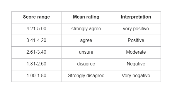
This fivepoint Likert Scale Interpretation Diagram is ideal for learning more about your chosen topic. Likert scales are great if you enjoy working with numbers and statistics. When presenting a Likert scale, each response is assigned a number value. Use these figures to total the results. A statistical mode is usually the best way to present Likert scale results. This is usually the most straightforward way to interpret the results. You can present your findings using a bar chart, with each bar representing a different response. Using the EdrawMax online template, you can create this fivepoint Likert Scale Interpretation Diagram.


 Desktop