Complete Guide for Bubble Chart
Create a Bubble Chart on Edraw.AI Online Free Free Download Free Download Free Download Free DownloadAre you looking for new and interesting ways to present your data? Too many times, we fall short of ways to represent data in a three-dimensional form. Well, this is exactly where a Bubble Chart can help you. A derived version of a scatter plot, it will let you showcase three-dimensional content across a plane x-y axis. In this post, I will answer questions like what is a Bubble Chart and will also discuss several Bubble Chart examples to help you understand the topic in detail.
What is a Bubble Chart?
In a nutshell, Bubble Chart is a popular data visualization tool that is drawn on a two dimensional (x-y) plane. While the x and y axis would depict a numerical value, we also draw a bubble (a circle) on the graph to represent the third value. Sometimes, we even use different colors of bubbles to depict a fourth value in the chart.
Therefore, instead of a Scatter Plot where only a dot is made on a two-dimensional plane, a Bubble Plot would change the size of the circle. That is, the diameter of the bubble would also play a vital role (and sometimes, its color as well). In this way, we can display three data series in a single diagram. Due to its wide application, Bubble Charts are commonly used in engineering, sociology, politics, finance, medicine, economics, and other sectors.
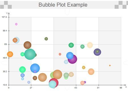
Image Source: bigcommerce.com>
When to Use a Bubble Plot?
Since Bubble Charts can be dynamic in nature, they can be used to depict data under various scenarios.
- Whenever plain-old visual tools like bar graphs, columns, cones, scatter plots, etc. are not able to represent data in three dimensions, a Bubble Plot is used.
- It is commonly used in social and economic situations to show the difference in certain characteristics over any area, population, country, etc.
- A Bubble Plot is also extensively used in research to represent the relationship between three different entities or how the change in a single entity affects other parameters.
- It is also used in finance when we need to showcase the change in a certain entity over a period of time. It is used to depict formula-driven data, to compare stocks, show growth of a sector/company, etc.
- In the fields of engineering, mathematics, science, research, etc. a Bubble Chart is used to represent the dynamic change in data.
- From architecture to information visualization and software engineering to machine learning, Bubble Plots have found a vital presence in almost every domain.
Strengths and Limitations of Bubble Charts
Now when you know what is a Bubble Chart, I’m sure you can know more about this visual representation tool. Though, just like every other data visualization method, it can also have its own advantage and pitfalls.
Pros
- Most importantly, a Bubble Chart can represent three-dimensional data, which is often missing in many data visualization tools.
- If we depict different colors for bubbles, then we can even represent a fourth value on the chart as well.
- We can illustrate an extensive piece of information in a simpler manner using Bubble Plots.
- You can show a relationship between three values and how they can change over time.
- They are pretty reader-friendly and let us understand even a complex thing easily.
Cons
- If the data is too complex and we have a lot of bubbles adjacent to each other, then the chart can become tough to understand.
- The overlapping of bubbles can create issues in distinguishing them.
- Users often find it hard to depict zero or negative values using a Bubble chart.
Variables in Bubble Chart
As stated above, a Bubble Chart would have different variables (at least 3) that are dependent on each other. If you have only two variables, then it is often recommended to go with any other visual tool to represent them. To create a user-friendly Bubble Plot, you need to pick and represent these variables carefully.
In most of the Bubble Chart examples, we deal with three different variables (in numerical forms). Two of these variables are plotted on an x-y graph with restricted numerical markings. Now, the third variable is depicted in the form of a bubble and the area of the bubble would also depict a value. That is, the bigger the bubble, the larger would be its value.
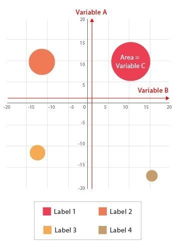
Image Source: datavizcatalogue.com
Sometimes, to make things easier for our audience, we label bubbles in different colors. In this way, they can easily distinguish bubbles from each other.
Bubble Chart Examples to Learn From
Now when you know what is a Bubble Chart and its common uses, let’s get to know about some of its examples to understand the way it is used.
This is one of the most common applications of Bubble Charts as it helps us to depict the relationship between any product and its sales. Consider the following table as the input data for it.
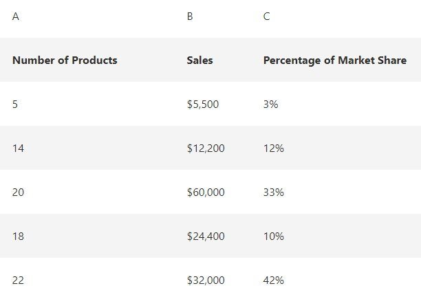
Image Source: support.office.com
As you can see, the number of products is in a range from 5 to 22, which we will depict on one axis. The other axis represents the sales of the products with respect to their pricing. Lastly, the percentage of the market share is represented by the bubble. For instance, the first product has just 3% market share with a small diameter of the bubble. The product with a 33 % market share has the biggest bubble size accordingly.
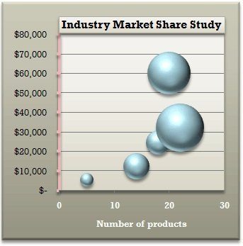
Image Source: support.office.com
This is one of the most interesting Bubble Chart examples that will help you to understand the common concerns of travelers. Ideally, when talk about traveling, the cost of the trip and our safety are two of the most important things we are concerned. Therefore, in this Bubble Chart, both of these parameters are depicted by the x-y axis plot.
The value is further depicted by the size of the bubble. For instance, in Mexico, the cost of travel is low, but safety concerns are more. To travel to France, one would need more money, but there won’t be so many safety concerns.
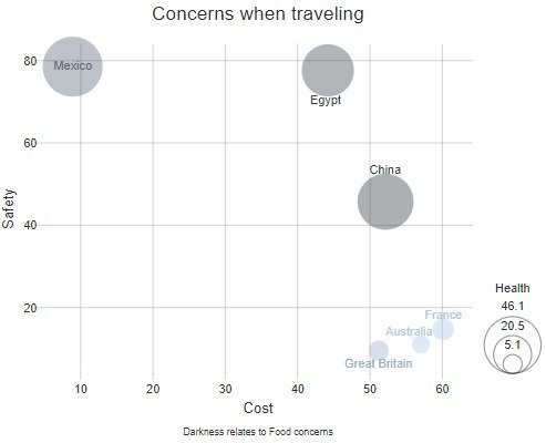
Image Source: netdna-ssl.com
If you think that Bubble Plots can only be used to depict data in sales or science, then you are wrong. There are so many other Bubble Chart examples that you might see frequently. For instance, in this example, we have merged information from different categories, and presented them in a remarkable way.
People from different age and gender were asked about the anticipated likelihood of a woman president in his/ her country. Therefore, on one axis, we represented the variation in the demographics by age and gender. On the other, we simply provided their opinion (yes/no). Now, different bubbles are used to list their answers with a value on each bubble to further make it clear.

Image Source: about.infogr.am
How to Create a Bubble Chart with EdrawMax Online?
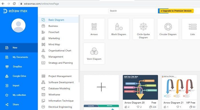
Apart from a dedicated desktop application, there are a few reliable online tools that can help you work on all kinds of visualization functions. One of the most trusted and powerful online designing tools is EdrawMax Online. All you got to do is visit the online toolkit on EdrawMax’s website to access its features.
- The tool has already provided various templates and scenarios to pick from that will drastically save your time in editing.
- Since it is a free online tool, you don’t have to go through the hassle of downloading any application.
- The user interface is extremely friendly and it features thousands of different vectors under various categories to make our job easier.
- Users can connect their account with Dropbox, Google Drive, and share their works, even import content from their system, with others.
Without much ado, let’s quickly discuss how to create your next Bubble Chart using EdrawMax Online.
To start with, just visit the official website of EdrawMax Online here:
https://www.edrawmax.com/online/, and log-in to your account. If you don’t have an account already, then you can create a new one firstly.
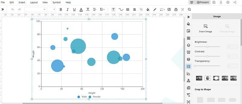
Now, you need to organize your data and to identify them as three different segments. Two segments would represent the x-y axis while one would represent the size of the bubble. There are different ways to represent this feature on this tool. You can start from a blank canvas or just use one of the readily available templates.
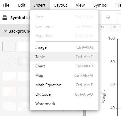
Once the canvas is opened, you can start working on it in the way you like. If you want, you can also go to its Insert menu and get any image, table, etc. as well.
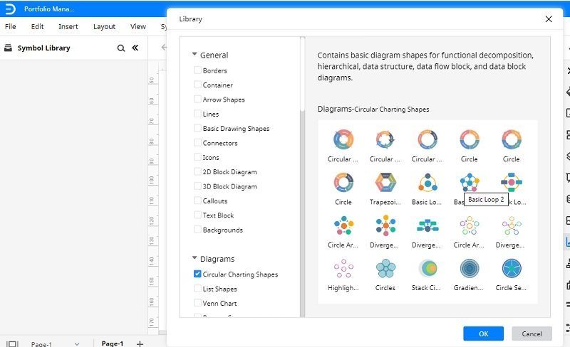
You can see all kinds of features listed on either side of the canvas. If you want, you can just go to the “Symbol Library” from the side and include all kinds of Bubble Chart symbols to your canvas.
On your right, you can access various options to edit your chart, change its color, and make all kinds of alterations to it.
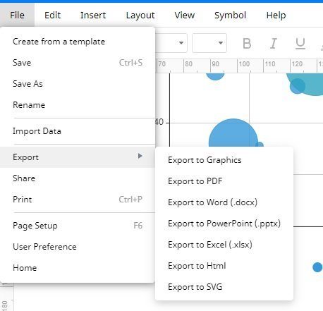
In the end, when you are satisfied with the results, just go to the “File menu” > “Export” and choose to “Export the Chart” in the format of your favor.
Common Issues When Using Bubble Charts
While Bubble charts are quite helpful, they can suffer from certain limitations at times:
- If the data is too complex or extensive, then users will find it hard to represent it.
- The lack of numerical content can also make the visualization tough.
- Sometimes, bubbles overlap in the chart, making it harder for us to distinguish them.
- There are times when depicting zero or negative information on a bubble chart can be tiresome.
That’s a wrap, everyone. I’m sure that the guide would have helped you answer questions like what is a Bubble chart and how to create one. To make it easier for you, I have even listed some interactive Bubble Chart examples too. If you want to create user-friendly and informative Bubble Plots in less time, then simply use a tool like EdrawMax online. A freely available online tool, it can help you come up with all kinds of charts and visual graphics like a pro.