Pie Chart - Everything about Pie Graphs
Create a Pie Chart on Edraw.AI Online Free Free Download Free Download Free Download Free DownloadWhat is Pie Chart?
All of you I am sure in your school days would have heard about the pie chart. If not, here is the answer to what is a pie chart. A pie chart is a circular chart displaying data, statistics, and information. It is divided into different sectors that appear like wedges showing proportions. The varying ratios will tell you how much of a single data exists. The bigger the size, the more is the gathered data. The whole pie shows 100% of a whole, and the pie slices are the portions of this whole.
Source: https://www.meta-chart.com/pie
With a pie chart, it is easy to understand the size of the portions. Pie charts are useful in business and educational purposes. You can use it to show segments of populations, expenses, and survey answers.
History of Pie Chart
Pie charts came into existence about 200 years ago. William Playfair, a Scottish writer in the year 1801 who strongly believed in appealing to the human eye for magnitude and proportion invented pie chart. According to him, this is an easy and unique method to convey an idea.
He first invented a pie chart for comparing geopolitical territories which were represented by circles and at times segmented slices as seen in the Turkish Empire. However, his invention got lost until Charles Joseph Minard, the civil engineer from France in the year 1858 used a circle-divided map. It displayed the proportions, and the amounts of the meat supplied to the market.
During the same time, an English nurse, Florence Nightingale, the statistician, and social reformer, used the polar area diagram for showing the dynamics of causes of death in the British Army. Every segment had uniform angles and will vary with the length of the radius from the circles center.
Why Need A Pie Chart?
You need a pie chart primarily for displaying comparison. When elements get represented this way, you can see the most and least popular aspect. It has different applications in business, home, and schools.
When it comes to a business, you can use it for showing the failure or success of a product or service. Also, you can use it for showing the market reach of a business in comparison to the others. In school, a pie chart gets used for showing the number of boys or girls in each class or the success of students in different subjects. At home, it proves to help plan a diet. Another good use of a pie chart at home is to determine how much you will be able to spend on different things.
Therefore, the advantages of pie charts can be summarized as below:
- It is convenient and straightforward to understand.
- The data shown is a fraction part of the whole. It serves as a useful tool to communicate the information to an uninformed audience.
- Audiences can check and compare data at a glance. It helps in understanding details and making an immediate analysis.
- For emphasizing a particular point, the presenter can manipulate a piece of data in pie charts.
- With this, the readers will not have to measure or examine the underlying number.
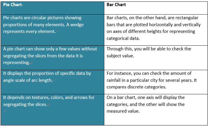
Pie Chart VS Bar Chart
Pie charts and bar charts are the two most used charts for brochures, presentations, websites, newspapers, and magazines for improving the visual effects. However, these two are different from each other. Let’s see how.
Source: www.infragistics.com
Comparison Between Pie Chart and Bar Chart
- Bar charts tend to more flexible in comparison to pie charts as they can chart several categories during several periods. If you have to compare elements during the same period, bar char is the best choice.
- A pie chart cannot show accurate data and thus, are not prevalent. However, readers will be able to compare the segments of arbitrary segments easily using a bar chart.
- Pie charts are easier to understand in comparison to bar charts. You can understand it at a glance.
- Pie charts are easy to create when compared to bar charts.
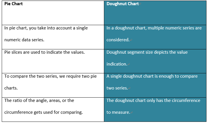
Pie Chart VS Doughnut Chart
If you see the pie chart examples, you will see that like them, doughnut charts have data arranged in a ring. Each data series serves as a ring. Unlike pie charts, these have over one data series. If the puzzle of what is pie chart and what is a doughnut chart troubling you, check out the differences.
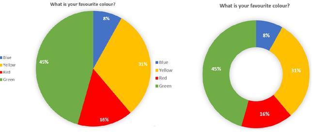
Source: www.limesurvey.org
Pros & Cons of Pie Charts and Doughnut Charts
- Both the pie and doughnut charts compare the contribution of each value of the total.
- Pie chart and doughnut charts are easy to create and to be understood.
- You can analyze only a few pieces of data in doughnut and pie chart.
- Both the chart types become helpless when it comes to observing the trends over time.
Pie Chart Examples
Basic Pie Chart
First up is the basic pie chart. It is a simple diagram that looks like a pie divided into slices. These slices show the percentage or proportions contributing to the total.
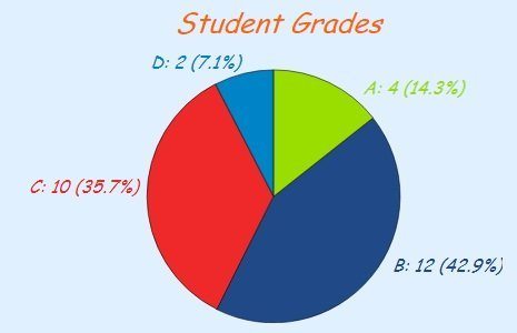
Source: www.mathsisfun.com
Pie chart example for the basic type given above that tells the students grades in the form of slices.
Comparative Pie Charts
The second pie chart example is the comparative pie charts wherein there are two pie charts used for comparing data.
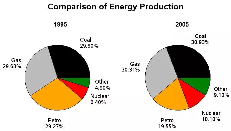
Source: www.ieltsliz.com
For instance, a comparative pie chart given above shows the comparison of energy consumption in the year 1995 and 2005.
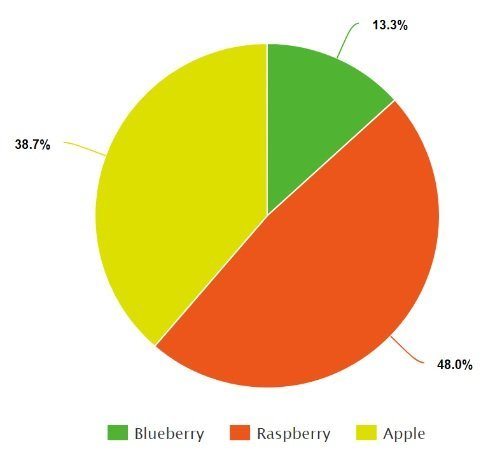
3D or Exploding Pie Charts
3D makes a pie chart attractive without altering the underlying data. It pulls out an individual slice, pulls the entire apart, or enlarges the entire section taking a bar of the pie chart. For emphasizing, you can move back the single slice from the remaining pie chart.
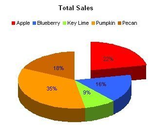
Source: www.peltiertech.com
For 3D or exploding pie chart, we have given a pie chart above that depicts the total sales of different brands like Apple, Blueberry, and so on.
How to make a pie chart with EdrawMax?
If you are not familiar with creating a pie chart, you don't have to worry as here is EdrawMax that will make drawing a pie chart easier for you.
Step 1: Go to the “File” menu and click on the “New” option. Select “Chart” option and choose “Pie Chart” template from the library.
Step 2: Now place the chart on the drawing screen and edit the shape as per your desire. From the library function on the left side, you can also change to different templates available for the pie chart.
Step 3: Feel free to set the fill style by selecting a category.
EdrawMax allows distinct features like:
- Loading data from a file
- Adding or deleting a category
- Hiding/showing Legends
Once you have created the pie chart, save it as a project file and export if needed.
Tips on Creating a Pie Chart Efficiently
- To avoid complications, use a maximum of five slices in the pie chart. However, two slices are the best.
- In case your chart doesn't have a meaningful order, you can arrange it from maximum to minimum.
- It is better to use labels instead of legends, as they are easy to read.
- Use proper color codes for separating the various slices representing different data.
Limitations of Pie Charts
In some cases, you shouldn’t or cannot use a pie chart. People who do not know what a pie chart is might make this mistake. Here are some of the instances when you should avoid using one.
- You have to compare data or more than one metric.
- The data values aren't distinctly separated. Using a pie chart for data analysis might have limitations when you are handling data points with similar sizes.
- Your data is progressing in real-time.
- You will have to display specific data and include a part-to-part comparison.