What is A Radar Chart with Examples
Create a Radar Chart on Edraw.AI Online Free Free Download Free Download Free Download Free DownloadA radar chart helps illustrate the comparison of data groups and entities with distinct features. We use radar charts to compare the characteristics of various groups and items by stacking them at axes coming from the same point. You can easily compare items with different parameters using a radar chart. It stacks items on the same central point and uses transparent shades and patterns to showcase the contrast to the reader. From the example down here, you will learn more about the uses and types of radar charts such as the spider chart, web chart, star chart, etc.
What is a Radar Chart?
A radar chart is an informative visual tool in which multiple variables (three or more) and compared on a two-dimensional plane. For this, we will create different axes emerging from a common central point. In most of the cases, all the axes are equally distributed and uniformly drawn from each other. Sometimes, the axes are also connected to each other to form different grids that make it easier for us to plot the spider chart.
Source:EdrawMax Template Community
The radar graph concept was first introduced in 1877 by Georg Mayr and it has been changed vastly in the modern times. These days, web/spider graphs are commonly used in comparison, analysis, and decision-making. Radar charts are considered as a better alternative to column charts as they can depict multiple variables easily without creating a clutter.
Elements of Radar Charts
While a spider chart can seem a bit complicated at times, it is pretty easy to understand as it has a few basic elements.
- Center point: This is the core of a spider chart (at the center) from which different axes are drawn.
- Axis: Each axis represents a variable in a radar chart and is given a name and different values. A radar graph has at least 3 axes.
- Grids: When axes are linked in a spider chart, it divides the entire graph into different grids that help us represent information in a better way.
- Values: Once the graph is drawn, we represent various values on each axis and plot the chart for every entry by allocating distinctive colors.
Source:EdrawMax Template Community
When to Use a Radar Chart?
Ideally, a spider (radar) chart can be used in any situation when you need to represent multivariable information in a 2D plane. Though, the concept of a radar graph is mostly used in these cases:
- Comparison of entities: A spider graph can help us compare different products and concepts in a single diagram. We can distinguish different entities through color- coding.
- Analysis: A radar chart can also help us understand a concept and how its value is changed over different parameters. For instance, you can analyze the market performance of a product over time.
- Decision-making: Since a spider chart can depict so much information in one place, it can help you make data-driven decisions easily.
- Other applications: Apart from that, a radar graph can also work as an ideal visual aid. It can play a vital role in different sectors like marketing, analysis, sales, research, education, and more.
Pros & Cons of Radar Charts
Just like every other visual tool, radar charts can also have certain advantages and limitations. If you want to learn more about the concept of a radar graph, then you should know its pros and cons.
Pros
- It acts as an excellent tool to compare different entities easily.
- Even if there are multiple variables to compare, we can do it with a spider graph.
- They are simpler to understand by the audience instead of a column diagram.
- We can distinguish different entities via color- coding.
- Extremely useful in drawing comparisons on the basis of different parameters
Cons
- If there are a lot of variables to compare, then even a radar chart can get cluttered.
- Sometimes, users find it hard to come up with an ideal data set to represent different variables together.
- They are not ideal for making trade-off decisions or comparing vastly distinctive variables.
- At times, the radial distance can be hard to judge and provide on-point information.
Radar Chart Examples
To help you further understand the concept of radar charts in a better way, I have listed these diverse examples that you can quickly go through. Find more radar charts templates.
This is one of the simplest spider charts on how a single entity can be represented. In this, we have explained the weekly sales figures of a garden center with the axes varying from 0 to 100. Different variables are shrubs, trees, flowers, bulbs, and seeds. Lastly, we have depicted how many of these variables are sold in a week (for instance, 80 flowers and 60 shrubs).
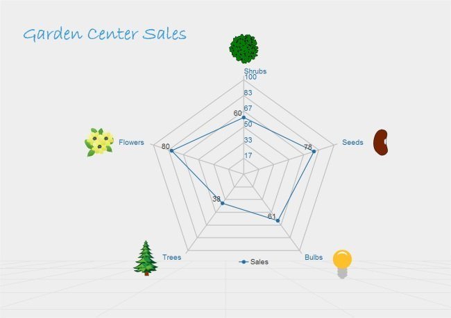
Source:EdrawMax Template Community
As stated above, radar charts are mostly used in competitive analysis and this is an ideal example of the same. Firstly, the chart is created to represent different parameters like price, durability, after-sales service, advertisement, and so on. Later, three different products are compared on the basis of these variables. For better understanding, each product has been allocated a different color.
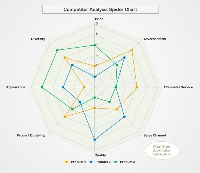
Source:EdrawMax Template Community
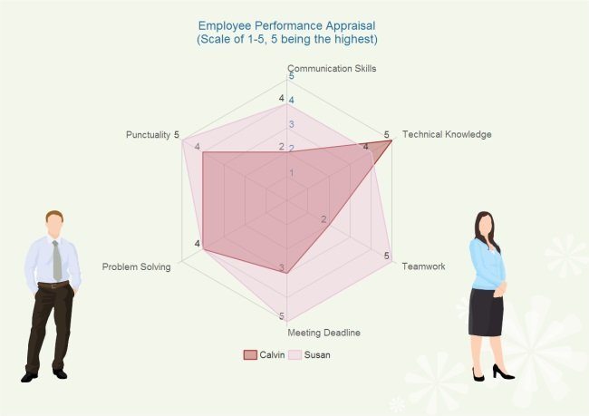
In this example, you can see how the overall performance of two employees is compared using a spider graph. To compare them, we have used variables like punctuality, communication skills, technical knowledge, teamwork, etc. Furthermore, both the employees are allocated points (1-5) for each of these variables and are compared accordingly.
Source:EdrawMax Template Community
How to Create a Radar Chart with EdrawMax Online?
To create engaging radar charts, you can take the assistance of a readily available web tool like EdrawMax Online. The online application has hosted a wide range of templates and vectors that you can use to create all kinds of diagrams. This will save your time and resources while providing the best solution to create all sorts of visual tools. You can export the diagrams in different formats and use them with the application of your choice. Here’s how you can quickly create a spider chart with EdrawMax Online.
To start with, you need to identify the variables that you need to compare and their values for different entities. If you want, you can just create a table to have all the data handy.
Now, just go to the official website of EdrawMax Online and log-in to your account. If you want, you can look for any readily available template for a spider graph to use or just open a blank canvas as well.
Once the canvas is opened, you can add all kinds of vectors to your illustrations and represent your data as well. Work on all the axes and depict your information through the spider chart. You can also alter the overall appearance of the radar graph through the options provided on the sidebar.
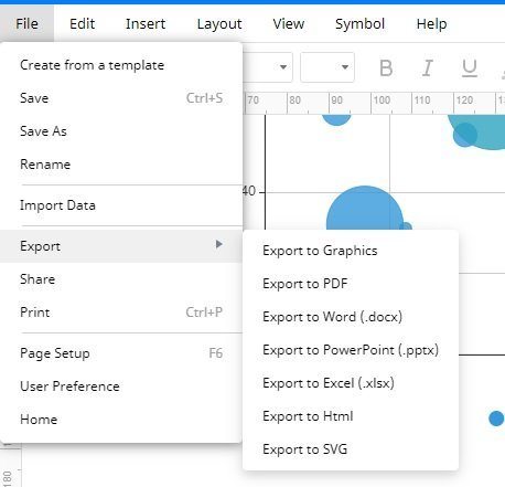
In the end, you can just go to the File menu to export the spider chart in a preferred format and use it with the application of your choice.
Tips on Drawing Stunning Radar Charts
To come up with better radar charts, you can follow these quick suggestions:
- Try not to represent more than 15 variables in a single chart else it can clutter the diagram.
- Have all the axes equally distributed unless stated otherwise
- If it is a comparative chart, then try not to go overboard and keep things simpler.
- Try to have a common and feasible scale to measure all variables.
- You can have different color codes to distinguish the entities on the same scale.
Radar Chart Maker
A radar chart helps the reader easily understand the comparison for two or more groups with different parameters. It is a simple diagram when you are the reader, but creating a radar chart without proper diagramming tools is complicated. EdrawMax Online is the best radar chart maker that makes your job easier with its collection of professional radar graph templates and editing tools. With EdrawMax, you can create a spider chart in no time using its comprehensive symbol library. It also gives you the option to import symbols from the web or your device, and you can export your diagram in any format you want.