How to Make a Scatter Plot in Google Sheets
The representation of data into a chart is very useful to understand any data set. It helps us visualize different relationships, which exist inside our data sets. We can compare these data sets and see how one affects the other. One way of visualizing data is to create a scatter plot.
What makes the scatter plot unique from other plots is that it is the best way to understand nonlinear data. It helps to make observations and finding results straightforward. We can use different software to create a scatter plot. In this guide, we will learn how to create a scatter plot in Google Sheets and using EdrawMax.
How to Make a Scatter Plot in Google Sheets
Step 1: Insert data in Google Sheets
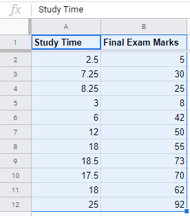
First, make a new sheets document in Google Drive to begin making a scatter plot in Google Sheets and start to insert your data either manually or through import. This is how a sample data set will look like on the spreadsheet.
After this, select your data and then open up Insert from the top menu, and click on the Chart icon. A sample chart will insert inside your document, which is auto-generated by Google based on your data. Chart Editor will pop up on the right side of the document, where we will spend most of our time in making a scatter plot in Google Sheets.
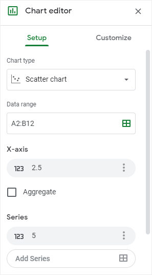
Chart editor has two tabs: the Setup tab and the Customize tab. Open the Setup tab and select Scatter Chart under the Chart Type sub-heading. Make sure that the Data Range is correct as per our data.
Step 2: Customize Google Sheets Scatter Plot
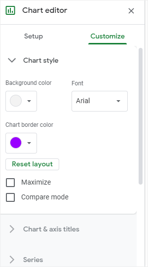
Head over to the Customize tab in the Charter editor, here you will see many sub-headings including Chart Style, Series, Legends, Vertical Axis and others. When you click any of these, it will open up the control pane for these attributes.
Click on Chart Style and there will show more options. For example, you can click on the Background color and change it, or you can select a new font style in the Font menu.
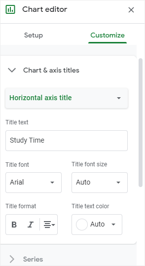
Similarly, you can also change the axis titles by going to Chart & axis titles. Select the axis that you want to edit and then you can give it a new title in its Title text box, change its Title font and Title font size among other settings.
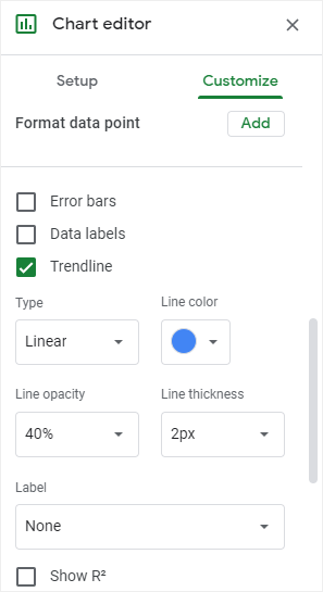
Step 3: Add a Trendline in Scatter Plot
Go to the Customize tab, find Series, click on it and then scroll down to find the Trendline button. Click on it and now a trendline will be displayed on your scatter plot. You can further change the Type, Line Color, and Label of the trendline.
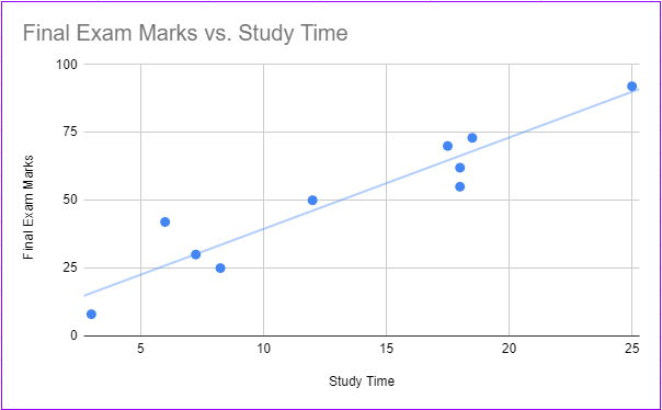
From the below picture, you can see how a linear trendline will look like on a Google Sheet scatter plot. You can resize this graph or move around its elements as per your tastes and needs. You’ve learned how to make a scatter plot in Google Sheets, now let’s see how to do it with EdrawMax Online.
How to Make a Scatter Plot in EdrawMax
Step 1: Insert a Scatter Plot in EdrawMax
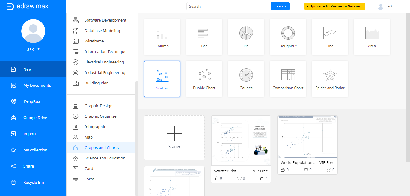
Making scatter plots in EdrawMax Online is much more convenient and easier-to-use than creating scatter plots in Google Sheets. All you need to do is to go to https://www.edrawmax.com/online/ and select Graphs and Charts on the left menu. Click on the Scatter icon and some pre-made templates for scatter plots will show on the below template gallery, unlike how google sheets scatter plot works. Click on the first plus icon to open a blank template.
EdrawMax Online application has been launched. Select Insert > Chart on the toolbar, choose Scatter Plot in the Insert Chart window and click OK. It will provide you with a pre-made scatter plot.
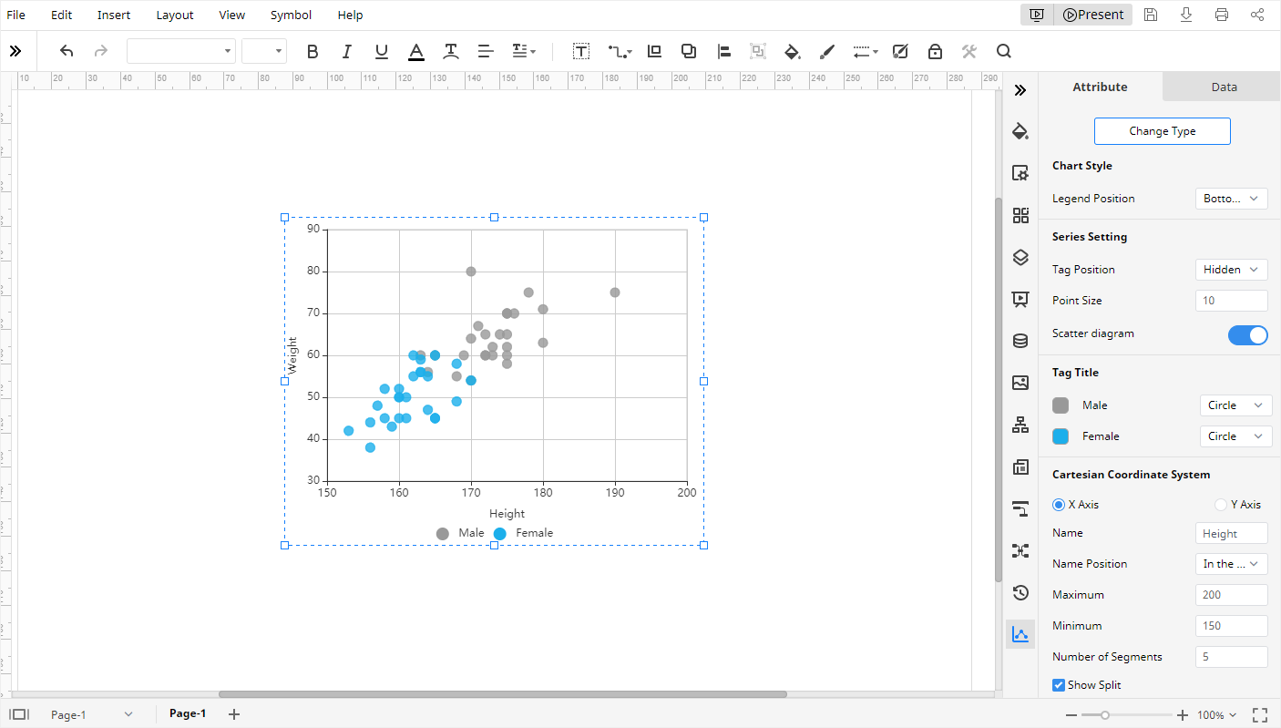
Click on the >> icon on the right sidebar, and then double-click on the plot if the scatter plot controls are not visible. Over here you also see two tabs: Attributes and Data.
Step 2: Customize EdrawMax Scatter Plot
Now you can also adjust the scatter plot according to your needs by going to the Attribute tab. Here you will see many different buttons and controls. For example, you can adjust the Legend Position, the shape of the Tag Title. And you can also change the names of the X-axis and Y-axis in the Cartesian Coordinate System. You can even modify the Point Size in the Series Setting.
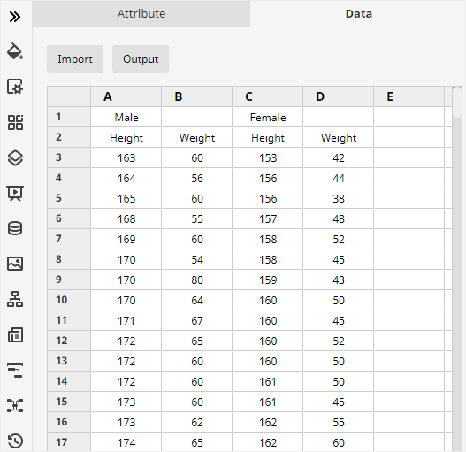
To edit the data, click on the Data tab, here you can use Import to fetch CSV or XLSX data and adjust individual rows and columns. You can see that EdrawMax is much easier and faster to use as compared to google sheets scatter plot.
How to Export an Edraw Chart as a Common File
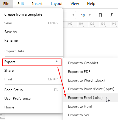
After you’re done editing your scatter plot on EdrawMax, you can go to File > Export and select any common format, including Excel (.xlsx). Now you can edit this scatter plot inside Microsoft Excel and share it with other co-workers who use other software.
EdrawMax allows greater collaboration and uses cloud infrastructure to its advantage. You can also save this scatter plot directly inside your Google Drive or DropBox, which further makes it easier for collaboration and file-sharing with co-workers. This concludes our guide on how to create a scatter plot with different diagramming tools.