Control Chart 101 - Definition, Purpose and How to
Create a Control Chart Online Free Free Download Free Download Free Download Free DownloadDo you know which charts are the heart of the statistical process control (SPC)? Yes, the control charts. It is a type of graph that is used to study how a particular process changes over time. The description below will provide you with a detailed overview of the control charts. If this topic piques your interest, continue reading!

What is a Control Chart?
A control chart is also called process-behavior charts or Shewhart charts. It is one of the process improvement techniques.
This graphical tool is used in the quality-control analysis. Moreover, it helps to monitor a process that is shifting over time. The changes can be in any organization or company such as manufacturing, service, healthcare, non-profit, etc. It provides you with a picture of how the process will change over the years.
Furthermore, it also indicates the kind of variation you’re dealing with as you move towards continuous improvement. Moreover, control charts are not always used alone, but It helps you to draw out conclusions on whether the process variation is getting out of control or consistent.
The essential elements of a control chart include:
- Visual time-series graph - It shows data points gathered at definite time intervals
- Horizontal control line - It helps to visualize the trends and variations
- Control limits - It represents upper and lower limits placed at an equal distance below and above the control line.
Different Types of Control Charts
There is a wide range of control charts that are developed for a particular purpose. The two broad categories of control charts are:
Variable Control Charts
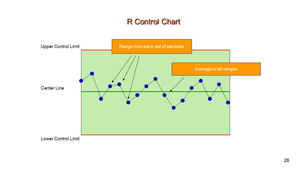
● Range (R) Control Chart
This type of chart shows the variability within the process. It is best for small sample sizes, for instance, a small size < 10. For every set, it records the smallest and largest readings. The centerline in the chart is the average of all the ranges.
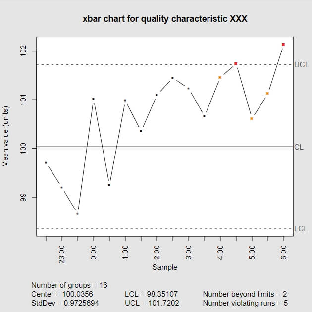
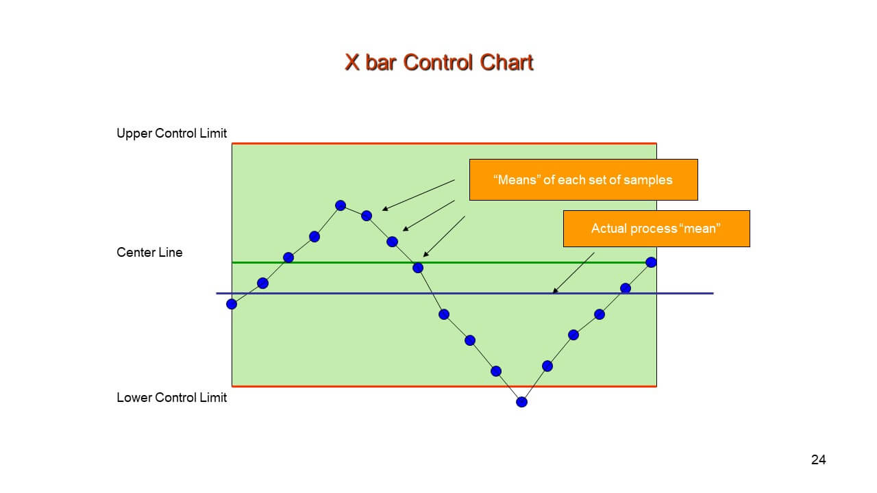
● X Bar Control Chart
This type of chart is used to monitor the average or mean of the variable, such as the weight of all bags, the length of steel rods, etc.
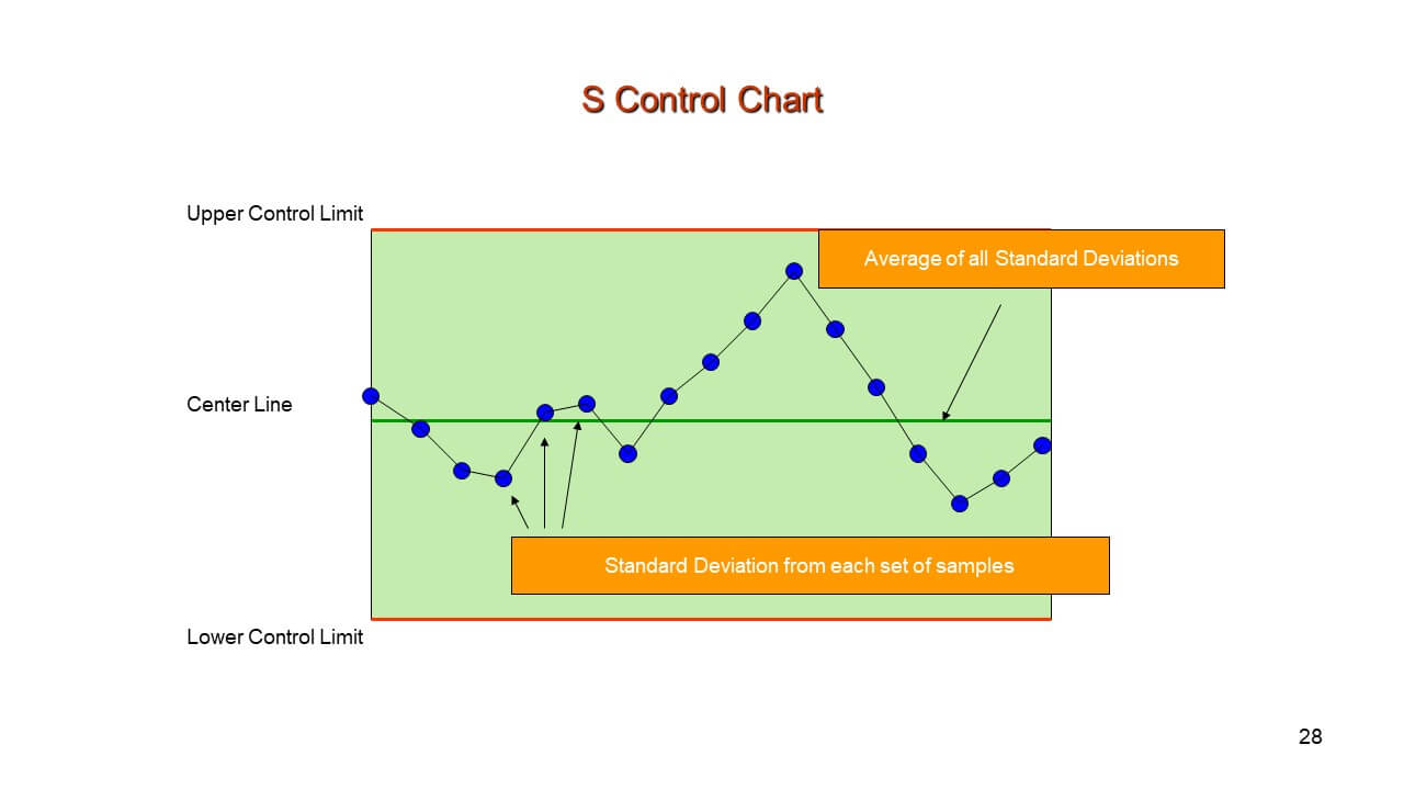
● Standard Deviation (S) Control Chart
This type of chart is used to monitor the average or mean of the variable, such as the weight of all bags, the length of steel rods, etc.
Attribute Control Charts
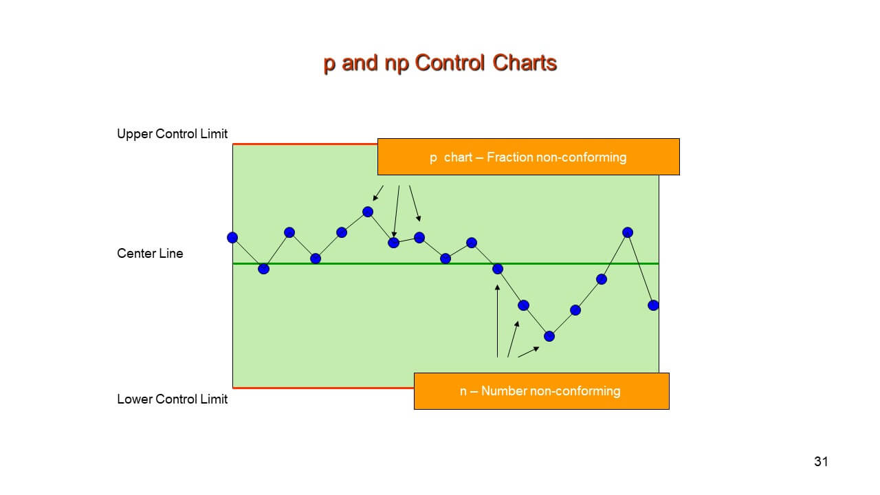
● “np” and “p” Control Chart
You use P charts when you inspect a pass or failure. In this chart, the sample size may vary, and it indicates the portion of successes. In contrast, in the np charts, the sample size has to remain constant. Moreover, these charts monitor the nonconforming units in a given sample.
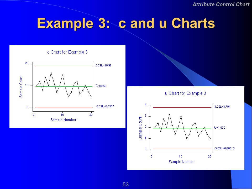
● “U” and “C” Control Chart
You use a C chart when there are defects in a sample unit, and the samples per sampling period should remain constant. However, a U chart is similar to the C chart, but the difference is that the samples per sampling period can vary.
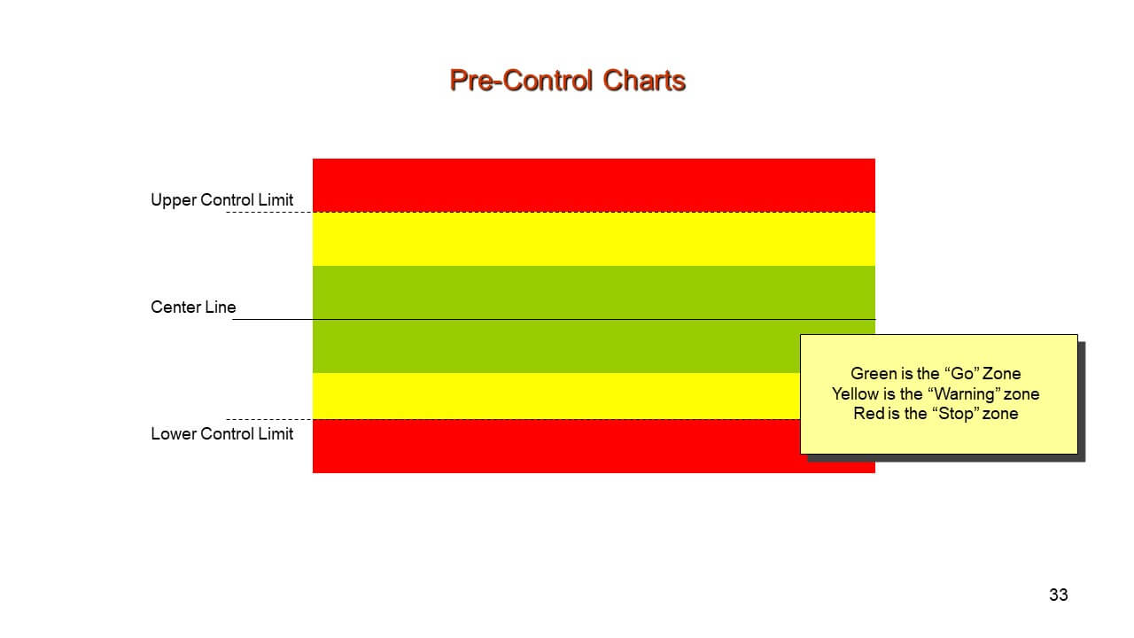
● Pre-Control Chart
It is used to control and monitor the process average. You take many small samples from a process and check it against specific requirements.
The Purposes of Using Control Charts
We will explain the purpose through an example. Let’s suppose you had a flat tire, and you went to your college late that day. Your teacher scolded you, and you don’t want it to happen again.
You cannot remove the probability of a flat tire, but you can reduce its chances. If you know the reason, you can do the calculation and remove it.
● Eradicate Problems
A control chart monitors the process and detects the variation that occurs. Also, it eradicates the issues, so it doesn’t happen again.
● Estimate Process Average
Let’s suppose you figured out why there were out of control points, and you calculated the control limits again. This chart now shows you the process average and shows you an average time to get to college. Hence, it helps in estimating the process average.
● Assess Process Improvements Efforts
It also helps to monitor the consequences of your process improvement efforts. For example, you decided that you will leave your home 30 minutes early; therefore, the control chart will show new variation and average in the data.
Different Types of Process Variation
It is essential to monitor the various kinds of process variation because it helps to control your process. A variation is of two types, i.e., common and special.
● Common Cause Variation
This kind of variation is consistent, predictable, and will always be present in your process. Let’s use the same example as mentioned above.
Suppose it takes 30 minutes to get to your college. Some days you take more time, while on other days, you take minimal time. Therefore, some days you reach college a little late and sometimes early. But the range is always between 25 to 35 minutes. These variations remain within the upper and lower limit, and there is no need to change the process.
● Special Cause Variation
This type of variation is unpredictable and sporadic. If special causes occur, you have to find the root of the problem and eradicate it, so it does not happen again.
Suppose you were going to college, and you have to stop the car in the middle of the road because of the flat tire. Typically, it takes 25 to 30 minutes, but now it took you 1 hour or more to reach the college.
How to Create a Control Chart?
These charts are ideal because they distinguish common cause variation from special cause variation. Follow these steps along to make one for yourself.
Select an appropriate chart for your data. You must decide the period because it is essential to collect the data and establish control limits. It is noted down or recorded on the X-axis of the chart.
Collect all the necessary data you need and start plotting. Now, from your data, calculate the average. Also, add a control line.
Then, calculate the upper and lower limits. Make sure to add these lines with a different style or color in your chart. To calculate UCL and LCL, you must:
- Subtract the average with the recorded number and square the answer.
- Calculate the average of all squared results.
- Determine square root (it is the standard deviation) of that answer.
- Now, find how many standard deviations you need to fall in between your controlled process.
- The upper and lower limits of a well-controlled process are within -3 and +3 standard deviation from the average.
Notice any “out of control” signs in your chart. Also, note the places or areas your data falls outside the control limits.
Find the root cause for the out of control sign, if any, and make adjustments in the process. It will minimize the risks. Since you have the control limits in your mind, keep tracking your process.
A control chart is a graphical tool that helps to study how a particular process will change over time. Moreover, there are two major types of control charts, i.e., variable and attribute. There are two types of process variations, which are essential to understand because it will help you create a control chart.


