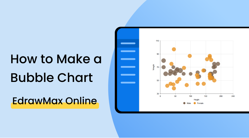
How to Make a Bubble Chart: A Stepwise Tutorial
1. Introduction
A bubble chart is a type of chart used to visualize variables between three or more numeric values. Each bubble represents one data point, and these are displayed by vertical position, horizontal position and dot size. It’s a variation of the scatter plot, in which bubbles swap with data points to form the bubble chart. Bubble charts might be mistaken by another chart type, called a packed circle chart. But in this article, we will guide you through the steps on how to make a bubble chart.
2. How to Create a Bubble Chart
There are some variables that we need to know before we dive deep into how to make a bubble chart. First, to make a bubble chart, we need three-column data. One column will tell each point size, and the other two will relate to each data point's horizontal and vertical positions. Here are some things to keep in mind when creating your bubble chart:
1. Scale bubble areas by value
Make sure that the area of the bubble in the chart relates to the third value in the columns. If that mistake happens, you'll end up with bubbles four times the area by inputting the same value twice.
Another thing to be aware of is that depending on your bubble chart; you might be required to match the value to the area in the chart to avoid discrepancies in sizes. However, many tools will do it for you straight away.
2. Limit the number of points to plot
Because overlaps often happen when creating bubble charts, transparency of the bubbles is essential to visualize the chart correctly. However, this also highlights limitations on the chart regarding the number of data points and keeping the graph readable.
If you think that your chart is getting over plotted, it's best to find a way to sum up the data or go for a different graph that helps visualize it better. There's no reason to try and reduce the size of the bubbles because doing it would probably make it harder to read values.
3. Include a legend
Including a legend to show bubble sizes is crucial to make it presentable and easy to read. When using an interactive application, use it to turn the values visible by hovering over the data points.
4. Present a clear trend
Choosing the order of the values is essential to understand and present a clear trend. The two central values should be on the horizontal and vertical axes, leaving the other variable to the size point.
5. Incorporating negative values
When inputting negative values, keep in mind that these can't be linked to point size, as bubbles can't have negative numbers. So if you still want to use a bubble chart to present negative values, then you'll have to insert additional information. For example, positive values might have filled circles and unfilled for negative numbers or fill them with different colours.
3. How to Create a Bubble Chart Using EdrawMax Online?
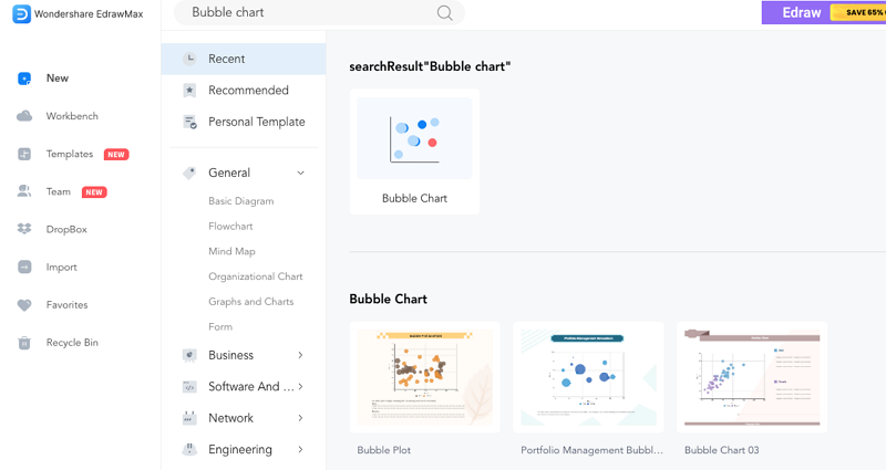
Here are the steps you need to follow to create your bubble chart online using EdrawMax Online. Go to EdrawMax Online and sign in to get access to hundreds to chart templates.
You'll be presented with a few template options of bubble charts.
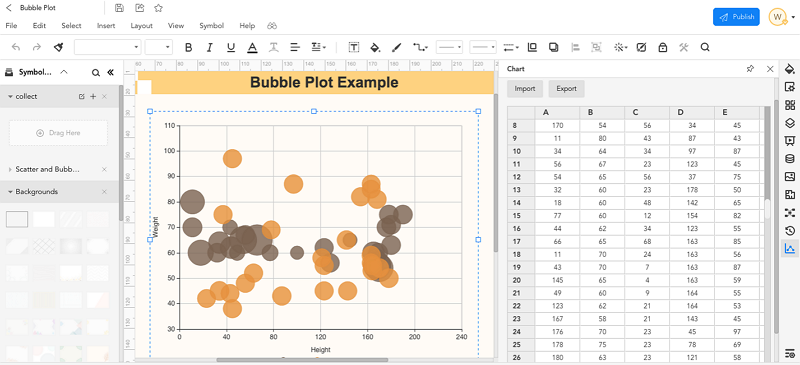
You'll have to insert your own data or import it from another chart.
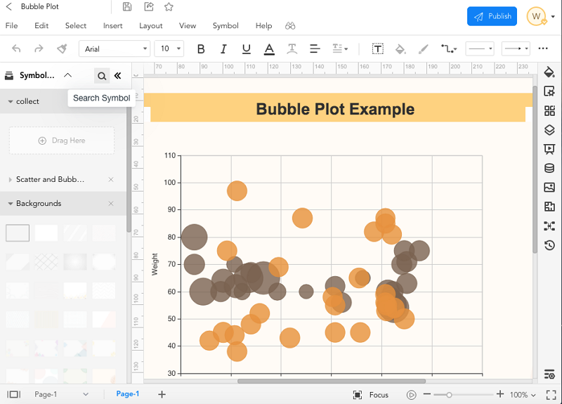
On the sidebar, you'll have a button with the title of "chart" where you'll be able to insert data. Then, after you've inserted the correct variables onto the right axis and point sizes, you'll have your graph ready.
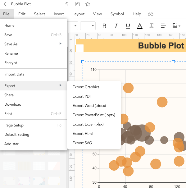
After you are done with it and ready to show it to your co-workers or in a presentation, you simply go on "File", go down to "Export". There you'll be given a choice to export your bubble chart in several ways. Please choose the one that fits your purpose better and click on it. To share, you'll have to go on "File" again on the top left corner of your project and press "Share". A window will pop up asking you where do you want your chart to be shared.
4. Expert Tips for Making a Bubble Chart
Interpreting a bubble chart
When reading a bubble chart is relevant to understand that it works piece-by-piece. For example, how do the two columns of data correlate with the data point size without forgetting that each variable has to make sense and that the little bits make it whole.
Identifying the suitable case to use
Because it is such a complex chart, you'll need to be mindful of your audience and choose the proper case to use a bubble chart. When you add other dimensions to your graph, but it doesn't add value to make up for their presence, you should try to present your project in another type of chart.
In terms of design, there are a few other tips that you should mind when creating your own chart:
- Use interactivity
- Narrate the chart
- For static bubble: include words
Powerful visuals make the audience understand better the chart. The use of animation, filter, and navigation features turns your chart attractive and easy to read.
A read-through is important for those who are not experienced in reading bubble charts, as it will be beneficial to have a complete understanding as new variables appear on the graph.
To provide the audience with clarity in your chart, you must label your axes or highlight essential data points. It is crucial that you do it, especially if your chart is not interactive or you are nowhere around to explain it. So the inclusion of notes and information on your chart will help to make it more accessible to others.
Wondershare EdrawMax
EdrawMax is the easiest diagramming tool that serves all your purposes. Try Free Online now!


5. FAQs About Creating Bubble Chart
What is a bubble chart good for?
A bubble chart is good for when you want to present three values or data in a graph. For example, they are often used to show financial data and other complex data information, also for when you want to show data represented in two axes and a physical measure. Bubble charts use x, y and z values.
How do you read a bubble chart?
Each data information connects with the two axes and bubble size representing the bubble's xy place in the chart. First, the graph shows numeric data on the horizontal axis and again on the vertical axis. Then, the third data point is displayed as the size of the bubble, combining all the values and displaying them as a bubble chart.
How to use a bubble chart?
You should use a bubble chart if you want to display data with three or more variables. For example, by coding the two most prominent values on the axes xy and placing the third value on the z variable, you'll end up with a bubble chart representing three different data points.
6. Key Takeaways
- Bubble charts are a great way to depict data information when there are three variables or more.
- It not only lets you visualize all your complex data points in a graph, but it also does it in a dynamic and attractive way.
- Edrawmax can be used to create these charts with ease, allowing the use of templates and saving you time.
Bubble charts are better used to convey information about a third observational element. It uses the size of the xy points to represent the magnitude of the variable. In EdrawMax Online, we can easily create one or use one of the many templates there is. It is easy and intuitive, and with this guide, you'll be able to know how to make a bubble chart in no time. So start your bubble charts and impress your boss and coworkers right now.
Create and share 280+ diagrams with EdrawMax Online