Free Editable Pie Chart Examples
We use pie charts to visualize data as a part-to-whole relationship. Pie charts are essential for presentations and reports where you want the reader to understand the data trend and its segments as a whole. These charts are easy to create and use, but there is always a big chance of using the wrong pie chart to represent data. You can find the right one from our pie chart examples down here.
1. What is Pie Chart
As the name suggests, a pie chart visualizes data segments as a fractional part of the whole in the form of a pie or circle. It compares data percentages by cutting the pie into various slices based on each data segment. The pie chart is the best graphical representation tool to depict part-to-relationship between the same data type segments. It is easy to understand as you can compare the percentage of segments using small and large slices. With our pie chart examples, you will find out when appropriate to use a pie graph.
2. The Pie Chart Examples
There are lots of benefits of using pie charts. It is simple and easily understandable for the reader. You can visualize data as fractions and compare it with making using complex numbers. The reader can make out the data trend in a pie chart with one glance. Sometimes, using the pie chart is not the smartest option as it only allows you to compare only one data set. It also gets complicated if you cut the pie into many slices. The following pie chart examples will tell you the best use cases of a pie graph.
|
|
|
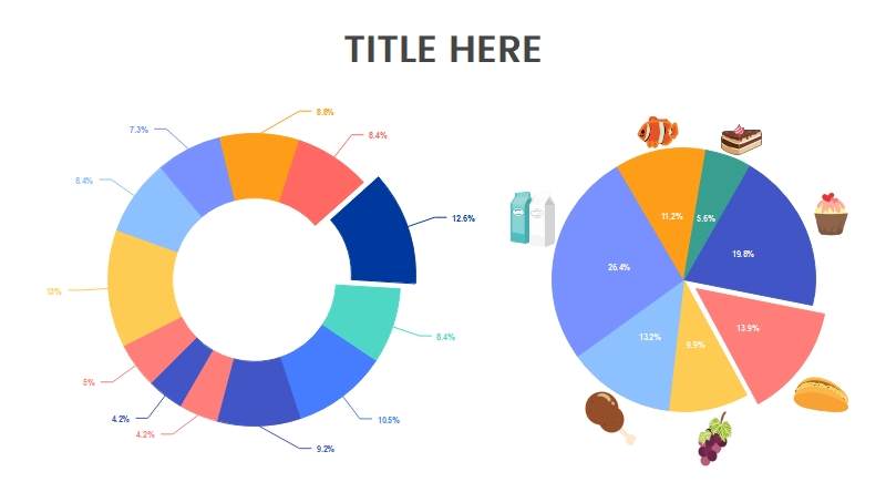
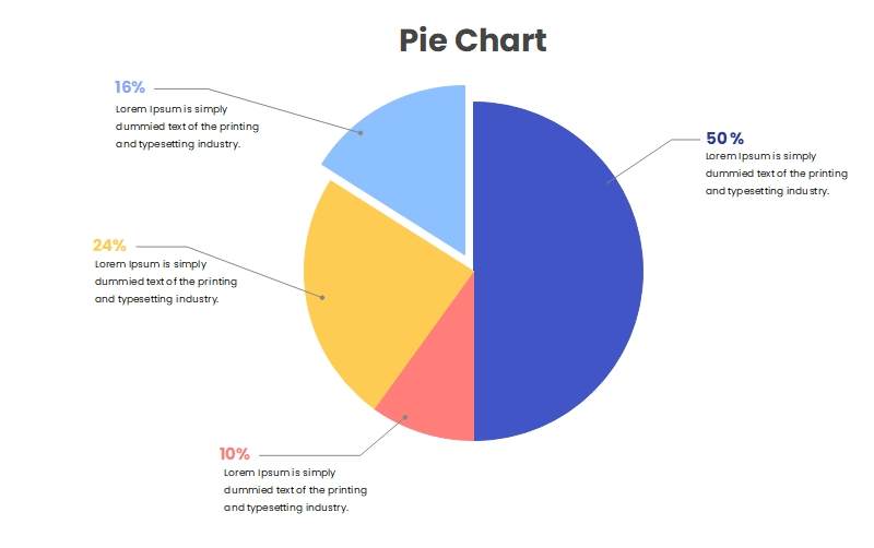
| Federal Budget Pie Chart | Editable Pie Chart Meme | Pie Chart Template |
|
|
|
| Government Spending Pie Chart | Circle Pie Graph | Blank Pie Chart |
|
|
|
| Percentage Pie Chart | Pie Chart Example | US Budget Pie Chart |
Example 1: Federal Budget Pie Chart
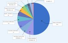
This is a federal budget pie chart example as you can see that there are various big and small slices in the chart based on the data percentage. The whole circle or pie represents the total federal budget, and each slice divides the data segments based on the federal spending allotted to the federal sector. A pie chart cannot compare subclasses or two data sets, so the mandatory and discretionary percent of spending is a part of each slice. Instead of using numerical data, the reader can quickly understand federal spending.
Source:EdrawMax Online
Example 2: Editable Pie Chart Meme
You can use pie charts for many things, and creating memes is one of them. This example shows an editable pie chart meme. It is a proper pie graph as you can see that it is a whole circle with slices that compares data segments. Instead of writing the whole joke in plain text, you can use pie charts to create memes like our example. This meme is about a person pondering whether to wake up early tomorrow or not. Both big and small slices of the pie graph led to the same answer no, which means he never wakes up early.

Source:EdrawMax Online
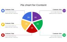
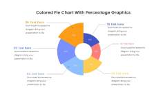
Example 3: Pie Chart Template
As you can see in the example diagram, pie chart templates make it easy for you to create pie charts for presentations and reports. There are already five slices of the same size in the graph in this example. You can add the title of the data segment in each graph, but you can't use slices of the same size because the percent of each data segment is typically different. You can use a pie chart maker to customize the graph, remove or add slices and change the size of each slice based on your needs.
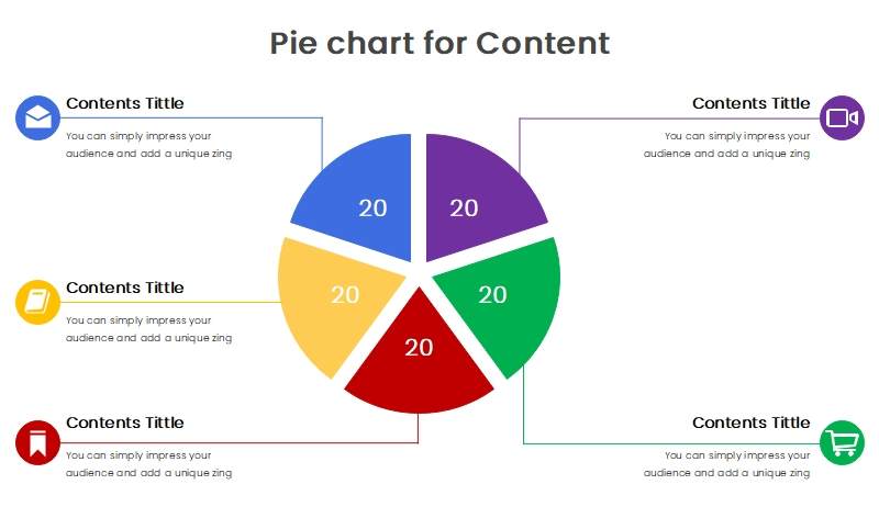
Source:EdrawMax Online
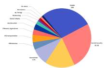
Example 4: Government Spending Pie Chart
This is an example of the government spending pie chart of UAE. It is almost similar to the budget pie graph because it gives the information of budget spent by various government sectors. Readers can take a single glance and understand that the government spends the most on social security, and the transport sector is spending the least percentage of the budget. This chart makes it easy to make changes in the budget plan, and it uses different colors for each slice to make things as simple as possible.
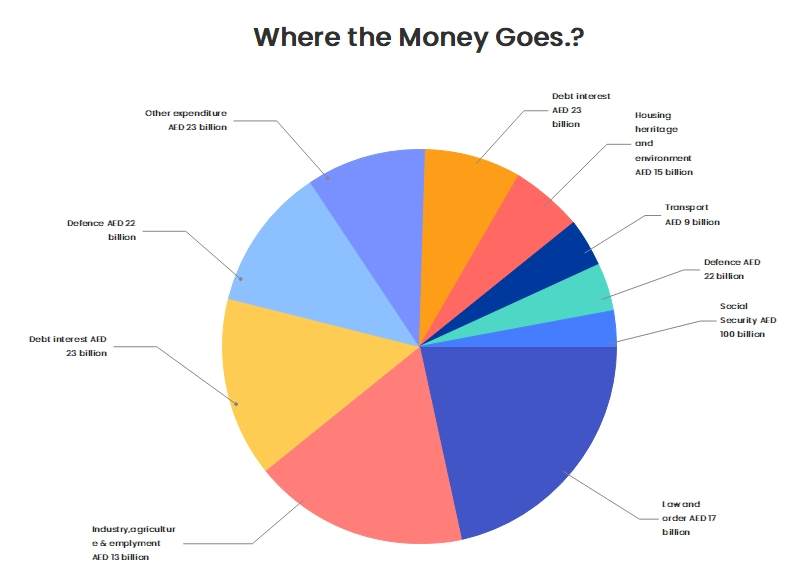
Source:EdrawMax Online
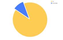
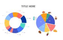
Example 5: Circle Pie Graph
You can see two types of pie charts in this circle pie graph example. You can use either of these pie charts to represent data comparison visually. The circle in the first chart is empty from the inside, but the boundary is still there. There are also multiple-sized data segments in the graph. When you compare these two diagrams, you can see that even if both are correct, the second one is simpler and easily understandable compared to the first one.
Source:EdrawMax Online
Example 6: Blank Pie Chart
This is an example of a blank pie chart that you can create using a 2d circle or a 3d circle. As you can see, it completely looks like a pie cut into various slices. There is no information written in the graph, but labels show the percent of data segments in a data set. The graph is the best example of long text visually represented as a pie to make things easy to understand. You will have to write a lot explaining each data segment with text, but you can also do it using a simple pie chart.
Source:EdrawMax Online
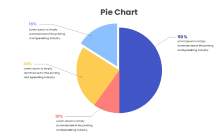
Example 7: Percentage Pie Chart
This percentage pie chart example compares data percentage using graphics and different colors. You can see that the layout of this graph is a little different from other pie graph examples. The size of each size is different, but the length of each slice also depends on the percentage of data. To make a percentage pie chart, you have to write each slice's percentage in the graph. Use different colors for each slice and ensure that the biggest slice is also the longest.
Source:EdrawMax Online
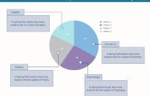
Example 8: Pie Chart Example
This is an example of a detailed pie graph used in product sales and budget analysis presentations. There is a simple pie graph in the middle with percentages written on each slice. The graph uses labels to name the data segments and gives details and important remarks to simplify things. It is not using bright colors, and its layout is sleek. It is better to use this chart in high-end business presentations or to make reports that you will give to your superiors to show your professionalism.
Source:EdrawMax Online
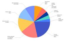
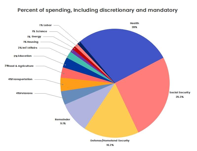
Example 9: US Budget Pie Chart
This diagram represents the US budget pie chart. You can use it as a reference when creating a graph with lots of slices that can complicate your presentation. It gives us the details about the president's proposed budget plan. You can see that half of the 1.5 trillion budget goes to the military, and the other half goes to all other government sectors. At first glance, you can make out that the country is spending most of its budget on the military. Suppose you were to explain information using text, then it will take you several pages to write it down.
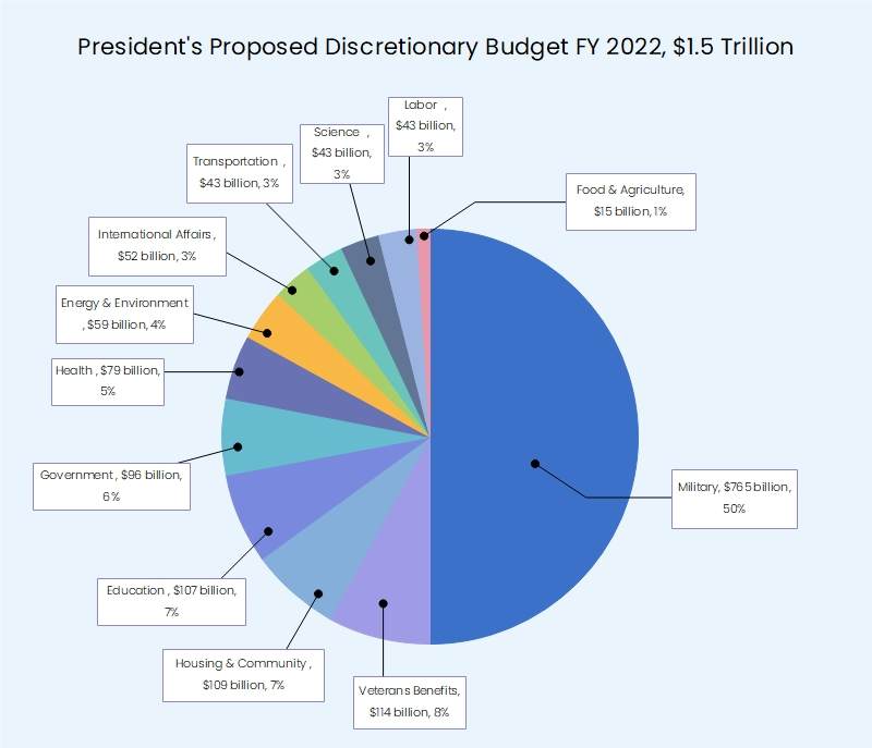
Source:EdrawMax Online
3. Online Pie Chart Maker
We use pie charts to visualize data comparison and ensure that the reader gets the general idea of the data trend at a glance. The logic is simple, but making a pie graph is tricky when creating many slices to represent various data segments. It is not a big problem if you use the right diagramming software. EdrawMax Online is the best pie chart maker as it gives you access to many professional templates and pie graph designs. It also comes with a comprehensive library of symbols, lots of customization tools, and various other cool features that will help you create a perfect pie chart.
4. Key Takeaways
A pie chart is a circular graph visually representing data comparison by dividing the circle into slices like a pie. The size of each slice depends on the percentage of the data segment, and it visualizes data as a whole at a certain point in time. Unlike a bar chart, you cannot, and pie charts can't depict data changes over a period. In each pie chart example, you can see that the slices are perfect depending on the percent value of the data segment. Find more pie chart examples in the template community.


