Free Editable Scatter Plot Examples
The scatter plot example establishes visual patterns and mathematical representation of a plot. By charts, diagrams, graphs, and tables, one can create a scatter plot to establish numerical correlations. A scatter plot’s essential parts are the trend line, the third categorical variables, and the third numeric variables.
1. What is Scatter Plot
Scatter plots are akin to line graphs. On the X-Y axis of a line, the line graph plots a continuous function. One can find various dots to focus on individual pieces of data.
The main objective of the scatter plot is to identify the correlational relationship. Many people use the 3D Scatter plot with three axes. Another essential part of a scatter plot is a bubble chart. Bubble charts work well with data that has three series. Color-coded bubble plots are easy to use. It can sort the bubbles into categories.
Another bubble plot is a cartogram. People use these scatter plot examples indicate several oil rings, population, natural weather events, or any geographical data. Scatter plots offer a visual idea of data. However, while line graphs use lines, scatter plots use dots. Scatter plots are vital because it creates the base for simple linear regression.
2. The Scatter Plot Examples
With the help of scatter plot examples, one can create various diagrams, charts, and graphs without efforts. The following examples are made in EdrawMax Online, and give you the references and inspirations when creating scatter plot diagrams.
|
|
|
| Scatter Plot Data Example | Scatter Plot Correlation | Scatter Plot Data Sets |
|
|
|
| Scatter Plot Graph Example | Linear Scatter Plot Example | Quadratic Scatter Plot |
|

|
|
| Scatter Plot Example with Data | Scatter Plot Examples Real Life | Scatter Plot Example for Kids |
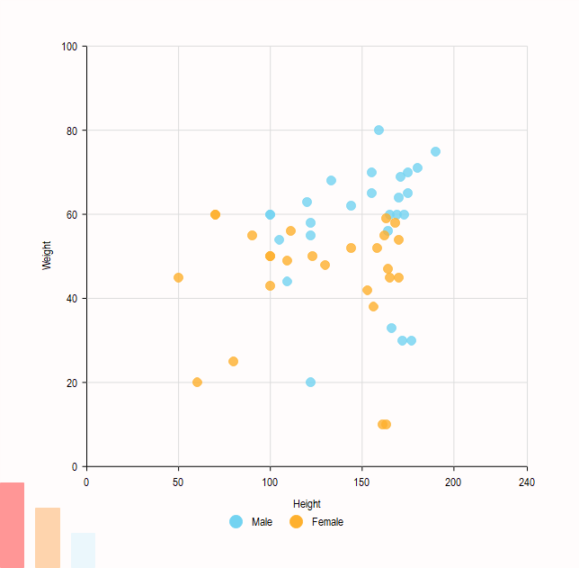
Example 1: Scatter Plot Data Example
The given scatter plot example is a mathematical diagram or a type of plot. It uses Cartesian coordinates to display the values for two variables in a data set.
 Source:EdrawMax Online
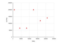
Example 2: Scatter Plot Correlation Example
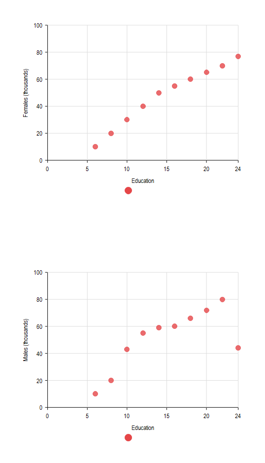
The scatter plot example shows the income chart for adults based on their years of education. For example, 16 years of education refers to a graduation degree, whereas 21 years refer to a Ph.D. degree. The following graph shows females with 23 years of education earn a minimum of 80,000 dollars. It also represents the trend.
 Source:EdrawMax Online
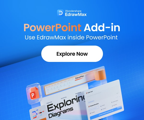
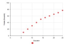
Example 3: Scatter Plot Data Sets Example
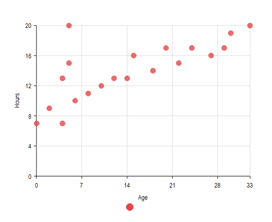
The third scatter plot example depicts the amount of sleep a person needs per day as per their age. In the next part, it shows their average income based on their education. In the case of the females' education, the graphical representation is diverse.
 Source:EdrawMax Online
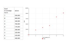
Example 4: Scatter Plot Graph Example
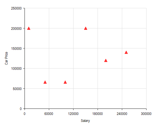
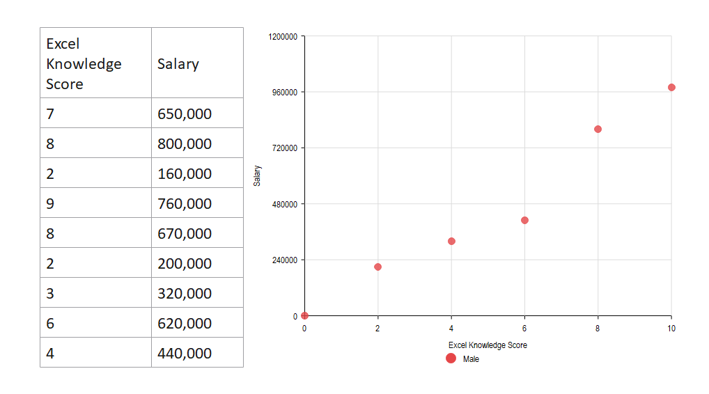
The fourth scatter plot example in Excel is useful to plot various points with their value. Usually, the plots are scattered randomly, which establishes the relations between two variables. One can insert menu tabs under the charts section.
This type of scatter plot example is easy to use. People can use it to demonstrate agricultural data. By arranging data, creating variables, one can make this type of plot example.
 Source:EdrawMax Online
Example 5: Linear Scatter Plot Example
The given scatter plot example shows the scientific XY data. One can create this example by using the Scatter symbol, click scatter, trend line, and straight lines. There are also vertical and horizontal axis scaling and axis title.
 Source:EdrawMax Online
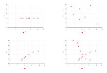
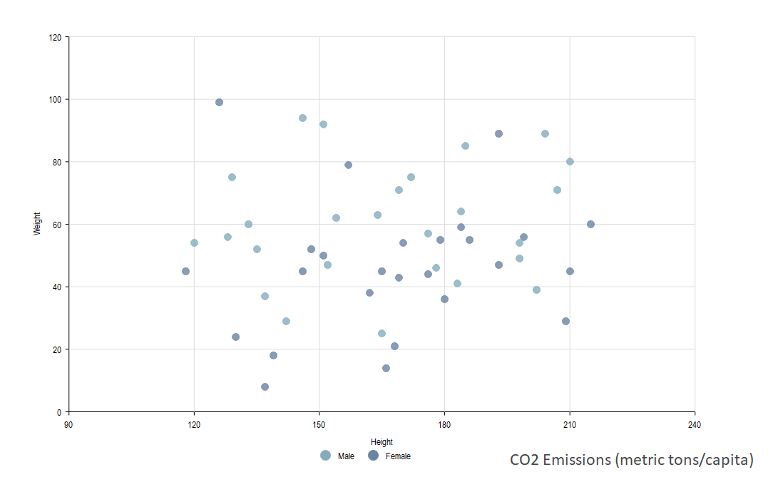
Example 6: Quadratic Scatter Plot Example
The given scatter plot example depicts a relation between two data sets. People use Dot to represent a single data point.
One can see visual data distribution by the graphical representation of several data points. The variables demonstrate a correlation between the variables.
Next, there is a graph that illustrates the weight of a person in a week. Another graph in the plot example shows the change in the temperature. Some real-life correlations get depicted through some other set of graphs.
 Source:EdrawMax Online
Example 7: Scatter Plot Example with Data
The given scatter plot example is also known as a scattergram or scatter diagram. One can make a unique visual distribution of the data set. In these graphs, data points are more evenly spread.
For example, one graph shows the way chemicals react to a changing temperature.
 Source:EdrawMax Online
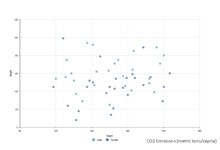
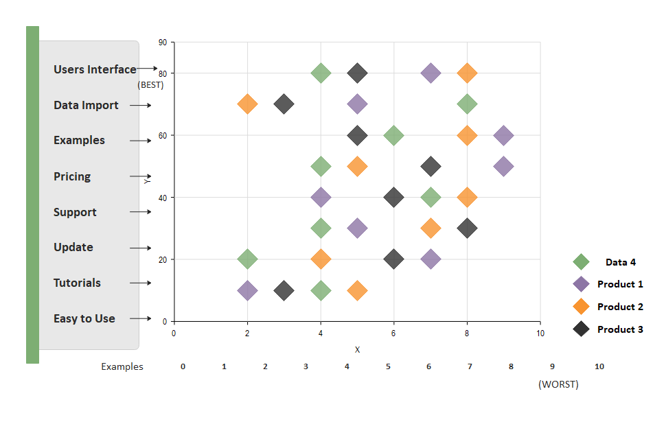
Example 8: Scatter Plot Examples Real Life
A competitive analysis is a process of categorizing and evaluating the competitors to understand their strengths and weaknesses in comparison to your own. A scatter chart works best when comparing large numbers of data points without regard to time.
 Source:EdrawMax Online
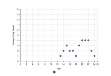
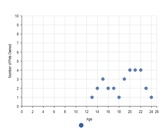
Example 9: Scatter Plot Example for Kids
A scatter plot is a type of data visualization that shows the relationship between different variables. As the data scatter chart shows, this data is shown by placing various data points between the x- and y-axis.
 Source:EdrawMax Online
3. Online Scatter Plot Maker
One can use an online scatter plot maker like EdrawMax to make a scatter plot. Three primary types of scatter plots are there.
- Strong positive correlation
- Strong negative correlation
- No correlation
One can use scatter plot examples to calculate the correlation of determination. QI Macros for Excel offers free technical support to create this.
EdrawMax Online is not just an online graph maker. Use EdrawMax online to create your scatter plots with ease, just grab a template or choose one scatter plot template from EdrawMax Template Gallery and keep customization as your preference. It already has more than 25 million users. The users can work on this tool to create more than 280 different types of diagrams. Many reputed companies consider the EdrawMax Online as their trusted companion.
Why Choose EdrawMax Online
- Create over 280 diagram types
- Supports team collaboration
- Personal cloud & data protection
- Print, share and download
- Powerful template community
4. Key Takeaways
The dots in a scatter plot example represent the values for numeric variables. They are different from each other. The position of the dots indicates all values for an individual data point. One can use the Scatter plot to observe the relations between variables. Not only the values but a plot example also patterns the whole data. If you still confused about how to make scatter plot in EdrawMax Online, here is an scatter plot guide to help you create plans in minutes.