How to Make a Scatter Plot or Scatter Chart
Create a Scatter Chart Online Free Free Download Free Download Free Download Free DownloadWhat is a Scatter Plot?
As the name suggests, a scatter plot is a type of mathematical diagram, which uses in the Cartesian coordinate system to display the value of two variables or a set of data.
The points plotted on the graph shows the relationship between two sets of data represented in the X-axis and Y-axis. The position of each dot on the horizontal and vertical axis indicates the values for a particular point.
A scatter plot is used to observe relationships between variables. It is also called a scatter graph, scatter chart or scatter diagram. The relationship between variables in the scatter plot is known as Co-relation.
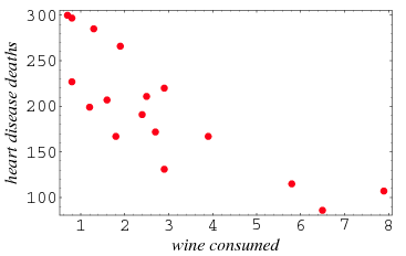
Image Source: wolfram.com
The above example shows the heart disease deaths presented in the Y-axis due to wine consumed presented in X-axis.
A scatter plot is very useful to research and get a visual comparison of two variables in a data set. It helps in determining what kind of relationship is possible between two sets of data.
When to Use a Scatter Plot
The scatter chat works well when we are comparing a large number of data points and trying to show the relationship between two variables. When we are trying to identify the potential root cause of the problem, the scatter plot is used.
Scatter plots are important in statistics as they can show the correlation between two values of variables. If there is no correlation exists between the variables, the points appear to be scattered on the chart.
If there exists a strong correlation, the points will concentrate near a straight line or stay near to each other.
How to Make a Scatter Plot Online
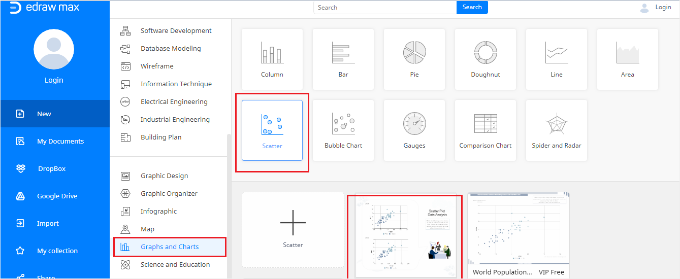
Step 1: Let’s get started by clicking on the link -https://www.edrawmax.com/online - and opening EdrawMax Online on your browser.
Step 2: Navigate to the Graphs and Charts section, find the Scatter option and once you click on one of available scatter templates, a new scatter plot will be visible on the screen.
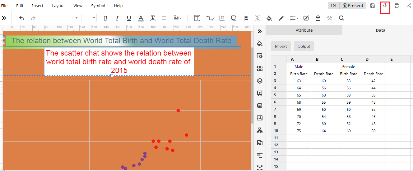
Step 3: Click and edit the title and the description of the scatter plot; Input or change the data of the plot on Chart (Data) pane. By clicking on the import button, you can import data from your local desktop as well.
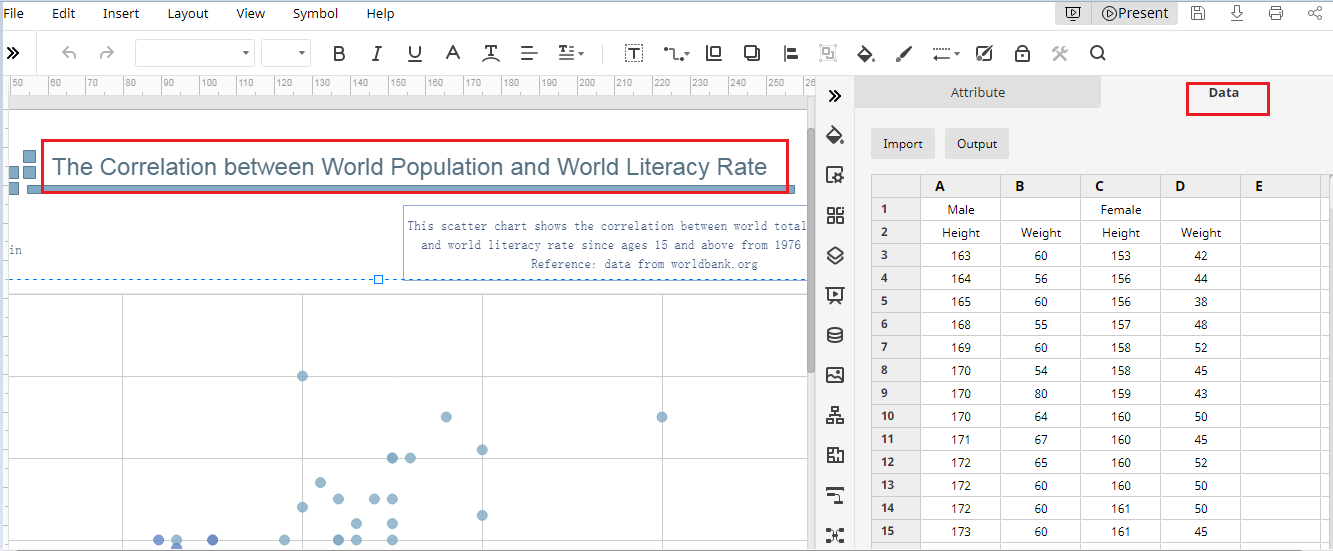
Step 4: You can edit the tag title and change the names, position, and colour of X-axis and Y-axis on the Attribute pane.
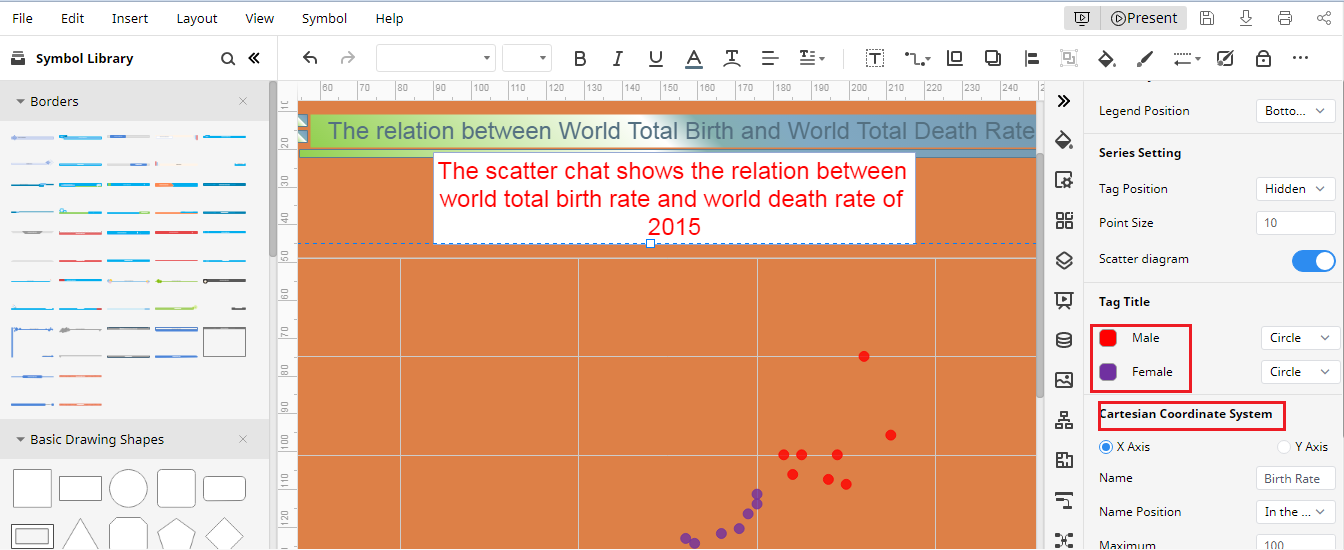
Step 5: Manually enter the data on Chart (Data) pane and the scatter plot will change automatically. Click on the download button on the top right and a scatter plot will be saved on your local storage.
Visit More Free Scatter Plot Templates
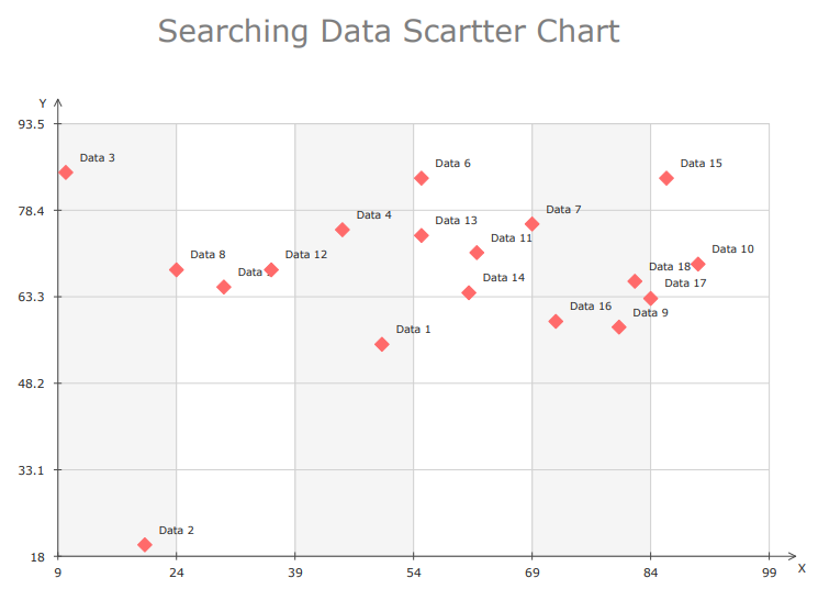
Data Scatter Chart Template
The Data Scatter Chat template available in EdrawMax online can be used to create a scatter plot and edit data as per your requirement. The scatter plot is created automatically and easily, according to the given data and the set of variables presented in the X-axis and Y-axis. Customize your own style of data scatter chart by using EdrawMax.
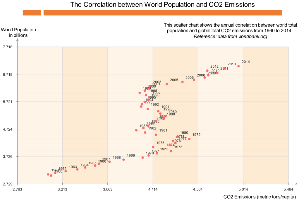
World Population And Carbon Dioxide Emissions Template
As you have already seen, the scatter chart or scatter plot is used to plot a series of data points to display the relationship between two variables and show how much one variable is influenced by another.
This template can be used to identify a positive correlation between these two variables such as World Population and Carbon Dioxide Emissions.