How to Create a Gantt Chart in Excel
Today, in this article, you’ll find a step-by-step guide to making Gantt charts for projects in various industries. Here we will give you detailed instructions on how to make and customize your Gantt chart in Microsoft Excel.
How to Make a Gantt chart in Excel
Step 1: Create a Project Task Table
Before you are going to work on a project, in most cases, you will break down the entire project into chunks of work phases, which are called project tasks. These tasks are also the important basic elements to form your Gantt chart.
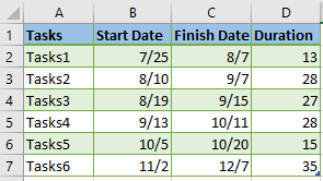
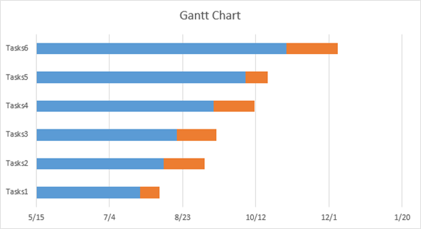
As is shown on the above picture, you need to input the task data in the worksheet, including task name, Start Date, Finish Date and Duration (count of days required to finish that task). Besides, the tasks should be sorted in the order of start date. Here we are using Excel 2016.
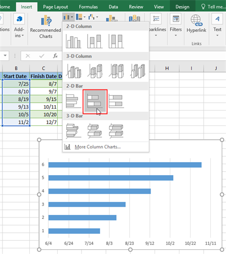
Step 2: Make a Stacked Bar Graph Based on Start Date
After creating a project task table, we need to make a stacked bar graph before we set up a Gantt chart.
- Select the range of Start Date, it’s B2:B7 in this case;
- Go to Insert tab, click bar graph icon on the Charts group;
- Then choose Stacked Bar under the 2-D Bar section.
As a result, you will get the following stacked bar graph inserted on your worksheet and when the graph is made, you can change the chart title as you like:
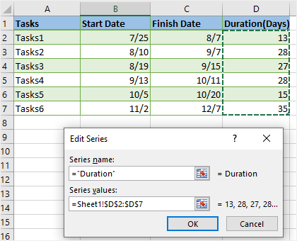
Step 3: Add Duration Data to the Chart
Now we need to add the series of Duration to the chart.
- Right-click on the chart area and choose Select Data on the context menu to open the Select Data Source window.
- Click Add button on the Select Data Source window.
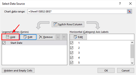
- Then the Edit Series window will open. In this example, we need to type Duration in the Series name field, then click the range selection icon in the Series values field and select cells D2:D7. Make sure that the column header couldn’t be included.
- Click OK in the Edit Series window and we will go back to the Select Data Source window with both Start Date and Duration added under Legend Entries (Series).
The resulting stacked bar graph would be like this:
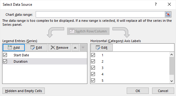
Step 4: Add Task Name to the Chart
In this step, we are going to replace the numbers on the left side of the graph with task names.
- Bring up the Select Data Source window again.
- Select Start Date on the left pane and click Edit on the right pane of Horizontal (Category) Axis Labels.
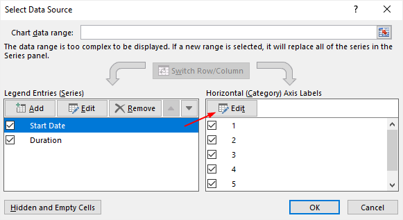
- The Axis Labels window appears on the worksheet and we will select the axis label range in the same way as we select Duration data in the previous step.
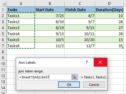
- Click OK twice to close the windows to get the resulting chart.
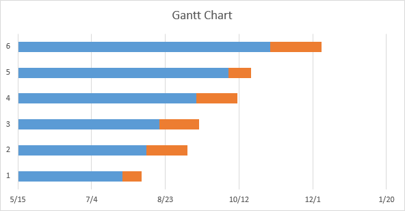
Step 5: Transform the Bar Graph into the Gantt Chart
To make the stacked bar graph look more like a Gantt chart, we have to do additional formatting. The critical thing that we should do is to make the blue Start Date bars invisible since we can’t delete them directly.
- Click on any blue bar in the chart to select them all and right-click on it to choose Format Data Point on the context menu.
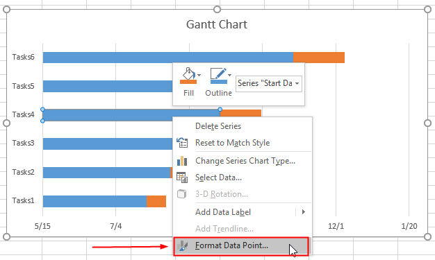
- The Format Data Series pane will show up on the right side of the worksheet. Then we should select No Fill and No Line under Fill & Line pane to make the blue bar transparent.
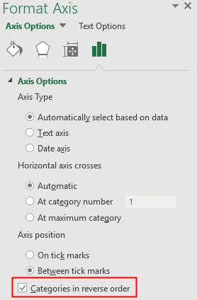
- Re-choose Vertical (Category) Axis on the drop-down menu and the Format Axis pane will be open.
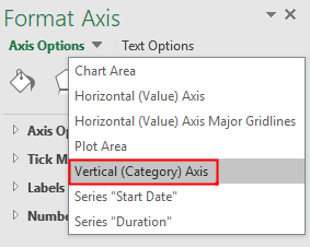
- Under Axis Options group, check Categories in reverse order to make the task names arranged in a proper order and the horizontal axis moved from the bottom to the top of the graph.
- If you don’t want to have a chart title shown on the graph, you can click the floating plus icon and uncheck Chart Title. Here is the final Gantt chart.
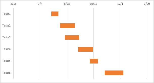
Since the Gantt chart is made from a stacked bar graph, you can customize the chart with the inbuilt formatting tools in Excel and make changes to your Gantt chart.
How to Make a Gantt chart in EdrawMax
Now we will introduce you an easier and more efficient way to make a Gantt chart and it will help you save time and effort and create high-quality Gantt charts.
Step 1: Select Gantt Chart Template
Enable EdrawMax, and go to find the diagram type of Gantt Charts under Project Management category.
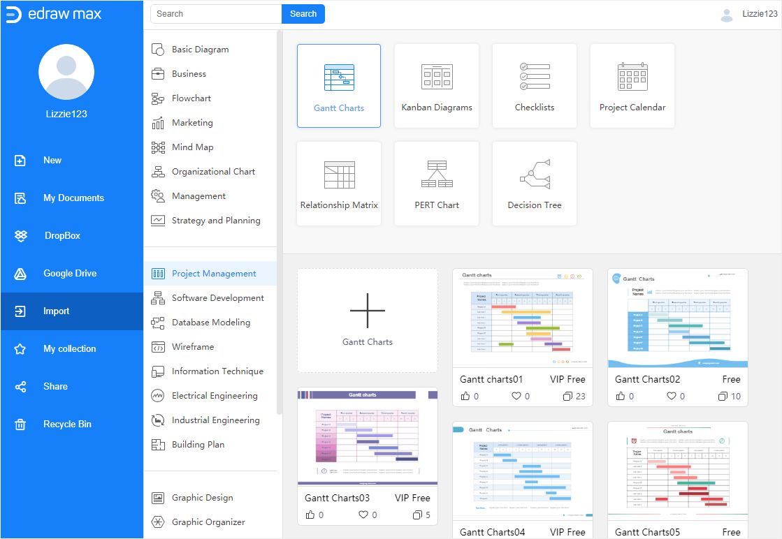
Click the plus icon or one of these Gantt chart templates to enter into the main interface. Here, in this case, we will click the plus icon to open a blank page firstly.
Step 2: Input Task Information
Usually, you can input the task information into the Gantt chart in EdrawMax via 2 methods:
- Type manually;
- Import data from outside sources.
Note: We recommend you importing data into EdrawMax if the volume of the dataset is too big and it will take much time for you to input the information manually.
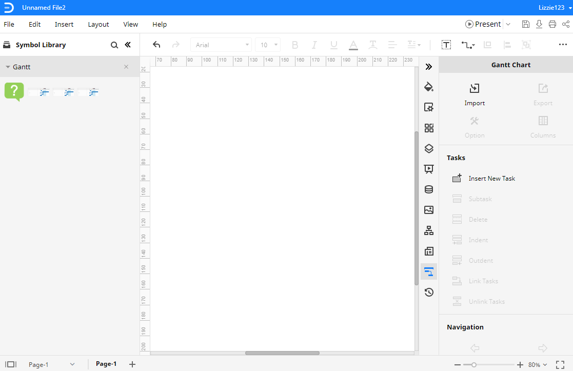
Click the Question mark symbol on the Symbol Library pane, then drag and drop it onto the drawing page so that you will know how to import data in EdrawMax.
Like creating a project task table in Excel, when you want to import data in EdrawMax, you also need to sort out your task data into a table and save it in Excel format.
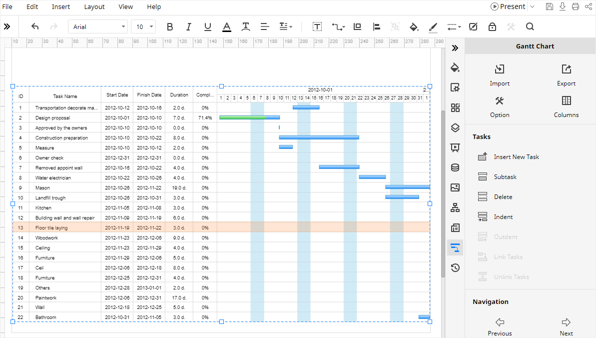
Step 3: Create Your Gantt chart
Click the Gantt Chart icon ![]() on the right-side bar and open Gantt Chart pane, then click the Import button to import data from the local storage. The required file formats of the data are xlsx and csv.
on the right-side bar and open Gantt Chart pane, then click the Import button to import data from the local storage. The required file formats of the data are xlsx and csv.
After you find the target file and click Open, EdrawMax will automatically create a Gantt chart based on the imported data.
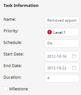
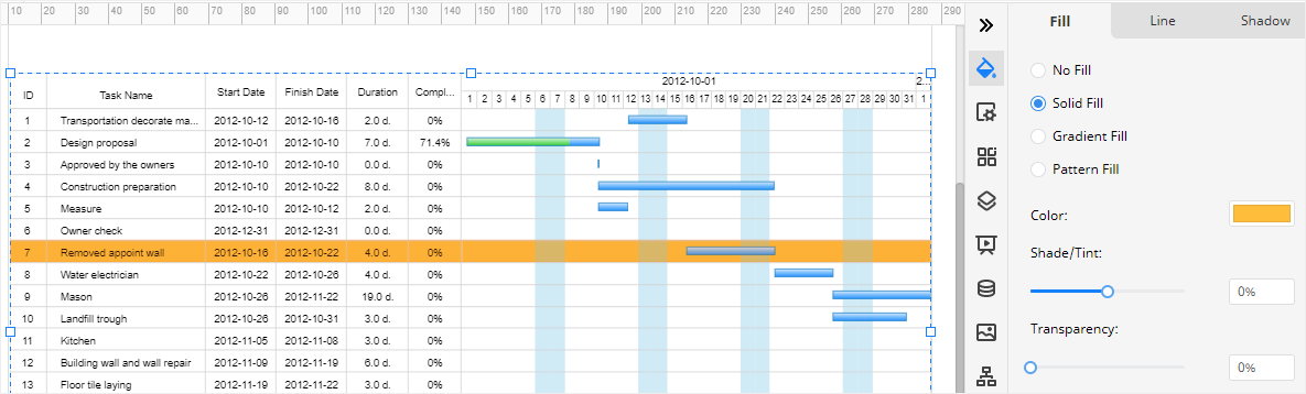
Step 4: Customize Your Gantt chart
If you want to change certain task information in EdrawMax, you can select the task in the Gantt chart at first, then open Gantt Chart pane, find Task Information section and change its information.
If you want to modify the color or style of tasks, you can click one of the tasks, go to Fill/Line/Shadow pane and change the color or style as you like.
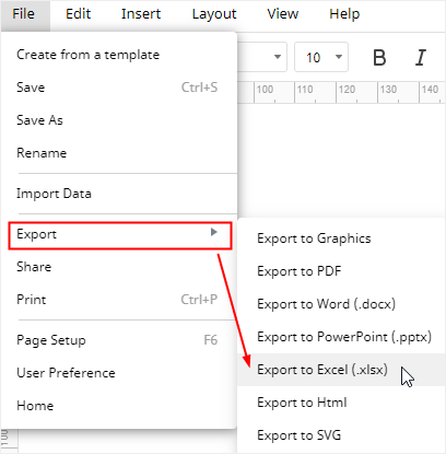
How to Export an EdrawMax Diagram as Excel File
When you finish making a Gantt chart in EdrawMax Online, you are also able to save and export the chart as an Excel file.
Go to File tab, click Export > Export to Excel, and EdrawMax will automatically save and download the created Gantt chart as an Excel file in your computer. So you can get a Gantt chart in Excel format. Remember, all the Microsoft Office files exported from EdrawMax are editable.
Thus, with the help of EdrawMax Online, it will be much easier for you or other users to make a Gantt chart than using Excel. In addition, you or anyone else are able to edit and modify the exported Gantt chart in Microsoft Excel (only for 2013 or above version) directly.