How to Make a Histogram in Excel
What is a Histogram?
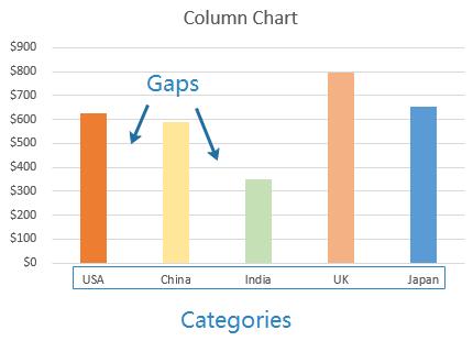
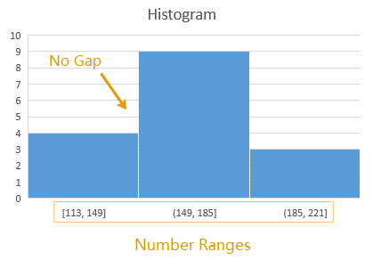
A histogram is a common chart used for data analysis in people’s work or study. It is a graphic display where the data will be grouped into ranges and plotted as bars. The height of each bar represents the volume of the data in each range. A histogram looks familiar to a column chart, but you can see their differences in the below pictures.
How to Make a Histogram in Excel 2016
If you are using Excel 2016, there is a built-in histogram chart type and it will be very easy and convenient for users to make a histogram in Excel.
Step 1: Input Data
The first thing you have to do is to input data into the worksheet. You can just type the data manually or import the data from outside sources.
Step 2: Create Your Histogram
Select the dataset, go to Insert tab and click on the Insert Statistic Chart option in Charts group.
Then click on the first Histogram icon, the histogram will be inserted based on your dataset and shown on the worksheet.

Step 3: Customize Your Histogram
For customizing a histogram, there are 4 function areas in Excel 2016 where you can change the styles, layout and colors of the histogram, add chart elements, modify the axis options or even change the gap width between bars.
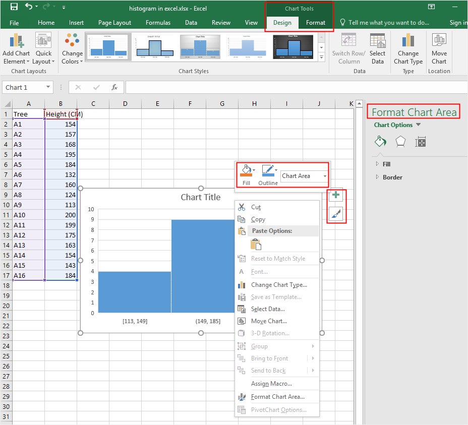
On Design and Format tab or on the floating menus next to the histogram, you can modify the style, layout and color options to change the appearance of the chart.
When you right-click on any part of the histogram, the contextual menus will be some of different from each other. However, most of the options on the menus are also shown on Design tab, Format tab or the floating menus.
For the right Format pane, the options on the pane will also change immediately according to your selection area on the histogram. When you select the bar of the histogram, the right Format pane will provide an option of changing gap width between bars.
Step 4: Change Histogram Bins
The word “Bins” represents bars on the histogram. If you want to add or decrease the number of bins on the histogram, you can select the horizontal axis and the axis options will show on the right Format pane.
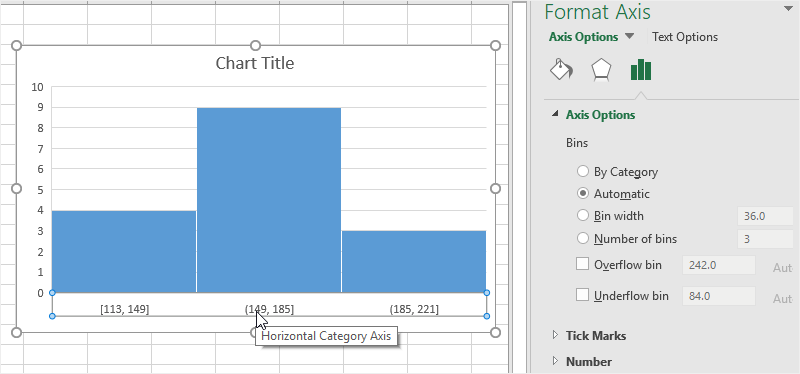
- By Category: This option is used when your horizontal categories are in text format. For example, if you have sales data of Smart Phone, Computer and Tablet, and you want to know the sales volume of each item, this option would be very helpful.
- Automatic: This option will automatically decide the number of bins in the histogram.
- Bin Width: This option allows you to define how big each bin should be.
- Number of bins: This option allows you to specify how many bins you want in the histogram.
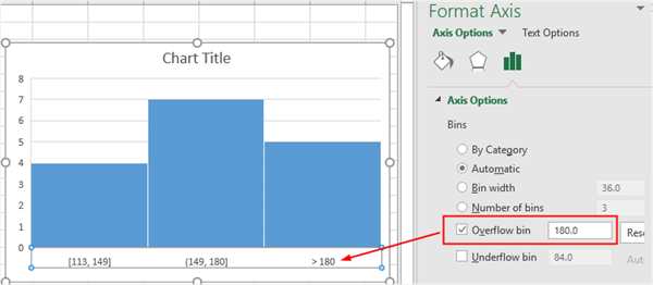
- Overflow bin: When you want to see the number of all values, which are above a certain value in the histogram, you can tick this option and input the certain number.
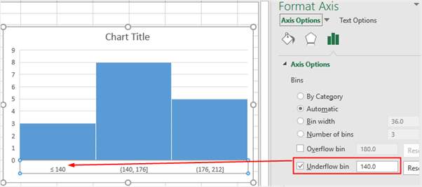
- Underflow bin: When you want to see the number of all values, which are below a certain value in the histogram, you can tick this option and input the number.
Step 5: Move Your Histogram
To move your histogram into another place, you can need to select the histogram at first, click Move Chart button on Design tab or the contextual menu of Chart Area.
Then, you will see the Move Chart window to ask you to choose where to place your histogram.
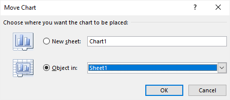
If you choose New Sheet, the histogram will be moved to a new sheet called Chart1 and the histogram will be on the center of the sheet; if you choose Object in, you can choose to move the histogram into another worksheet.
How to Make a Histogram with Data Analysis ToolPak
Creating a histogram with Data Analysis ToolPak works for all the versions of Excel (including Excel 2016). However, if you’re using Excel 2016, I would recommend you using the built-in histogram chart as the below section.
Step 1: Install Data Analysis ToolPak
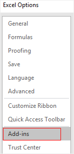
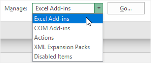
Go to File tab, select Options; in the pop-up Excel Options window, select Add-ins.
Then in the Manage drop-down menu, select Excel Add-ins and click Go.
Next, in the Add-ins window, choose Analysis ToolPak and click OK.
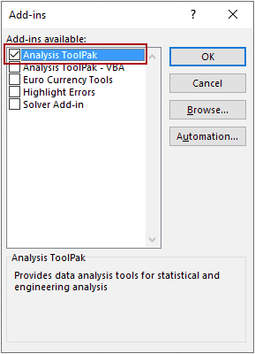
The Analysis Toolpak add-in will be inserted on your Excel and you can access it in the Analysis group of Data tab.
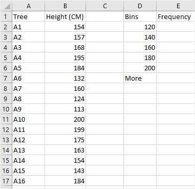
Step 2: Input Data & Add Bins
This step is the same as the steps in the first section. So you can type or import the data.
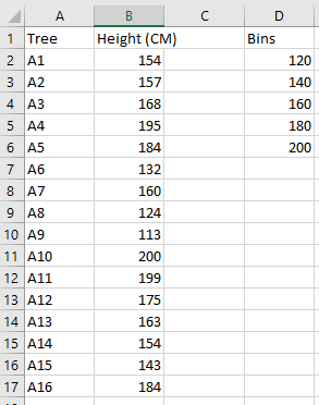
After inputting data, you also need to create data intervals in order to specify the histogram bin ranges. Bins are the numbers that represent the intervals into which you want to group the data. The intervals should be continuous, non-overlapping and usually in equal size.
Now you have to specify the bins in an additional column next to the dataset.
Step 3: Create Your Histogram
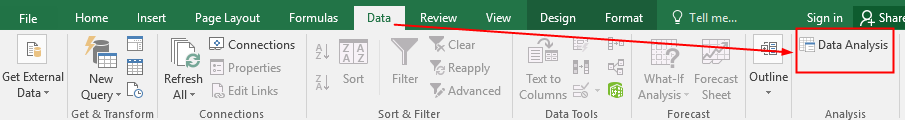
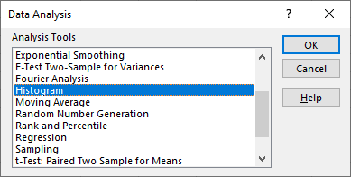
Go to Data tab, click Data Analysis in the Analysis group. Then in the Data Analysis dialog box, select Histogram from the list, click OK.
In the Histogram dialog box, you need to select the Input Range and Bin Range. You can leave the Labels checkbox unchecked if you don’t include labels in the data selection.
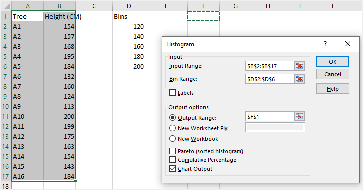
Besides, you can choose where to place the histogram in the part of Output options. Then, don’t forget to select Chart Output.
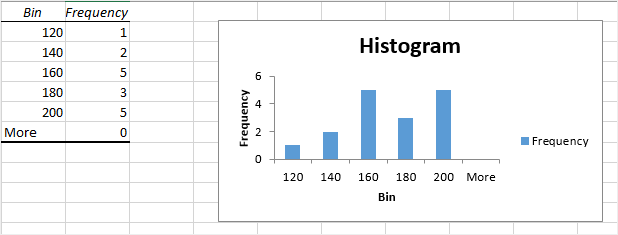
After that, click OK, the histogram will be inserted on the worksheet with the frequency distribution table.
Once you have created a histogram with Data Analysis ToolPak, you can not use Ctrl + Z to revert it. You have to delete the table and the chart manually.
How to Make a Histogram with FREQUENCY Function
Apart from the above 2 methods, you can also create a histogram via using FREQUENCY function. And the histogram will be dynamic, which means when you change the data, the histogram will update accordingly.
Step 1: Input Data & Add Bins
Similarly, you need to input the data into the worksheet and then create the data intervals.
Step 2: Enter the Formula
Before you enter the frequency formula, you need to add a column named Frequency next to the Bins column.
The FREQUENCY formula has the following syntax:
FREQUENCY(data_array, bins_array)
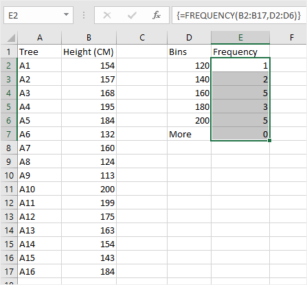
In this example, the data array is B2:B17, bin array is D2:D6, so we get the frequency formula:
=FREQUENCY(B2:B17, D2:D6)
Because the FREQUENCY function is actually an array formula, you need to press Ctrl + Shift + Enter, not just click Enter.
Here are the specific steps to get the frequency result from the dataset:
- Select the cells under the Frequency column, which are E2:E6 in this example.
- Press F2 to get into the edit mode for cell E2.
- Input the FREQUENCY formula.
- Press Ctrl + Shift + Enter to make sure the formula will be entered in cells (E2:E6) with the curly brackets.
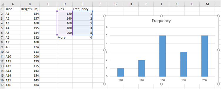
Step 3: Create Your Histogram
If you are not using Excel 2016 or the premium version of Excel, you can’t make a histogram directly with the inbuilt templates. But when you get the frequency numbers from your dataset by using FREQUENCY function, you will be able to create a histogram with a simple column chart.
Note: Because the FREQUENCY function in Excel is an array function, you cannot edit, move, add or delete the individual cells that are included in the formula. When you need to change the number of cells of bins or dataset, you have to delete the existing formula at first, then add or delete the cells, select a new range of cells, and re-input the formula.