How to Make a Line Graph
Create a Line Graph on Edraw.AI Online Free Free Download Free Download Free Download Free DownloadWhat Is a Line Graph?
A line graph, sometimes also referred to as Line Chart, Line Plot, or Curve Plot, is a graphical representation of fluctuation in figures of data that occurred over a certain period of time.
Comprised of X and Y axes, in a line graph, the actual figures are represented with ‘dots’ that are placed where the two axes intersect. These ‘dots’ are then connected with straight lines to make the variation in figures easily readable and more informative.
The key elements of a line graph include:
- Title – A short but self-explanatory name of the line graph to let the viewers know what they’re looking at.
- X-axis – A horizontal line with the figures or numbers incrementing from left to right.
- Y-axis – A vertical line starting from the left end of X-axis, and with the figures or numbers incrementing from bottom to top.
(Note: X-axis and Y-axis are joined to form a shape of a right angle.)
- Markers – The figures placed at consistent distances from each other to represent a static unit, e.g. months, years, number of products sold, etc.
- Labeling – A relevant name given to both the axes, e.g. Duration, Units, etc.
- ‘Dots’ – Mid-sized periods placed at the intersection of X and Y axes to represent the actual figure of the data at a particular time.
- Lines – Used to connect the ‘Dots’ to represent the increment or decrement of values over time.
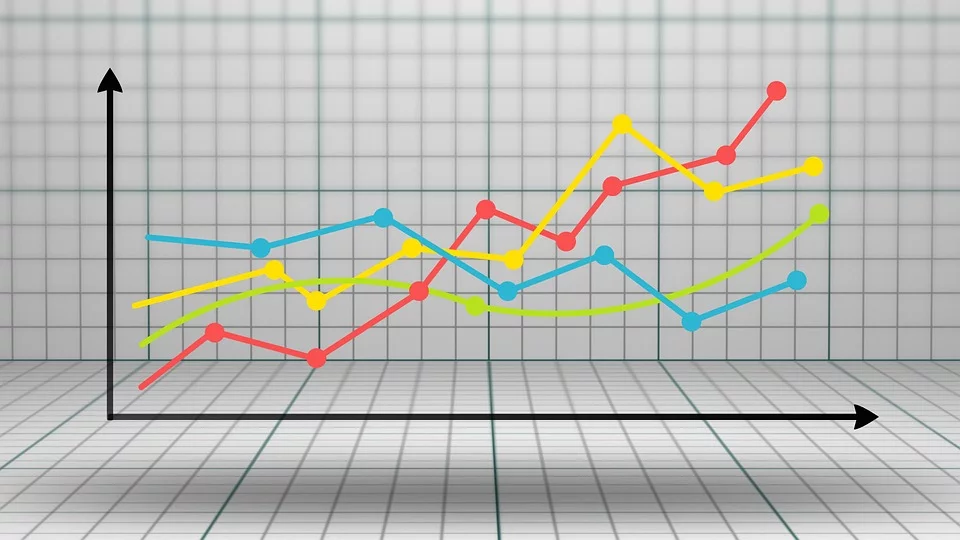
Image Source: Pixabay.com
When to Use Line Graphs?
Depending on the data, a line graph can be used in any situation where the values of the X-axis remain static and the variations or fluctuations in figures are shown in the Y-axis with respect to the X-axis. For instance:
- Number of Cars Sold in the Past 8 Months
- In this example, the X-axis will have 8 markers, each representing a month, and the Y axis will have the markers to represent the number of sold cars. A bulk figure can be set for the cars if the number is huge. For example, a chart cannot have 200,000 marks in Y-axis, and therefore a bulk of 20,000 can be set as 1 unit. With this arrangement, Y-axis will have only 10 markers to work with.
- Number of Students Enrolled for a Course in the Past 12 Months
- Like the previous example, this line graph can also have the X-axis to represent 12 months, and the number of students can be represented (in bulk) through Y-axis. Everything else and the entire concept of the line graph remains identical.
A line graph is helpful when one value remains constant relatively (typically represented through the X-axis), and the second value is variable (typically represented through Y-axis) in co-relation with the first value (X-axis).
How to Make a Line Graph?
EdrawMax Online offers a simple way to make line graphs in merely a few mouse clicks. The steps given below explain how you can draw a line chart using EdrawMax Online:
Launch your favorite web browser and go to https://www.edrawmax.com/online/. If you have already signed up and have saved your credentials in the browser, you will sign in automatically. On the other hand, if you are accessing the portal for the first time, you can create a free account and then sign in before you can make a line graph.
Click Graphs and Charts from the middle pane of the EdrawMax Online page, click Line from the top of the right window that appears next, and click your preferred template from the lower section (Line Chart – Energy for this example).
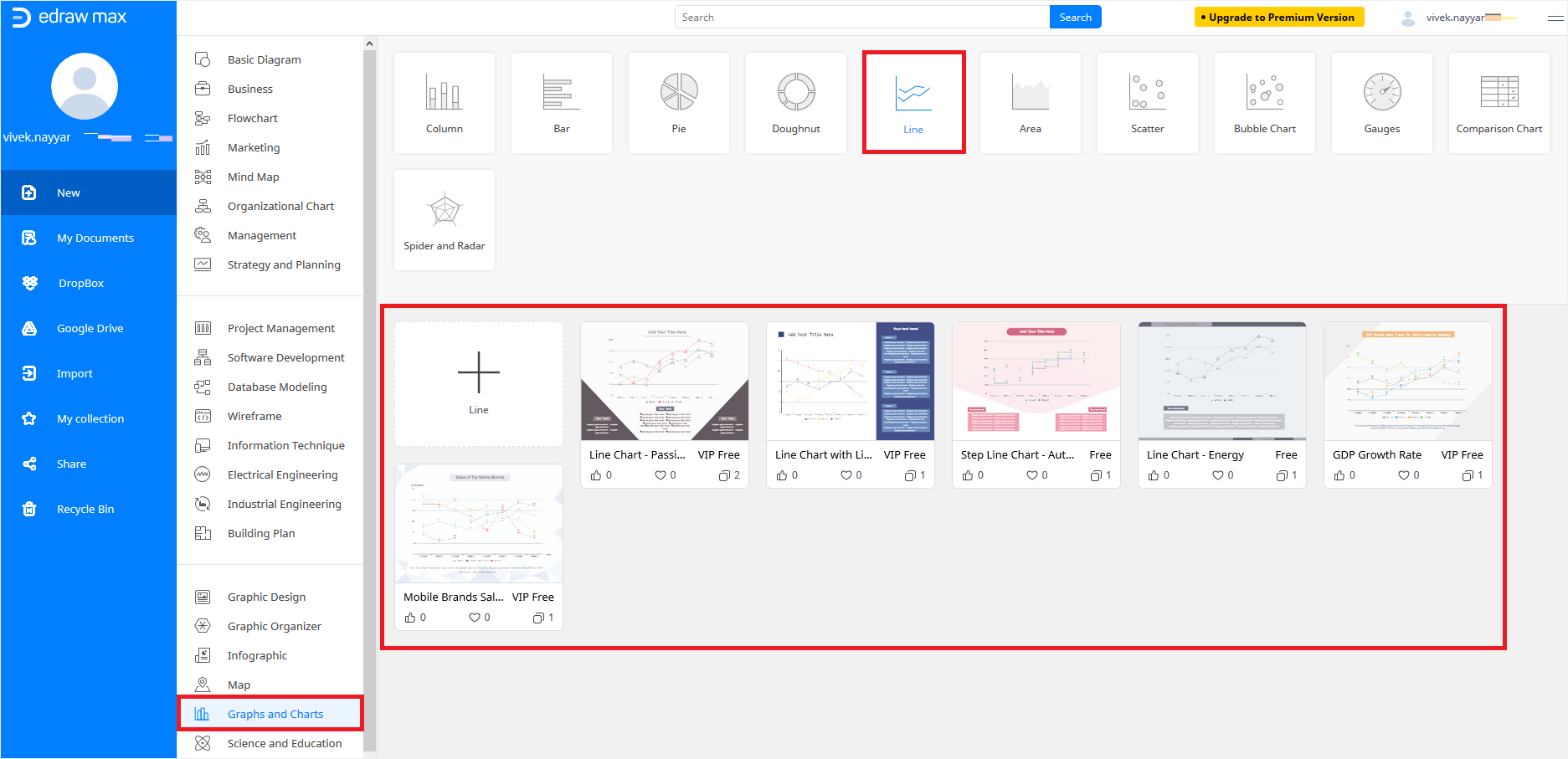
Note: If you are a premium member, you can choose a VIP Free template with a complex line graph, whereas, if you are a free member and still want to make a complex chart, you can click the "+" button and start creating your own from scratch.
Double-click a text box in the line chart template you just imported and type your preferred information as needed. Repeat the process for all the text boxes to make the chart reflect a clear insight of the data you want to show.
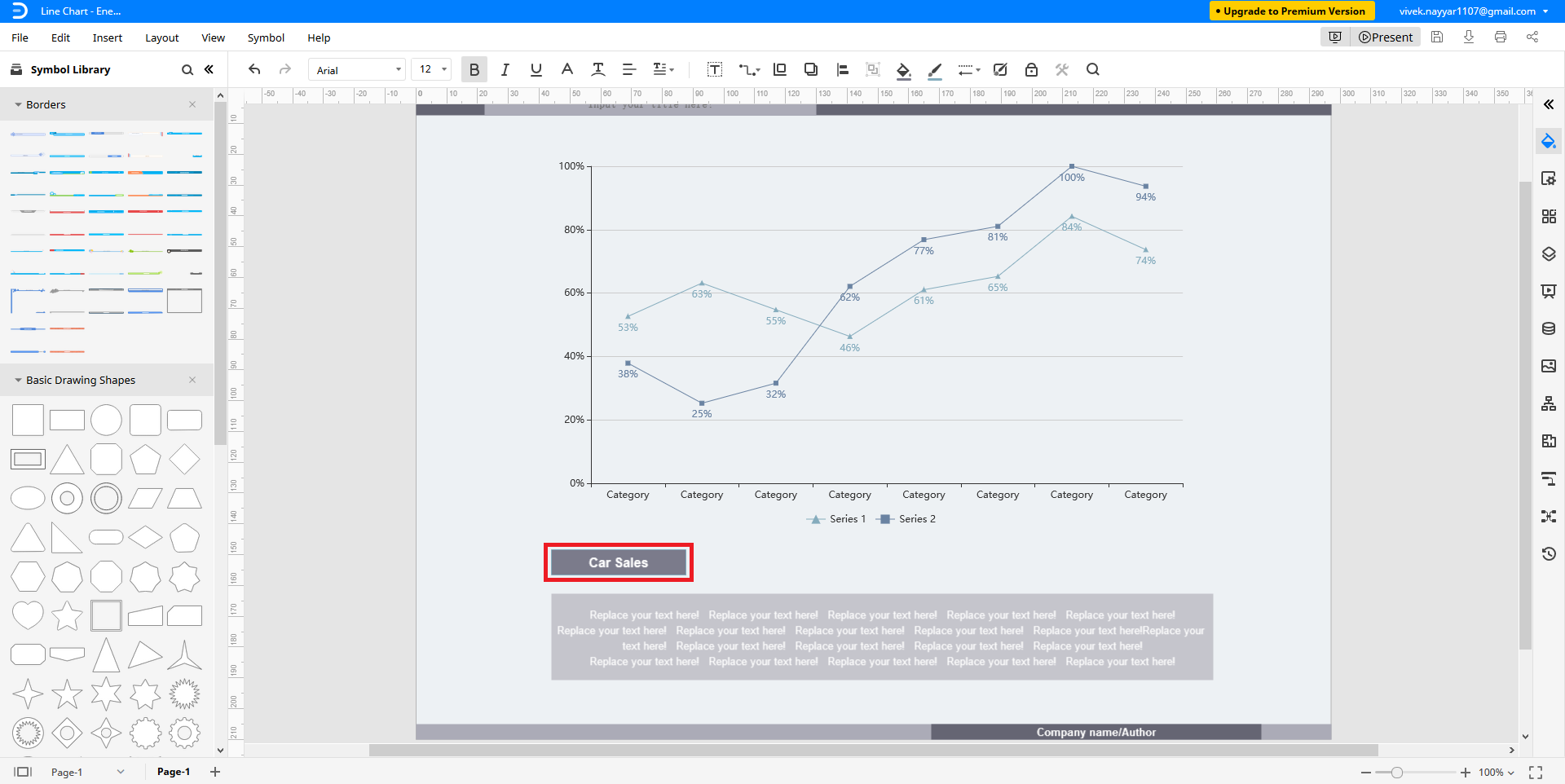
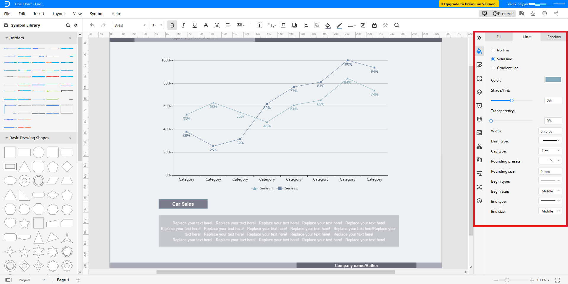
For further modifications or adjustments, you can click the "<<" icon from the top of the toolbar in the right, and choose your preferred tab to modify the attributes as needed.
Editable Line Graph Templates
Below are a few other line graph templates that can be downloaded for free and edited as per your data:
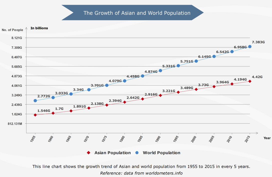
Population Growth Line Chart Template
– This line graph template with pre-built key elements can be labeled as needed to reflect the population growth in a region over a certain period of time.
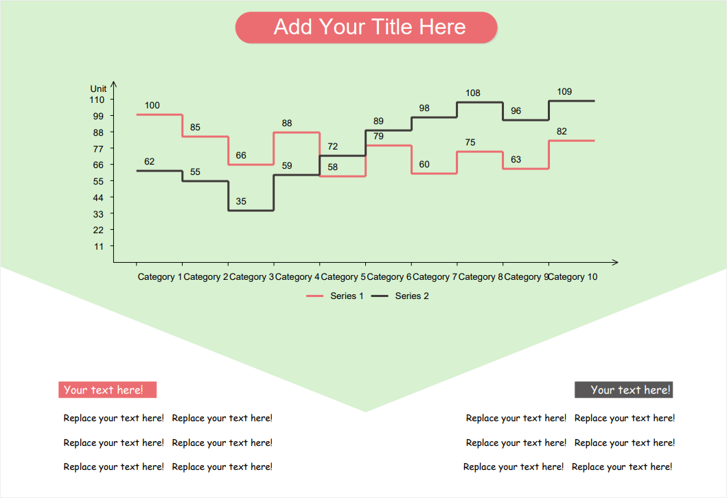
Step Line Chart Template
– This one represents the differences in values between two elements along with their progress over a given period of time.
Depending on the type of data you want to show, the labels and markers of a line chart may have different values. That said, it is always a good idea to have your data in a tabular form before starting off with a line graph.