Free Editable Comparison Infographic Examples
1. What Is Comparison Infographic
A comparison infographic is a visual representation using images and text to compare two or more items. These items depend on the topic of your infographic. For example, a student infographic may take two students for comparison. Your sales comparison infographic may be comparing two products for better ROI. Infographics help you visualize information using a combination of text, charts, graphs, and images to clarify the main topic.
2. The comparison infographic examples
We can use comparison infographic examples to understand how useful these artifacts are. Comparison infographics are very effective when your data is complex, and you do not want your audience to get lost and lose focus. As they say, an image is worth a thousand words. Similarly, an infographic has the potential to overcome communication obstacles with a balanced approach towards images and text. Let us review some examples to understand them better.
|
|
|
| Comparison Infographic | Side by Side Comparison Infographic | Comparison Infographic Template |
|
|
|
| Businesses' Comparison Infographic | Comparison Infographic Template Free | Social Media Comparison Infographic |
|
|
|
| Three Comparison Infographic | Cost Comparison Infographic | Comparison Infographic Ideas |
Example 1: Comparison Infographic
This comparison infographic example compares two transport modes, i.e., car and bus. You can see the potential of a comparison infographic compared to a simple text-based comparison. It uses symbols, icons, images, clipart, thumbs up and down. This visual description of the comparison is way clearer and more interesting. You can use the same example for other comparisons with different entities.
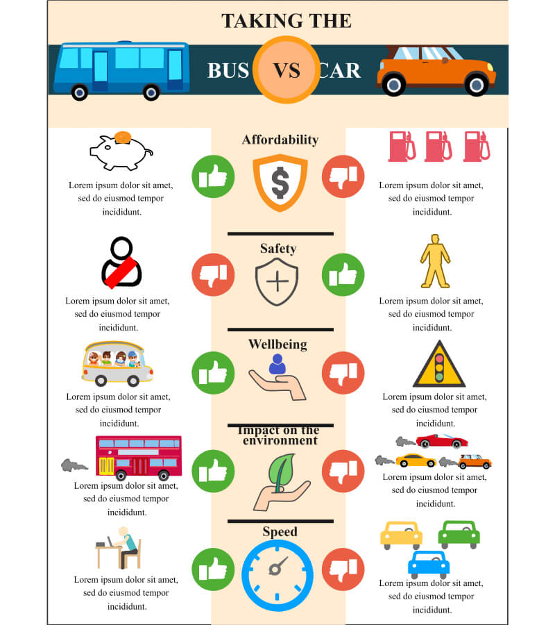
Click on the image to edit. Source: EdrawMax Online
Example 2: Side by Side Comparison Infographic
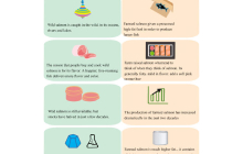
Side by side comparison infographic uses the table-like format for showing the different features of wild salmon and farm salmon. This infographic converts a simple table format into an infographic by adding images. It is clear, interesting yet it delivers complete information in a single look.
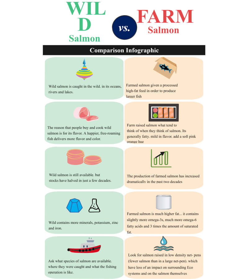
Click on the image to edit. Source: EdrawMax Online
Example 3: Comparison Infographic Template
Comparison infographic template shows the comparison of PPC and SEO. It starts with the definition of PPC and SEO. Then the next section is about the advantages of PPC and SEO, followed by the disadvantages. You can see how dividing the infographic into more sections allows more readability and makes it clearer without losing the audience's interest.
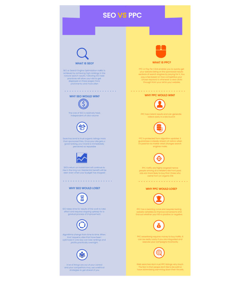
Click on the image to edit. Source: EdrawMax Online
Example 4: Businesses' Comparison Infographic
This is a business infographic. This can be used to compare two businesses in various aspects. The first section can be used to describe the nature of the businesses. The next section has two sections, each section has progressive circle charts that can be used to show each company percentage increase in, revenue, customers, profits, etc. This will help compare businesses in different facets to evaluate their overall efficiency and effectiveness in carrying out their operations. The next section can be used to compare the number of different products or services sold by each business and to draw a conclusion. It has a bar chart that can be used for plotting items sold. This infographic layout and charts are perfect for comparison. It packs a lot of data in a visually appealing way without looking stuffed with data. This infographic can be used by businesses to show a comparison of businesses in different aspects.
Click on the image to edit. Source: EdrawMax Online
Example 5: Comparison Infographic Template Free
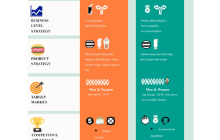
Comparison infographic template is suitable for comparing two products, stores, or businesses based on their business-level strategy, product strategy, target market, competitive advantage, and market share. However, the examples show the comparison between two fast-food chains. However, you can use this template to study the business mechanisms and strategies of different companies and use them to your advantage. Alternatively, business analysts also use this infographic to study and compare their strategies with their competitors.
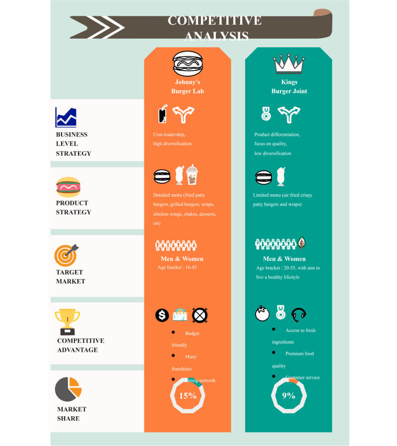
Click on the image to edit. Source: EdrawMax Online
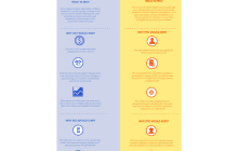
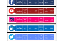
Example 6: Social Media Comparison Infographic
Now here comes a very detailed and intensive example of social media comparison infographic. It has many dimensions, and it compares various social media platforms based on different attributes. This example uses demographics, active users, frequency, format, etc., as the basis of comparison. However, you can use any other basis according to your requirements.
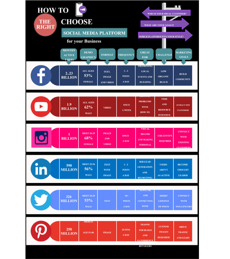
Click on the image to edit. Source: EdrawMax Online
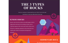
Example 7: Three Comparison Infographic
Three comparison infographics are unique because they don't compare entities side by side. This example compares three rocks by placing their descriptions one by one. It uses bright colors, graphics, and text to make these infographics eye-catching and interesting. The use of bright colors is a way to capture the audience's attention.
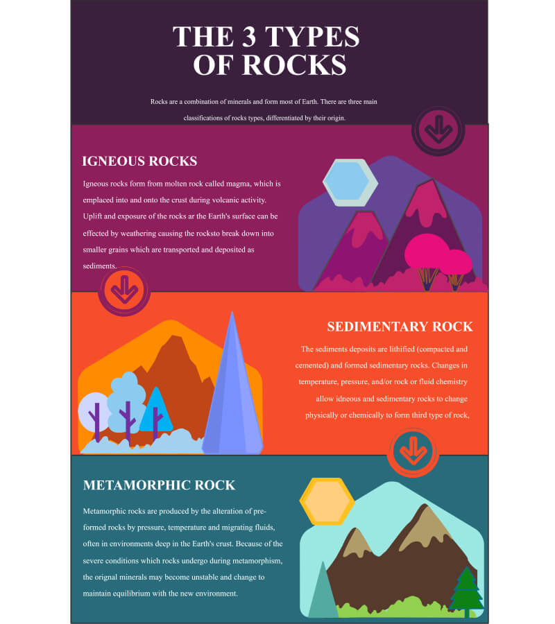
Click on the image to edit. Source: EdrawMax Online
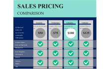
Example 8: Cost Comparison Infographic
The cost comparison is an essential part of business analysis and competitor comparison. Also, people use them to understand different products and versions too. This cost comparison infographic template compares different versions of a software program. You can use this template for comparing products or versions of products you are planning to buy. Some websites also show these comparison charts for product reviews.
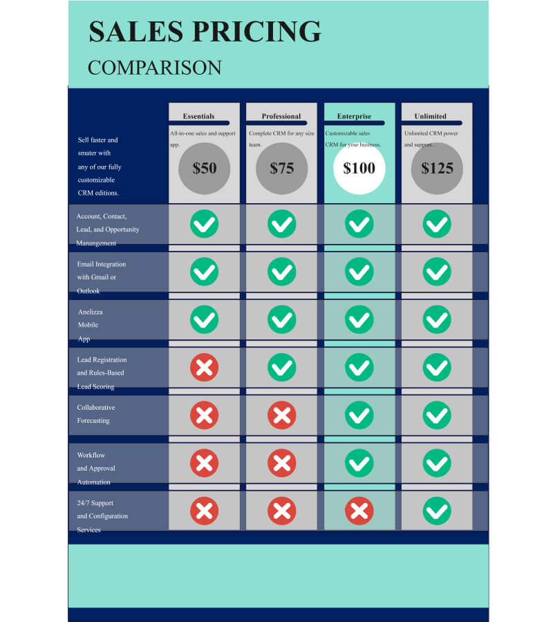
Click on the image to edit. Source: EdrawMax Online
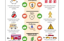
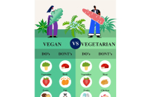
Example 9: Comparison Infographic Ideas
This comparison infographic ideas template shows the do and don'ts for vegans and vegetarians. It is an image-based infographic, and you can see how only images can communicate the message very easily and make the display very interesting and attention-worthy.
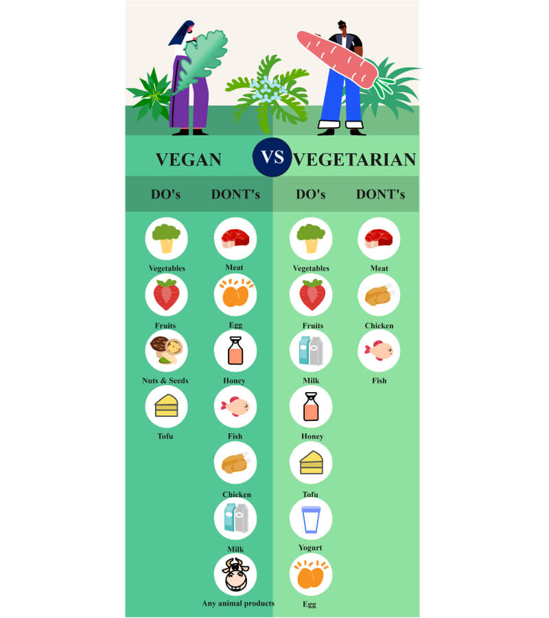
Click on the image to edit. Source: EdrawMax Online
3. How to Design a Comparison Infographic
Designing an infographic can be tricky because there are many factors to understand, such as the text to image ratio, the dimensions, the aspect ratio, orientation, and the information to add. So, along with strong analysis, you also need a tool that has the right tools to make your comparison infographic development journey easier.
We recommend EdrawMax because it is very easy to use with almost zero learning curve, has toolboxes for all sorts of customizations, and has a very well-stocked symbol library for almost all types of diagrams. EdrawMax stands out among others is a comprehensive templates library with samples for various diagrams. They give you a quick start, and you just need to add your data to complete your work. Let us review the steps involved in designing a comparison infographic.
Step 1: Analysis Phase
Analysis and brainstorming is the first step towards designing a successful comparison infographic. At the end of your analysis phase, the outcomes you need are a clear understanding of the goal and audience of your infographic. You need to know the audience so that all the information is according to their understanding level. Secondly, the goal description is critical so that your work follows a certain intent and scope.
Step 2: Contents of your comparison infographic
When you know the goal and audience of the infographic, you need the data and information that you will include in your diagram. In a comparison infographic, you need the entities you need to compare and the parameters, features, or statistics regarding these entities.
Step 3: Plan the infographic details
The footer of your infographic. Also, decide the aspect ratio, the dimensions, file type, and the distribution method to optimize your work accordingly. The next step is to decide the layout, placement of graphics and text elements, color theme, and title.
Step 4: Pick a template
EdrawMax infographic maker is a comprehensive infographic maker software with various templates available for free download and customization. You can find many comparison infographics in the templates library. Pick a template that closely matches your requirements and the focus of your infographic. Since these templates are designer-made, they follow industry best standards; hence you can be sure that your infographic is fully optimized for displays and presentations.
Step 5: Customize
Templates give a quick start and a strong foundation for your comparison infographic. It means most of your design work is already done; you can simply add or remove a few items while fixing your data into the template. You can also play up with text formats, font colors and sizes, images, clipart, and symbols to satisfy your creative cravings.
Step 6: Download, export, share or embed your infographic
Download your completed comparison infographic and export your work in multiple graphics or other formats like pdf, ppt, jpeg, gif, doc, etc., for platform-independent access and distribution. EdrawMax also has social media sharing and printing options.
4. Online Infographic maker
As we already discussed, designing infographics can be tricky because of the multifold dimensions with several visuals and representations. EdrawMax is an online infographic maker that has proved its worth in infographics designing. It has a very easy drag-and-drop layout, so you pick a chart, graph, placeholder, or symbol from the toolbar and drop it on canvas. Then, auto alignments and intelligent adjustments help you format your diagram easily. You can pick a premade template and put it in your data to create a stunning piece of work. It takes a few minutes to create your comparison infographic in the EdrawMax.
5. Key Takeaways
comparison infographics are a great tool for understanding the differences and similarities between two or more entities. It is a visual representation of the comparison that makes it more interesting and easier to understand. However, infographics can be challenging to design, so EdrawMax comes to the rescue with its drag and drop features, images, text toolkits, variety of designer-made templates, and great sharing and distribution options.