How to Make A Histogram in Google Sheets
A histogram is a graphical representation of the distribution of a desired data set. This is mainly used in areas that require a strong application of statistical analysis. How to make histogram in Google sheets is frequently asked, since it is somehow difficult for people to make histograms.
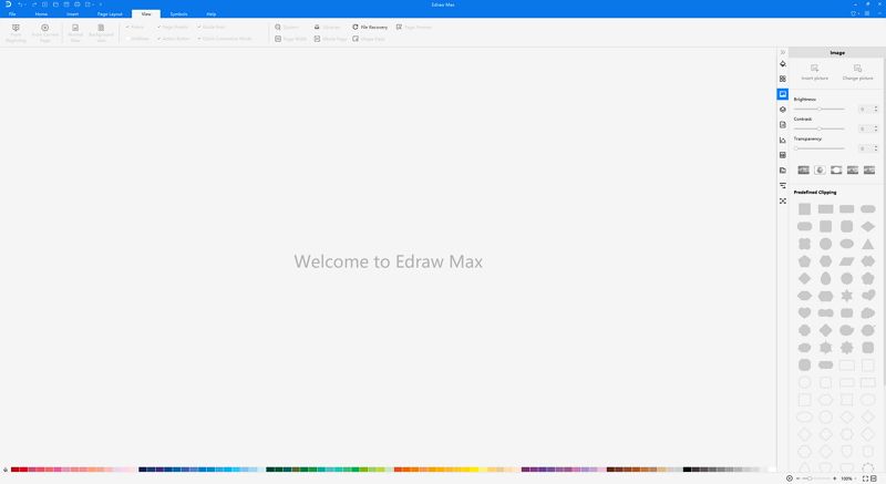
However,EdrawMax allows you to create histogram with minimal efforts.
1. What is Histogram?
A histogram is a kind of chart which represents how the data is distributed and their relationships. Also, it shows how values fall into each categories.
Indeed, histogram is perfect for showing the data and its relationship intuitively, which could save much more time for analyzing complex data. As for its usage, it contains several usages as below:
- Identifying and projecting outcomes
A histogram makes the identification of final outcomes to become more apparent. By filling in the final data and generating a histogram, you can develop an accurate estimate before proper and deeper analysis. However, this could result in slightly flawed results in the case of a wide range of data or improper arrangement of data;
- Identifying data symmetry
Sometimes, you will spot trends that lean in two directions simultaneously. A histogram can make it very easy to identify those occurrences and know when your processes are prone to producing symmetrical results in some circumstances. Occasionally, this can prove very useful for optimizing certain types of processes. On the other hand, it can also help you identify possible issues, as sometimes symmetry is not what you expect to see in your results;
- Spotting variations in the flow of data
When deriving results from a histogram, it is very easy to spot deviations in data from anticipated results. When the data is well arranged, one can easily identify results and thus adjust accordingly to meet desired outcomes. Thus this will lead to the desired results and work towards the desired outcomes;
- Spotting areas that require little effort
Making work easier is the primary function of a histogram. This can be achieved as it can help you determine the desired trends and whether the efforts being put in the various activities will result in the desired results. This will thus enable you put effort into the desired places. By looking at how your resources are allocated, you can rearrange this to get an optimal distribution.

2. How to Make A Histogram in Google Sheet?
There are 5 steps that involved in the process of making a histogram in Google sheet:
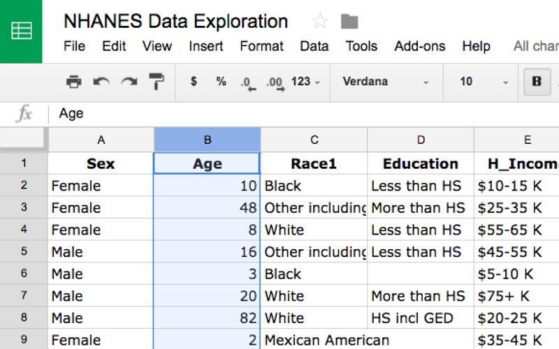
(1). Start Google Sheets with the data you intend to create a histogram for and select the column “Age” by clicking on the column letter above it;
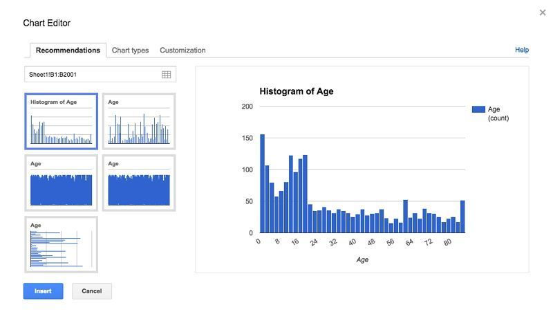
(2). Next, click on the chart icon  on the upper menu. A Chart Editor dialog box will appear. Since the column for Age contains continuous numerical data, Google Sheets will automatically recommend a histogram as the first option;
(3). Click on the Insert button on the bottom left of the dialog box to insert the histogram into your Google sheet so that you can edit it. You’ll first want to decide how wide you’d like the bins to be;
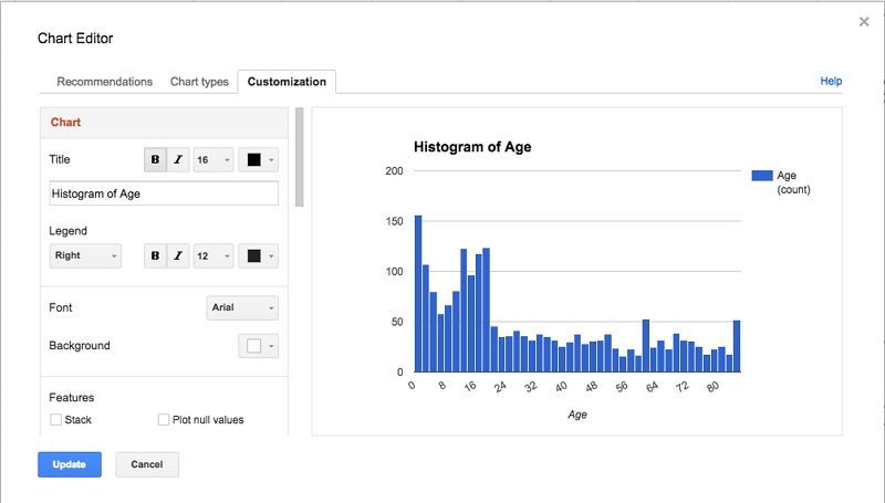
(4). On the inserted histogram, you will see a small downward-pointing triangle on the top right corner of the histogram. Click on that, and then choose the first option, "Advanced Edit" to customize histogram as your preference;
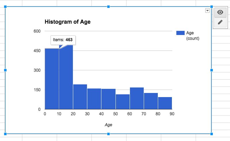
(5). Now you can use the histogram to get numbers for each bin. You can hover your mouse cursor over each bin, and it will show you how many items there are. Here, we have 463 people whose ages are between 0 to 10.
3. The Easier Way to Make Histogram with Edraw Max
By using Edraw Max, it is far easier to create histograms and other diagrams within minutes. With the knowledge on how to make histogram in google sheets, a simpler option is available. This is how to make a histogram in Edraw Max.
(1). Login or Sign Up
Compared with Google sheets, Edraw Max is the simplest method to draw histograms. Firstly, sign up the Edraw Max online with your Gmail or social media account;
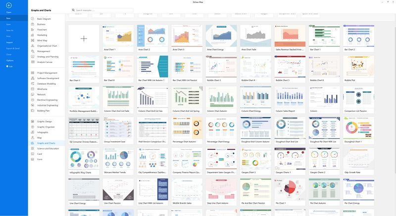
(2). Start Your Creation
Simply choose a histogram template form templates gallery, there are substantial examples and templates professionally designed for non-designers. Or, insert your data then your histogram could be generated aromatically;
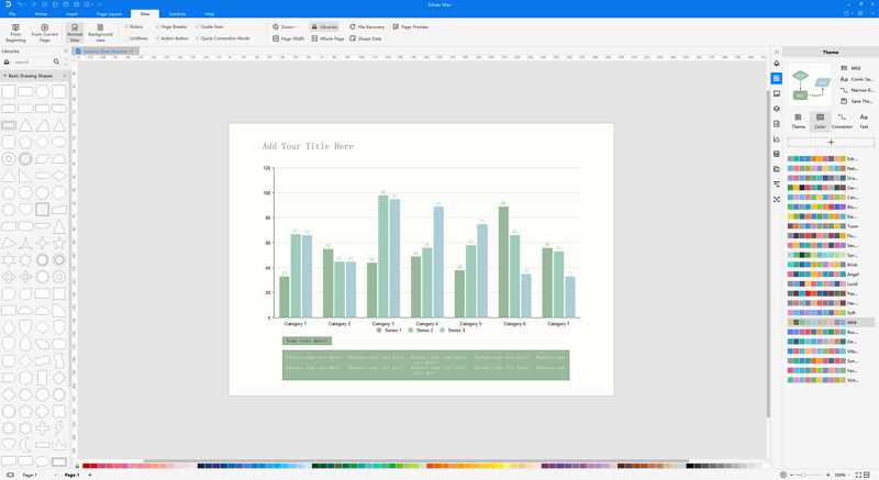
(3). Customize Every Detail
After choosing one histogram or creating one, you can customize every detail as per your needs. There are multiple color palette, fonts, shapes and styles are designed for you specially;
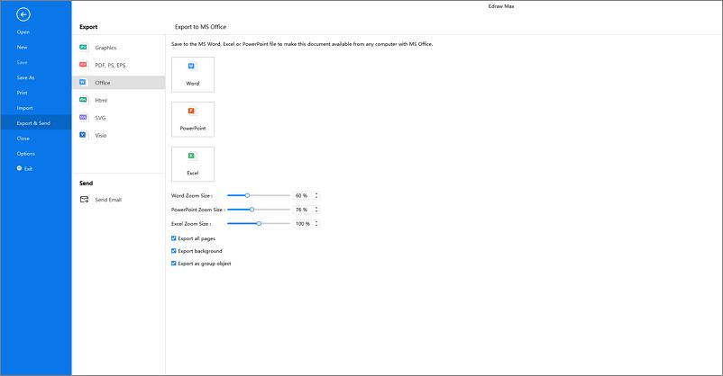
(4). Export, Share and Print
Once finished your creation, you can export your work in many formats, like Graphics, PS, Visio, Office, PDF and etc. Furthermore, you can share it to your friends on social media or just print it for displaying directly.
4. Why Choose Edraw Max?
Edraw Max enjoys advanced features that enables you to make creation of histograms in less time, as well as ensure your whole user experience could be smooth and pleasant. Considering its features, they are shown in following:
- Substantial Templates: it has a wide range of templates to choose from in templates gallery, which means there is no need to create complicated diagram from start that could take much of your time. Just one click, your work is almost done;
- Data Visualization: by using Edraw Max, your data could be easily visualized, sometimes one diagram is more powerful than thousands of words;
- Powerful Function: it allows to create more than histogram, but 280+ types of diagrams. Plus, there are more than 6000 symbols and icons professionally designed for customize your diagrams more artful;
- Export Formats: it not only supports to export file in regular formats, like Microsoft Office, Graphics; but also allows to export Visio, Ps, PDF files;
- Reasonable Price: compared to other diagramming tools, Edraw Max is far more affordable, which ensures you get the best services at your most convenience.
5. Key Takeaways
Histogram is a kind of chart which shows the data in the sheets effectively. An eye-catching histogram could improve your presentation quality, enhance your report and make your audience catch you easily. How to make a histogram in Google sheet must be the frequent question that people asked. However, Edraw Max is an online quick-start histogram tool which enables you to create histogram in three minutes when compared with Google Sheet, so there is no reason why not choose Edraw Max for your creation of histogram!


