Free Editable Line Graph Examples
We use line graphs to illustrate changes in data over a period. When you write a report or make a presentation that includes tracking small data changes, line graphs can visualize your information better than bar graphs. It also helps you to make a comparison of different data sets for the same time period. From the examples down here, you can learn about the uses and types of a line graph.
1. What Is Line Graph
A line graph uses lines to connect data points at a specified time interval to illustrate and compare changes in data over long or short time periods. Line charts are commonly used in finance as it deals with changes in services prices, and most companies use line charts to create their revenue sheets. You can also use line graphs to track growth over time and do various technical analyses that involve continual testing. It connects individual data points using a straight line to determine their relationship. Check out our line graph examples for a better insight.
2. Line Graph Examples
There are various layouts of line graphs. Before creating your chart, make sure you use the format suitable to your presentation or report. Line graphs compare data sets and visualize data trends even for small-time intervals that help predict data results. We create a line graph so that the independent data is at the chart's x-axis so that it is easy to depict data trends. You can create a line graph with only two data points if you want. This type of graph is also called a slope chart. Below are some of the most used line graph examples. Would you mind looking at each instance before you pick your ideal format?
|
|
|
| Line Graph | Number Line Graph | Line Plot Graph |
|
|
|
| Line Graph Example | Line Graph Template | Stacked Line Chart |
|
|
|
| Double Line Graph | Straight Line Graph | Horizontal Line Graph |
Example 1: Line Graph
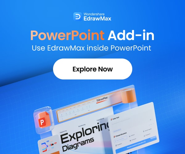
This is an example of a simple line graph comparing three data sets in a single chart. It is a graph of the change of sales of three products. There are three lines in the diagram depicting the sales trend for a specific time period. Sales for products one and two are gradually going up, but product three that started as the most selling product, is now unpopular for consumers. You can easily track data trends as you can see the lines moving up and down to represent the sales of products.
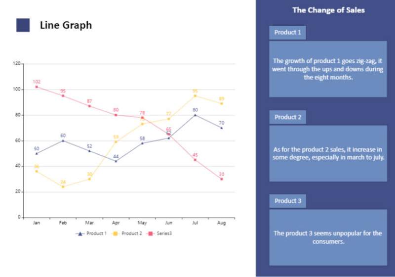
Source:EdrawMax Online
Example 2: Number Line Graph
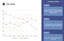
Line charts are mainly used to track changes in data trends for both small- and large-time intervals. The chart in the example is a number line graph that depicts the proportion of the aged population in developed countries. Number line charts are best when you are comparing numeric data sets. The diagram uses colored lines to represent each country, and you can see the name of countries next to the colors that represent them in the graph. No individual points are visible, and you can only see the line in the chart.
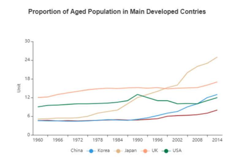
Source:EdrawMax Online
Example 3: Line Plot Graph
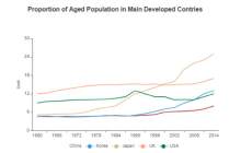
This is an example of a line plot graph. It is the type of line graph that uses scatter plots to denote individual points in the graph. The chart in the example illustrates the wildlife population of three animal species. We got the population number at the y-axis and the year of data recorded at the -x-axis. The reader can quickly get the general idea of which animal species is in danger of extinction. The population of bears is gradually going up, whales are also not an endangered species, but the population of dolphins is declining quickly.
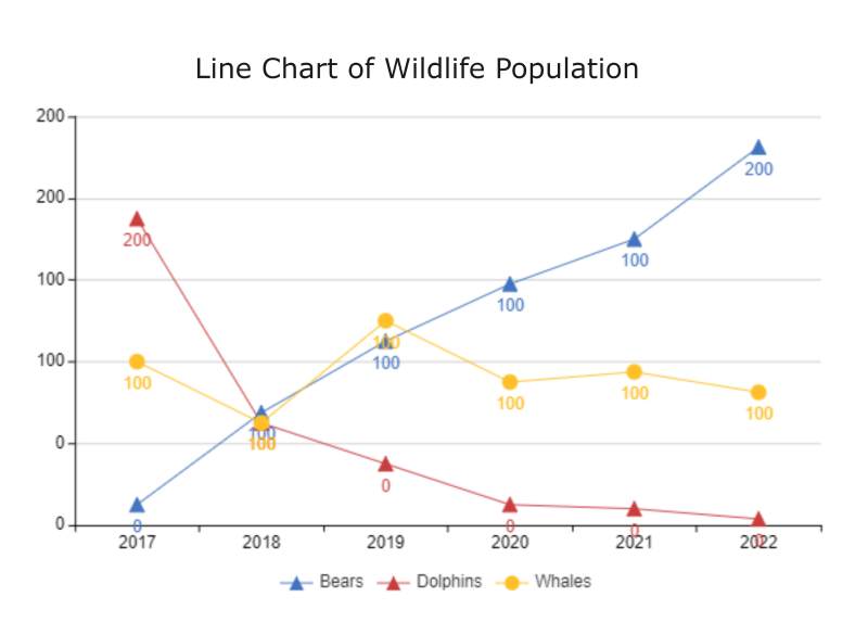
Source:EdrawMax Online
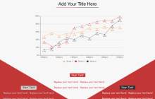
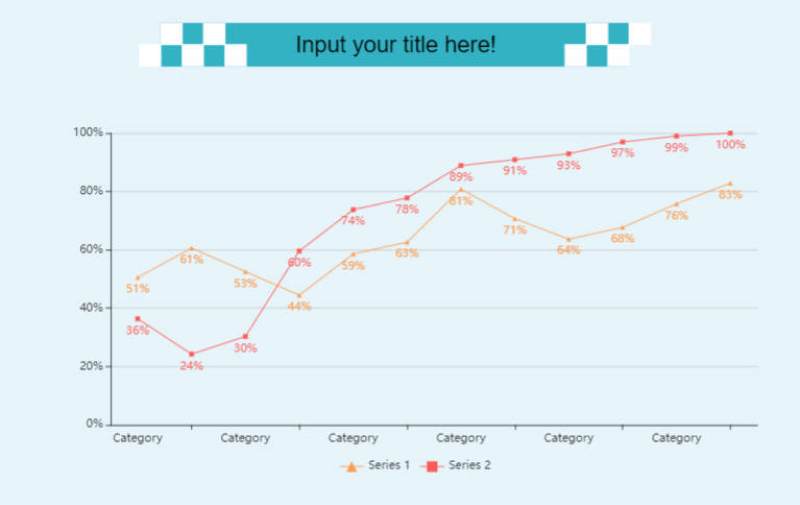
Example 4: Line Graph Example
This is a three-point line graph example that you can use to illustrate data changes based on a specific time period for three different data sets. This is an ideal format if you don't want to complicate your graph by adding more than two data sets. Represent each line with a different color to simplify things. Label the chart inside and outside to make it easy to understand for the reader. Add text to provide more details about your chart and data set. Make sure not to plot two individual points from different data sets at the same place in the chart.
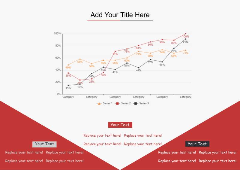
Source:EdrawMax Online
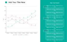
Example 5: Line Graph Template
This is an example of a clean line graph template. You can use this type of graph in your presentations where you want the audience to get the general idea of your work at a single glance. The layout of this template is simple. On the left side, we got the line chart diagram, and on the right side, we got labels and details about the components of the graph. You don't have to spend much time creating a chart with such a template, and go to EdrawMax and customize it. Templates help out a lot when you don't have much time to make a presentation.
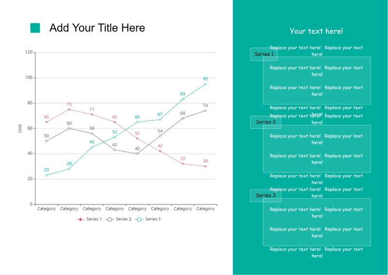
Source:EdrawMax Online
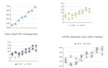
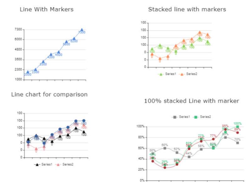
Example 6: Stacked Line Chart
This is an example of a stacked line chart and other line charts. There are four graphs in the sample. The first is a simple line chart that illustrates the data trends of one data set. The second one is the stacked line chart, in which you can use two visualize two data sets, but you know for sure that their lines will not cross each other in the graph. The third chart is a simple comparison graph for two data sets.
Source:EdrawMax Online
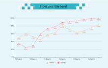
Example 7: Double Line Graph
This is an example of a double-line graph, and it illustrates data trends of two data sets in a single chart. When you know how to create a simple line graph, making one of these is also easy. You have to depict a data set first by using a single line. After that, you can show the second data set using its coordinates and the time period you used for the first data set. Don't worry if the lines cross each other unless you make a stacked line graph.
Source:EdrawMax Online
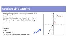
Example 8: Straight Line Graph
This is an example of a straight-line graph. It represents a linear function in mathematics. We use this graph to know that the data trend is changing at a constant rate for a continual period. A straight-line graph can move in any direction, diagonally going upwards or downwards. When predicting data trends, a straight-line graph is the most reliable tool. You can easily create it like a line graph with only one data set, and you can also use it to compare two straight-line data sets.
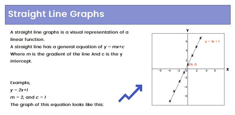
Source:EdrawMax Online
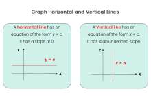
Example 9: Horizontal Line Graph
A horizontal line graph is similar to a straight-line graph, but it only moves in a straight direction parallel to the x-axis. You can see two graphs in the example. The first is a horizontal line chart, which illustrates a function with zero slopes. The second one is a vertical line graph. It is similar to a horizontal line graph, and the only difference is that its line moves parallel to the y-axis. You can create both of these in the same way, using the same format when you have data trends with a zero or undefined slope.
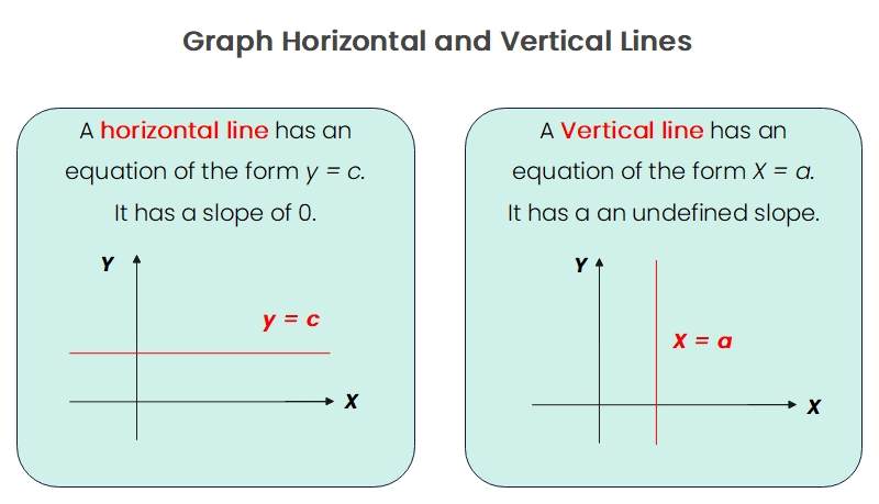
Source:EdrawMax Online
3. Online Line Chart Maker
Suppose you want to create a graph similar to any line graph example listed above, then the first thing you need is an online line chart maker. The general idea behind a line graph is simple and easy to illustrate, but when creating a graph, you can make many small mistakes that can ruin your chart. EdrawMax Online is the best line chart maker. You can find many professional line charts templates in its library, and it also gives you various customization tools to edit your template. With EdrawMax Online, you can create a line graph in no time effortlessly.
4. Key Takeaways
We use line charts to track data trends for a specific time period. It is easy to illustrate the change in data and compare data sets with a line chart. Line graphs are primarily used in finance and sales management, where you have to track small data changes for short time intervals. There are various line charts that you can see in our line graph examples listed above. With EdrawMax Online, you can get templates in the same format as the given examples, and you can also get various other professional templates. It is the best line chart maker with a comprehensive library of symbols and customization tools. Find more line chart examples in the template community.