How to Make a Bar Graph in Google Sheets
Google Sheets can help people collect and save data in the cloud and visualize data graphically. Besides, your team members, bosses, partners can have easy access to the spreadsheets. Thus, today, we will teach you how to make a bar graph or bar chart in Google Sheets.
How to Make a Bar Graph in Google Sheets
It’s easy to create a bar graph with your data in Google Sheets. Here’re the instructions and you can just follow these steps. First of all, you need to have a Google account. If not, you can create one.
1. Open a new Google Spreadsheet on your browser and input your data into it, or open a Google document that contains your data.
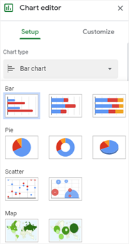
2. Select your data with labels and choose Insert > Chart to trigger Chart editor.
3. Find Bar Chart on the drop-down menu of Chart Type, select the pie chart that you want to use and the chart will appear on the spreadsheet. Generally, you can change chart types in the same way.
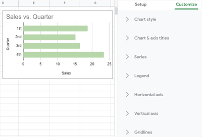
4. Go to the Customize tab and you are able to change chart styles, bar colors, label formats, legend positions or add gridlines with the editing options on the pane.
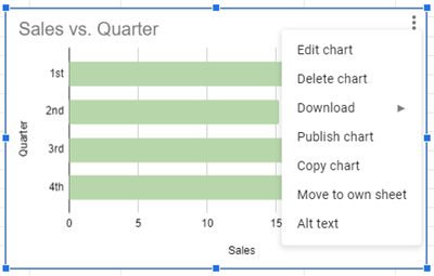
5. Click the bar chart, select Edit Chart on the menu to return to Chart editor.
How to Make a Bar Graph in EdrawMax
As a web-based diagramming tool, EdrawMax Online is also capable of making eye-catching and professional bar graphs. If you are interested in trying something new or different, we hope you could spend extra minutes reading the tutorial below, and you may give our EdrawMax Online a try.
To draw a bar chart only with your data, you can just follow the steps directly.
1. Enable EdrawMax Online, click a plus icon on the template gallery and open a new blank page if you haven’t used EdrawMax
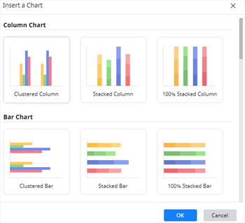
2. Navigate to Insert > Chart, choose Bar Chart in the Insert Chart dialog box and in this case, we select Clustered Bar.
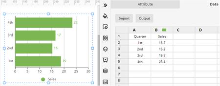
3. Input your data for making the bar chart into the spreadsheet of Chart (Data) pane and the example chart will turn into the bar chart that you want.
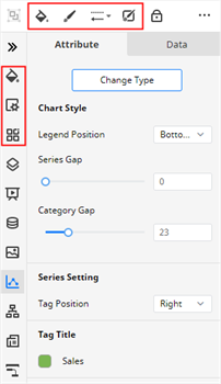
4. Find the editing and formatting options in Chart (Attribute) pane, Fill/Line/Shadow pane, Page Setup pane, Theme pane and the toolbar. With them, you can change chart types, chart styles, data settings, chart colors, etc.
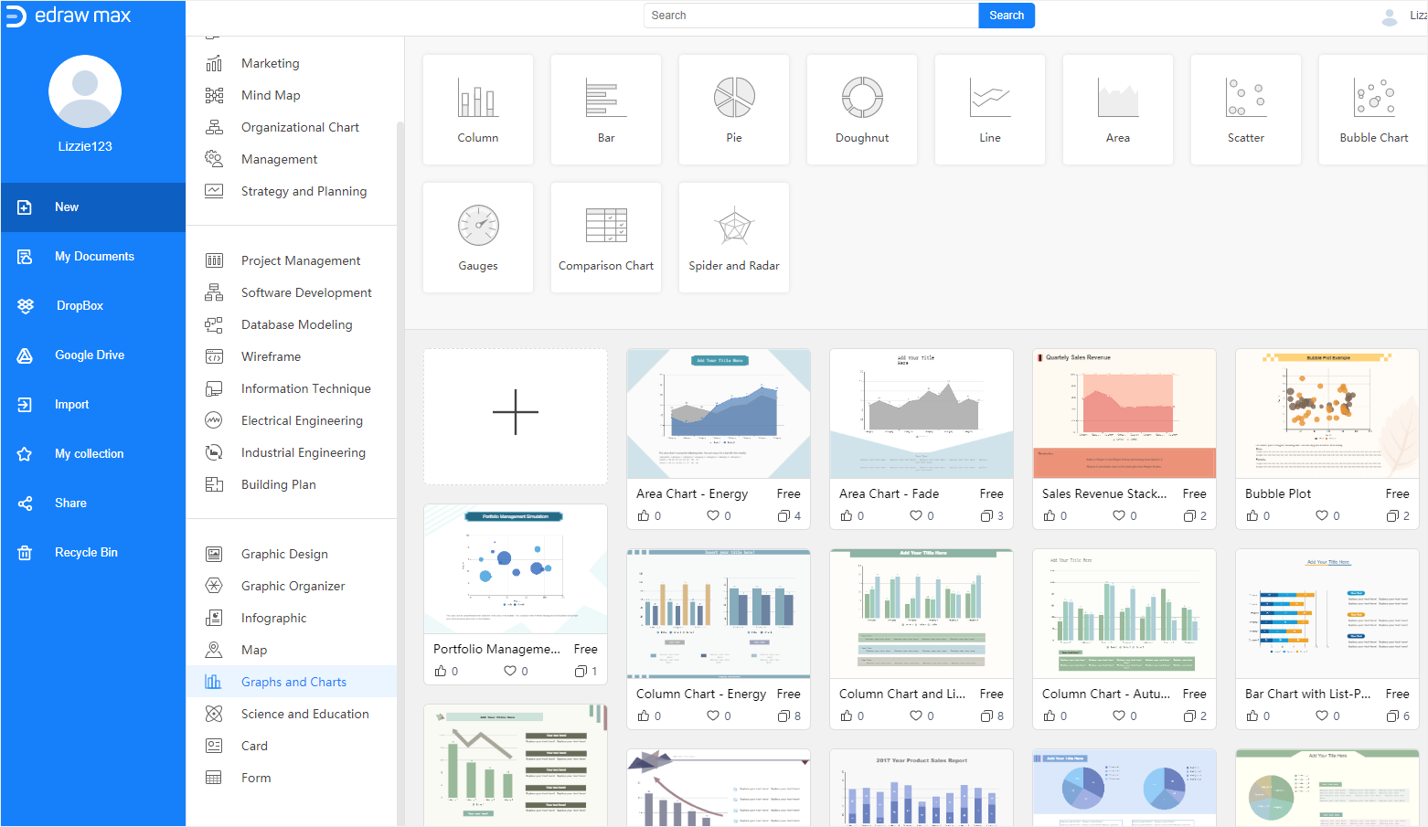
If you want to make your bar chart look more vivid and impressive in your presentation, using an Edraw bar chart template will be a good choice.
1. Pick a bar graph template that you want to use and click on the thumbnail to open the template.
2. Then input the data in the same way and add analysis results on the text boxes. Similarly, you can customize the bar chart and the whole page with those editing and formatting tools mentioned above until it turns into what you want.
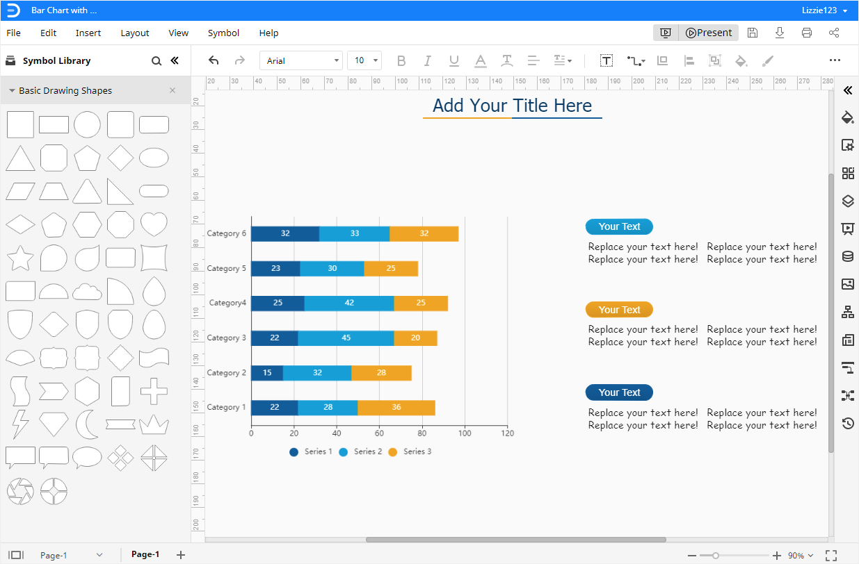
3. More importantly, you can click the Play button on the upper right corner to present the current page in the full-screen mode so that it’s easy for you to check out how the bar chart looks like in a presentation.
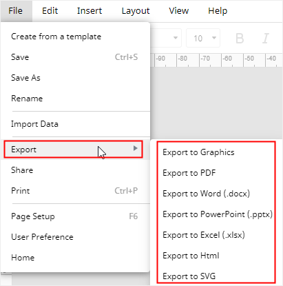
How to Export Edraw Charts as Common Files
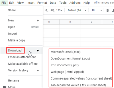
When your bar graph is done in Google Sheets, you can click the Download button under the Insert tab and select to save the spreadsheet as a Microsoft Excel file on your computer.
Moreover, EdrawMax also supports users to export the documents in several common formats or save them in Google Drive and Dropbox. So once you make a bar chart in EdrawMax, you will have many ways to share, save and access your chart.
Sign up for EdrawMax Online and try it for free!