How to Make a Bubble Chart in Tableau
1. How to Make a Bubble Chart in Tableau
A bubble chart is a two-dimensional graph where plotted discs graphically represent data. The plotted discs resemble bubbles, hence the name bubble chart. It combines a scatter plot with a proportional area chart. It's used to visualize and analyze data in 3-4 dimensions.
There are several online software to create bubble charts online, and one such software is Tableau. Here, this step-by-step guide will show you how to make a bubble chart in Tableau.
Step 1: Open the Tableau software
Open Tableau and select one of the Connect options from the right-hand menu. Tableau can open any file type, regardless of format, so you should have no trouble opening yours. Here, as an example, you will look at data from Sample Super-Source.
Step 2: Insert the information
Now choose the data you want from the Dimensions for the row and Measures for the column. On the screen, you'll see a standard bar chart. You can add as many dimensions and measures as you want to create the bubble charts. For columns, we will choose Category from Dimensions and Sale from Measures.
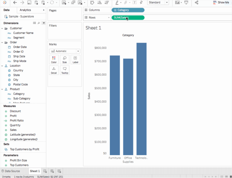
Step 3: Insert the Bubble Chart
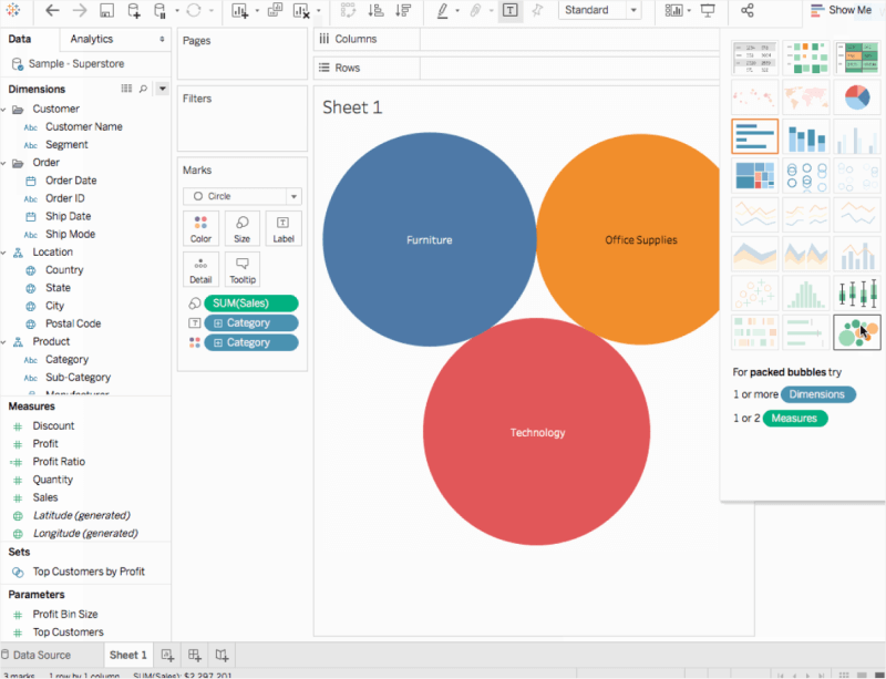
To use a bubble chart instead of a bar chart, go to the Toolbar on the right side of the screen and select "Show Me," then select the "Bubble Chart" icon. Following that, you'll see a Tableau Bubble Chart on the screen.
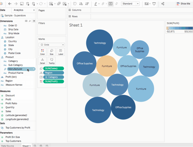
Step 4: Give Personal Touches to Chart
You'll find many editing choices on the left side of the screen. Drag the region onto the details under Marks to add more bubbles to the chart. You can add additional data and information by bringing profits to colors under Marks. Drag the area region to label under Marks to name each bubble in the same way. Go to Show Me and then Format Mark Labels to change the labels.
1.1 The Advantages of Making a Bubble Chart in Tableau
Bubble Chart is used to illustrate the relationship between numerical variables visually. Like Scatter Plot, bubble charts can help understand social, economical, and other scientific relationships. There are a couple of advantages of making a bubble chart in Tableau, like:
- Tableau is one of the most celebrated data visualization tools, which offers several features that help you make a bubble chart or packed bubble chart.
- Tableau can create complex bubble charts without worrying about data loss at any stage.
- If you make a cubble chart with multiple data, then Tableau is well equipped to handle it.
1.2 The Disadvantages of Making a Bubble Chart in Tableau
Bubble Charts help in data visualization, and just like Scatter Plot, we use two-dimensional plots to conclude our findings. There are certain disadvantages of making a bubble chart in Tableau, like:
- Several users have complained of having security issues when it comes to Tableau.
- Tableau is priced by users, making it extremely costly for large organizations.
- If you make a bubble chart in Tableau, you will understand how it focuses primarily on visualization and cannot work with unsorted data.
1.3 Tips for Making a Bubble Chart in Tableau
If you are making a bubble chart in Tableau, you must consider some of the tips mentioned below to achieve the said result:
- Before you start making the bubble chart in Tableau, you should first set up Data Sources.
- When you first start building the Tableau Dashboard, try to be less cluttered with your designs.
- It is always recommended to use a grid layout.
2. How to Make a Bubble Chart Online Easier
There is a tool EdrawMax Online that shorten your time to create a bubble chart online. Also, it contains substantial bubble chart templates in product and template community that you can use immediately and create chart without efforts.
On EdrawMax Online, you can find thousands of readily available templates and design components to create all kinds of diagrams. The best part is that EdrawMax Online can also be accessed online, letting you work seamlessly on any platform. With simple drag and drop options, you can also create visually appealing bubble charts via EdrawMax Online in the following way:
Step 1: Sign In EdrawMax Online
First of all, you need to log in to your EdrawMax Online account. If you haven't used EdrawMax Online before, you can sign up for a free account with your email address. Then you can use EdrawMax Online for free.
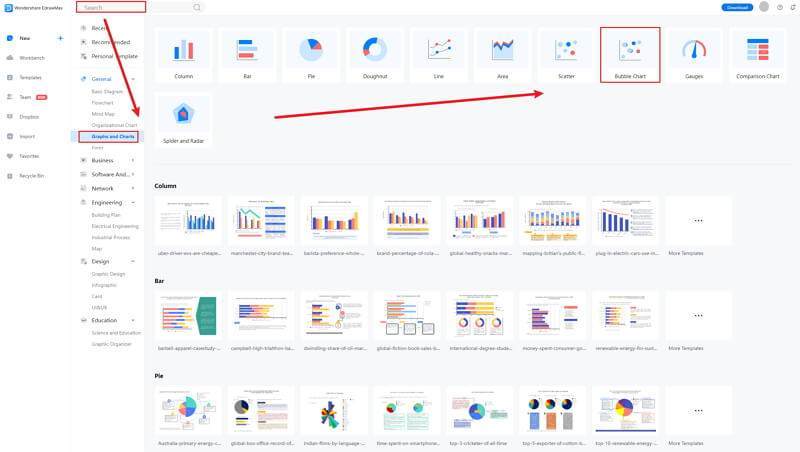
Step 2: Open Bubble Chart
Go to General tab, and find Graphs and Charts to select Bubble Chart. You can use a blank page to create your chart or use a free online template by Edraw. We will use a blank page to create a bubble chart from scratch.
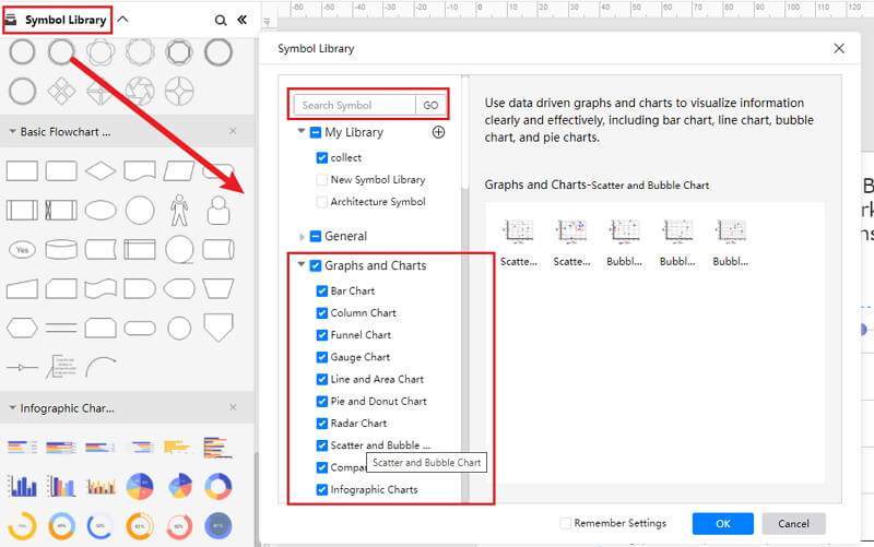
Step 3: Select the Bubble Symbols
Now go to Insert Tab and click on Charts. The Insert a Chart window will appear on your screen. Scroll down to Scatter Chart and select the second option, i.e., Bubble Chart. Now press OK to insert a bubble chart. A bubble chart will be added on your Edraw page.
Click the Symbol Library option on the top left side of the editor window. Next, a dialogue box will open. From the dialogue box, go to the Chart menu. A pop-up menu for chart symbol categories will appear. Or you can search the bubble from the Symbol Library. Then, select this option, it will appear on the left side toolbar.
Also, you can choose to insert your data from your end, and the chart will be made automatically.
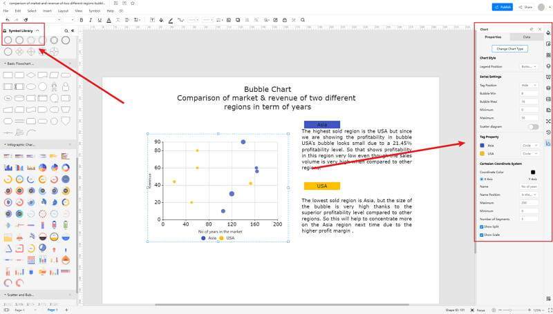
Step 4: Add More Details to Complete Chart
Once the symbols are imported to the editor window, you can drag and drop the six symbols in the editor to create your bubble chart using them. To edit the symbol, click in the boxes and enter your content. Likewise, you can make the boxes more attractive by using the Fill, Line, and Shadow options.
There are many editing options available in EdrawMax Online to make sure your bubble chart is customized according to your needs. You can change the transparency, change, type of fill, as well as add and remove layers.
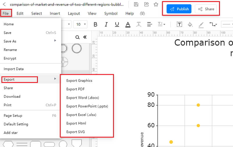
Step 5: Export Bubble Chart as Tableau
Click on File in the top left corner, from the drop-down menu select Export. From the Export menu, select Export to Excel (.exl), and your Edraw bubble chart will be saved as a Tableau file to your computer. You can also export your files to cloud services like Dropbox on EdrawMax Online.
If you are still wondering how to make a bar chart in EdrawMax Online, you can check this bubble chart guide for reference.
2.1 The Advantages of Making Bubble Chart in EdrawMax Online
Compared with PowerPoint, there are many advantages that making bubble charts in EdrawMax Online:
- EdrawMax Online supports to make bubble charts online, and will be automatically saved, which means you could make charts in any where at any time.
- EdrawMax Online has a powerful Template Community, that you can find inspirations from thousands of templates made by Edraw users.
- EdrawMax Online supports to export and import multiple file formats, which ensures that you can make continue your work from other platform to EdrawMax Online, or you can export your bubble chart from EdrawMax Online, and attached to other files.
- Or even you can showoff your bubble charts with others by using Presentation Mode.
2.2 The Disadvantages of Making Bubble Chart in EdrawMax Online
Even though there are some advantages of using EdrawMax Online as the tool to create your bubble chart, certain limitations affect the overall quality of the project. For instance:
- EdrawMax Online contains limited bubble chart related symbols, but you can create your symbols and save them for the use of next time. However, it is good for you to make your own bar graph symbols, you can create symbols from EdrawMax, or you can import the symbols you like and save into your symbol libraries for later use.
2.3 Tips for Making Bubble Chart in EdrawMax Online
Creating bubble charts in EdrawMax Online could be easier thing than making in PowerPoint, since there are resources and powerful export function.
- Choose a built-in template from Template Community to start quickly.
- Use powerful toolbars on the right and left sides of canvas to make your bubble charts more stunning.
- Export your bubble charts in mulitple formats to meet your needs, or share to your social media, email, and print it out.
3. Tableau Bubble Chart Templates
The followings are the bubble charts Tableau templates, you can refer to them, or even use them immediately with ease. Or you can find more bubble chart examples for further reference.
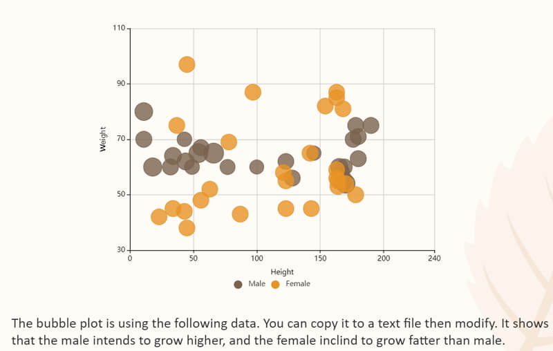
Tableau Bubble Chart Template
A bubble chart is pretty similar to the scatter plot; the only difference here is that instead of plots, we use bubbles and display the data in a three-dimension format. Each entity is used to represent the correlation between numeric data. As you can see from the Bubble Chart example here, we have Height on the X-Axis and Weight on the Y-Axis.
Source:EdrawMax Online
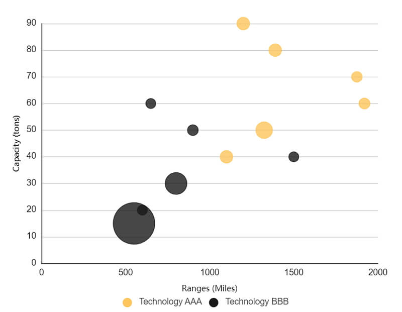
Bubble Chart Excel
Bubble maps are visual representations of data compiled in an organized manner. The following bubble chart a type of chart that displays three dimensions of data. One can make a bubble chart to compare products with different technology.
You can use EdrawMax Online to create similar-looking bubble charts or take inspiration from the free template and create your own using the drag-and-drop feature of this chart maker. With EdrawMax Online, you can create bubble charts that present the data in eye-catching visuals.
Source:EdrawMax Online
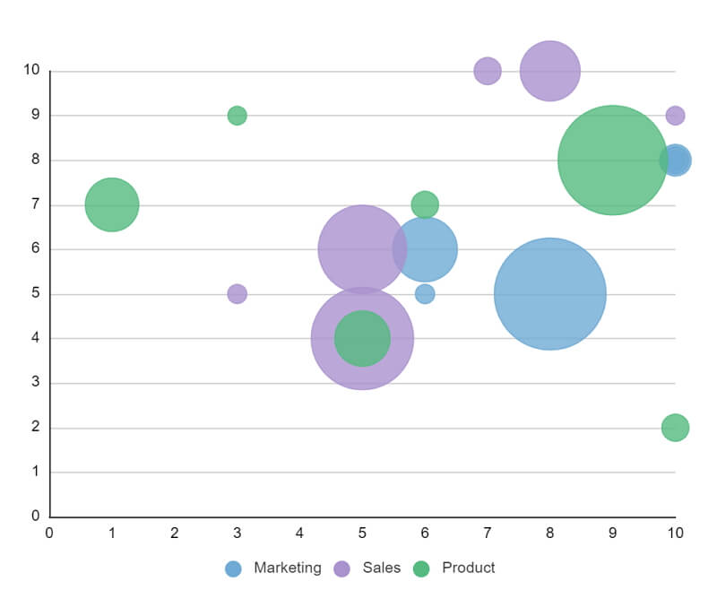
Bubble Chart Template
The following bubble chart is created across three verticals: Marketing, Sales, and Product. As we know, a risk assessment is a process to identify potential hazards and analyze the scenario of what would happen if the said hazard occurs. Several companies create such risk assessment bubble charts to understand the areas that might cause some hazards.
Source: EdrawMax Online
4. EdrawMax Online Features
EdrawMax Online is your go-to tool when it comes to designing charts. Unlike other complicated and complex tools in the market, EdrawMax Online offers full after-sales support and a dedicated team of experts who constantly update the template community. With EdrawMax Online, you can not only create bubble charts but can also easily design PERT charts, SWOT analysis, Funnel Charts, Stacked Bar Charts, and more. Moreover, you can easily combine these charts into one design without formatting.
- There are thousands of design elements in EdrawMax Online that can help you create 280+ different types of diagrams.
- You can also browse its extensive range of templates in EdrawMax Online Template Communityand can readily customize them as per your requirements.
- EdrawMax Online is a free cross-platform tool that you can access on any browser and use without any prior designing experience.
- There are dedicated features to customize your diagrams and export them in numerous formats like PNG, PDF, TIFF, SVG, and more.
EdrawMax Online also lets you export your bubble chart design into multiple formats, making the files highly independent of the platform you are using. If you have used a Linux system to create a bubble chart, you can access the same file in your Apple machine without losing any of the data.
5. Key Takeaways
Tableau is one of the best BI tools, and with strong visualization capabilities, it stands out among other software. However, the tool is complicated, and if you are a beginner, you might find some of the features a little too complex to access. Unlike Tableau, EdrawMax Online is designed and developed for beginners and professionals alike. EdrawMax’s dashboard is similar to Microsoft’s dashboard, giving you a user-friendly feel.
In addition to this, EdrawMax Online is quite affordable compared to Tableau or other segment tools. Moreover, unlike Tableau, where you can only make a certain set of diagrams, EdrawMax Online lets you create over 280 types of different diagrams.