How to create a Doughnut Chart in Tableau
1. How to create a Doughnut Chart in Tableau
As the name suggests, the A doughnut charts look like a doughnut with a cut-out center. They are pie charts demonstrating a "part-to-whole" relationship. A complete doughnut chart stands for the 100% relationship. They are used to show data, including numbers, rates, ratio values, and more.
You can create a doughnut chart in Tableau to describe the relationship of elements. If you want to create a doughnut chart on Tableau, you can follow these steps:
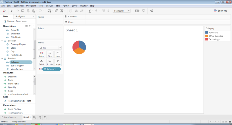
Step 1: Open Tableau
For making the doughnut chart, you need to open the Tableau software. Then you have to connect to Sample Superstore and choose Pie chart as your chart type from the Marks Card.
Step 2: Drag the Category Tab
To get a doughnut chart on the blank sheet, you need to go to the Dimension section and drag the Category tab to the Colors Marks card. Then you have to move the Sales Tab from the Measures section to the first size Marks card and then to the Label Marks. Once you drag the Sales Tab to Size and Label, there will be values showing on the Pie Chart.
Step 3: Move the Number of the Records
Once you finish moving the Number of Records field to the Row Shelf, you need to right-click on the contextual menu to set the Measures of the Minimum. Then you can drag the Number of records from the Measures sections and then place them on the Rows Shelf.
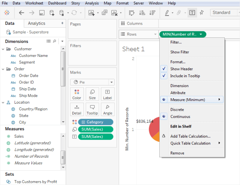
Step 4: Choose Dual Axis Option
For the next step, you need to change Measures to Minimum from the Sum for the new Number of Records. Then choose the Dual Axis option by right-clicking on the New Number of Records.
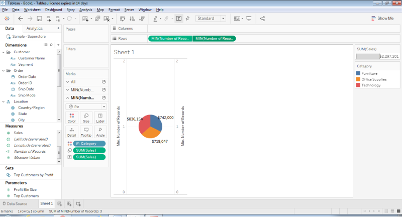
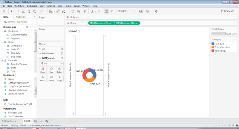
Step 5: Set the Background
Select the Min Number of Records from the Marks Card and Undo the second step to get the doughnut shape. Then set the background color as white after reducing the size of the Min. Finally, your doughnut chart is ready on Tableau. You can save it for later.
Doughnut charts represent relationships of multiple contents made of numbers, ratios, rates, and more. You can create a doughnut chart on Tableau, but the process is complex and time-taking. To avoid such confusion, you must use the high-quality doughnut chart templates of EdrawMax.
1.1 The Advantages of Making a Doughnut Chart in Tableau
Doughnut Charts are similar to pie charts as they illustrate the proportions of categorical data graphically. You can use make your doughnut chart in Tableau for some of its features and advantages, like:
- Tableau can handle a large amount of data that present in your Workbooks
- Tableau can easily integrate with over 200 different applications, making it more responsive.
- Once you master the tool, creating a doughnut chart in Tableau becomes extremely easy.
1.2 The Disadvantages of Making a Doughnut Chart in Tableau
In a general sense, doughnut charts are a variant of the pie-chart as it displaces categories as arcs rather than slices. Since Tableau is a data visualization software, many companies tend to make doughnut chart in Tableau. However, this tool comes with several limitations, like:
- Tableau is considered one of the most complicated tools for beginners.
- While creating a doughnut chart in Tableau, you will realize that the reports require manual refreshing.
- Tableau Public has zero to no security, which gives access to your Workbooks to anyone on the internet.
1.3 Tips for Making a Doughnut Chart in Tableau
As we know, doughnut chart or simply donut charts are used to show the proportions of categorical data. While making a doughnut chart in Tableau, there are certain tips that you should always follow:
- While creating a doughnut chart in Tableau, create two aggregate measure fields in the Rows section.
- Always add a set of fields in the Color, Angle, and Label cards of the Marks section as per your requirement.
- Apply Quick Table Calculation to the SUM field only after correctly entering all the required data.
2. How to Make a Doughnut Chart Online Easier
There is a tool EdrawMax Online that shorten your time to create a doughnut chart online. Also, it contains substantial doughnut chart templates in product and template community that you can use immediately and create chart without efforts.
On EdrawMax Online, you can find thousands of readily available templates and design components to create all kinds of diagrams. The best part is that EdrawMax Online can also be accessed online, letting you work seamlessly on any platform. With simple drag and drop options, you can also create visually appealing doughnut charts via EdrawMax Online in the following way:
Step 1: Sign In EdrawMax Online
First of all, you need to log in to your EdrawMax Online account. If you haven't used EdrawMax Online before, you can sign up for a free account with your email address. Then you can use EdrawMax Online for free.
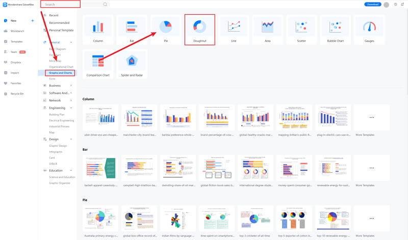
Step 2: Find the Doughnut Tab
Click on the General tab. When you click the General tab, you'll see the menu will open in the upper side window. There are many options, as you can see in the below image. Click the Doughnut Chart tab to open the editor window.
Step 3: Modify Your Doughnut Chart
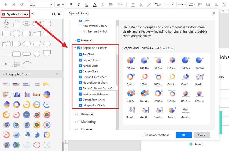
When you click the large + sign, the editor window will open. You need to find bar chart from the Symbol Library, there are many themes for bar charts.
Click the Symbol Library option on the top left side of the editor window. Next, a dialogue box will open. From the dialogue box, go to the Chart menu. A pop-up menu for bar chart symbol categories will appear. Then, mark the Doughnut Chart tab, click the OK button to import the bar graph in the editor window.
Or you can import the data from your end, and the bar chart will be made automatically.
Step 4: Add More Details to Complete Chart
Once the symbols are imported to the editor window, you can drag and drop the doughnut symbols in the editor to create your doughnut chart using them. To edit the symbol, click in the boxes and enter your content. Likewise, you can make the boxes more attractive by using the Fill, Line, and Shadow options.
There are many editing options available in EdrawMax Online to make sure your doughnut chart is customized according to your needs. You can change the transparency, change, type of fill, as well as add and remove layers.
If you want to change the graph type, go to the Attributes pane, and then click the Change Type option. To edit the series and categories of the data, go to the Data pane, and an editor window will open where you can input your data. You can add more series and categories as well as edit the different values against the series and categories.
Step 5: Export Doughnut Chart as Tableau
Click on File in the top left corner, from the drop-down menu select Export. From the Export menu, select Export to Tableau (.exl), and your Edraw Doughnut Chart will be saved as a Tableau file to your computer.
If you are still wondering how to make a bar chart in EdrawMax Online, you can check this doughnut chart guide for reference.
2.1 The Advantages of Making Doughnut Chart in EdrawMax Online
Compared with PowerPoint, there are many advantages that making a doughnut chart in EdrawMax Online:
- EdrawMax Online supports to make a doughnut chart online, and will be automatically saved, which means you could make charts in any where at any time.
- EdrawMax Online has a powerful Template Community, that you can find inspirations from thousands of templates made by Edraw users.
- EdrawMax Online supports to export and import multiple file formats, which ensures that you can make continue your work from other platform to EdrawMax Online, or you can export your doughnut chart from EdrawMax Online, and attached to other files.
- Or even you can showoff your doughnut chart with others by using Presentation Mode.
2.2 The Disadvantages of Making Doughnut Chart in EdrawMax Online
Even though there are some advantages of using EdrawMax Online as the tool to create your doughnut chart, certain limitations affect the overall quality of the project. For instance:
- EdrawMax Online contains limited doughnut chart related symbols, but you can create your symbols and save them for the use of next time. However, it is good for you to make your own bar graph symbols, you can create symbols from EdrawMax, or you can import the symbols you like and save into your symbol libraries for later use.
2.3 Tips for Making Doughnut Chart in EdrawMax Online
Creating a doughnut chart in EdrawMax Online could be easier thing than making in PowerPoint, since there are resources and powerful export function.
- Choose a built-in template from Template Community to start quickly.
- Use powerful toolbars on the right and left sides of canvas to make your doughnut chart more stunning.
- Export your poster in mulitple formats to meet your needs, or share to your social media, email, and print it out.
3. Tableau Doughnut Chart Templates
The followings are the doughnut charts PowerPoint templates, you can refer to them, or even use them immediately with ease.
Doughnut Chart Template
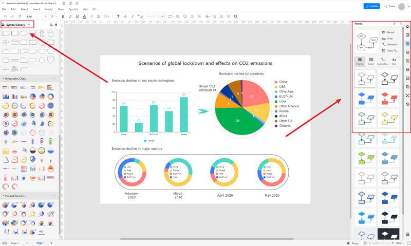
The doughnut chart template below is a hybrid template consisting of both bar and doughnut charts. The doughnut chart used here is nested as it allows you to display multiple series in a single visualization. While using the doughnut chart template, remember that the series is usually related but represents different categories.
For instance, it can be about your best-selling product or market trend of some beauty product or simply about your favorite places to hang around in your town. As you can see here, you can customize the template as per your need. You can also add the appropriate text at the bottom that would be helpful for your team.
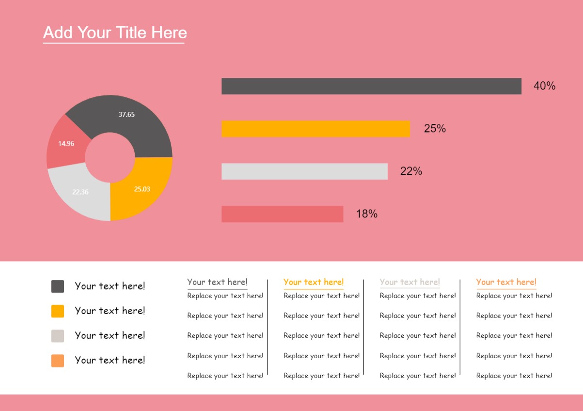
Source:EdrawMax Online
Doughnut Chart Excel
The following is a doughnut chart illustrating areas of different countries. To create such a doughnut chart, all you have to do is mention the country you are mentioning and enter the right data in the table column. As the doughnut chart illustrates, Russia holds 27 percent, Canada holds 16 percent, China holds 15 percent, the United States holds 15 percent, Brazil is at 13 percent, and Australia is at 12 percent. As we learned from this doughnut chart, Russia is the largest country globally.
With EdrawMax, you can either copy this doughnut chart or customize it as per your requirement. You can take this doughnut chart template to make different charts, like understanding the toughest subject in your class or the countries where the impact of COVID-19 was severe.
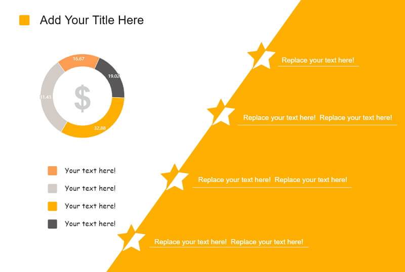
Source:EdrawMax Online
Doughnut Pie Chart
The following doughnut chart is a hybrid chart showing the SKincare Market Trends. In this template, we have used bar and doughnut charts to explain the growth of skin care market trends for a particular country. As shown in the doughnut chart here, we have taken the data from the last five consecutive years.
The doughnut chart here represents the "type of beauty products" for last year's data. In this case, 83 percent of people used emulsion skincare products, and only 25.6 percent used gel skincare products. Such doughnut charts are a great way to illustrate the market trends graphically.
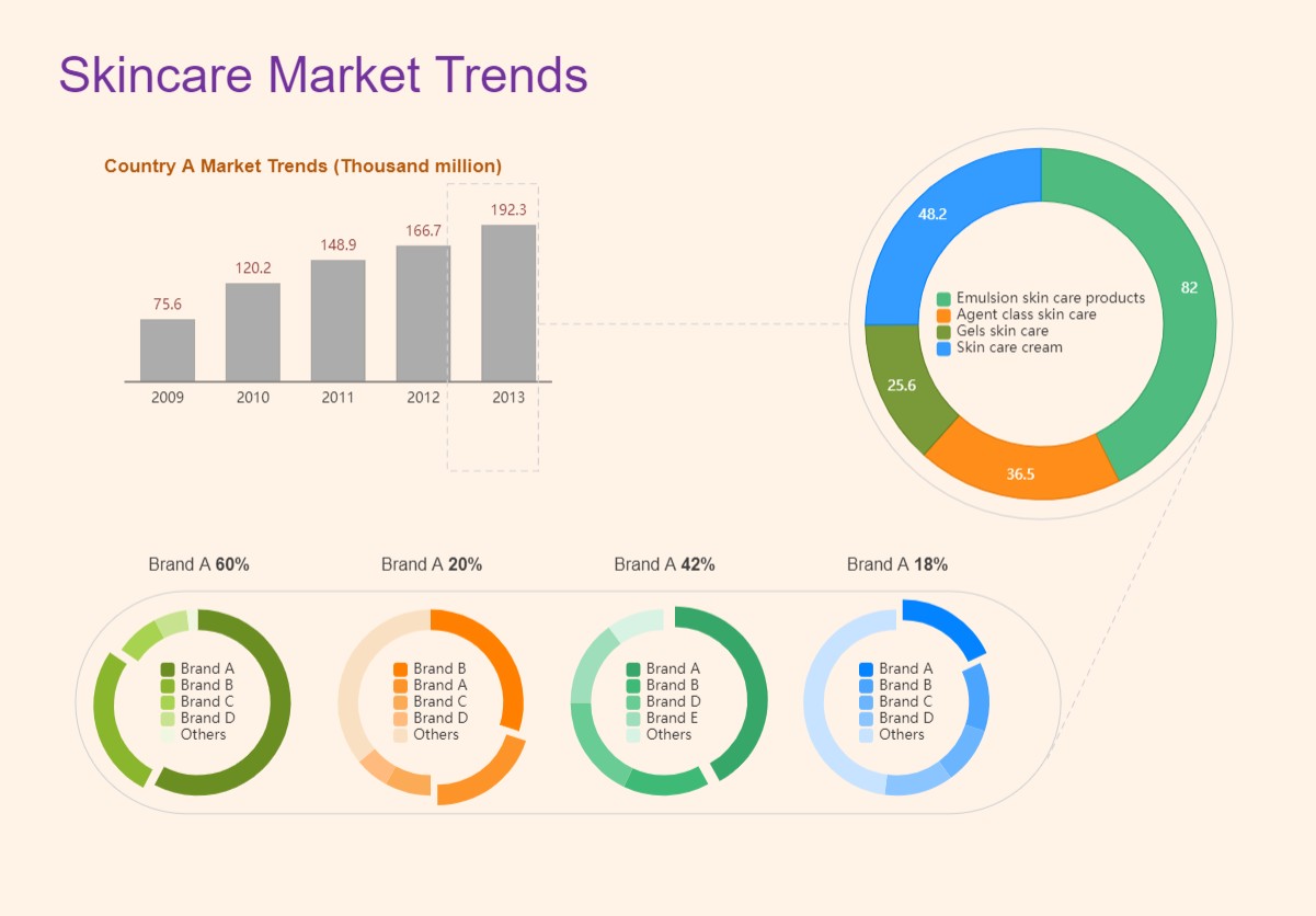
Source:EdrawMax Online
4. Free Online Doughnut Chart Maker
Unlike Tableau, which focuses only on data visualization, EdrawMax Online is a powerful free online chart maker. Trusted by over 25 million users, EdrawMax Online lets you easily create doughnut charts for your use. You can upload the CSV files in the table and instantly see them turning into the required graph.
- There are thousands of design elements in EdrawMax Online that can help you create 280+ different types of diagrams.
- You can also browse its extensive range of templates in EdrawMax Online Template Communityand can readily customize them as per your requirements.
- EdrawMax Online is a free cross-platform tool that you can access on any browser and use without any prior designing experience.
- There are dedicated features to customize your diagrams and export them in numerous formats like PNG, PDF, TIFF, SVG, and more.
The doughnut chart created in EdrawMax Online can later be shared on multiple social media platforms, like Facebook or Twitter. In addition to this, you can directly print out the doughnut chart designs for your offline submissions.
5. Key Takeaways
Making a doughnut chart in Tableau seems pretty easy at first glance, but only when you master the tool. Unlike Tableau, EdrawMax Online is considered the best tool to create doughnut charts that can digitally visualize the data. EdrawMax Online comes with free tutorials, extensive resources, and hundreds of free templates that let you easily make a doughnut chart for your organization.
With EdrawMax Online , all you have to do is to either take inspiration from the free template or enter the data in the table -- your dynamic doughnut chart will be created instantly.