What is Line Graph – All You Need to Know
Create a Line Graph Online Free Free Download Free Download Free Download Free Download1. What is A Line Graph?
A line graph uses lines to connect data points that show quantitative values over a specified period. They indicate positive benefits on the horizontal x-axis and a vertical y-axis. Generally, a grid is formed by intersecting perpendicular lines formed by both the axes, using a line. They display shorter changes and are better than bar graphs for the aspect.
A line graph is especially helpful in showing recurring data to facilitate comparison. For instance, repeated experiments in the field of science or other subjects, tables used are not intuitive enough to analyze. Thus, line graphs are useful to better indicate the data changes over time in the form of easy to read interface.

2. Parts of a Line Graph
You need several components required to draw a line graph as follows.
-
Data
Data is the most significant part of making a line graph. So, before you go to make a line graph, collect and add substantial data. It is usually contained in a two-column table corresponding to y and x-axes. You can even add a label if you want to attract attention to a specific set of data.
-
Plot
Then, you need a plot or graph paper or graph segment to indicate all those values. If you are a concerned business professional or tech-savvy guy, you will use the online tool to create a line graph.
-
Labeling each axis
Each axis needs a different label. You need to select which data set to present on which axis. Commonly, the data related to the money plot on the y-axis. And, each section requires labeling such as Time, Days, and Revenue, etc.
-
Legend
The legend is useful to add more than one set of data on a line. It represents the information about tracked data to help viewers understand and read the graph.
-
Title
A title is a must to create an identity for your chart. It should not be just the repeated labels, but specific information should be added to indicate what the data accurately represents.
3. Advantages of Line Graphs
You can use line graphs in many ways according to your requirements. But using a line graph is only helpful when you are using it at the right timing. You can use other graphs to record data sets, but you can only use them with data coming at continuous time intervals with a line chart. Line charts help predict the paths of data sets. It tells you how long the same pattern will continue or when the changes might occur. You can also look for missing fragments of data by analyzing the data line.
-
You can easily show the data changes over time over a line graph.
-
It is also helpful to show small changes that are difficult to measure in other graphs.
-
A relationship between 2 or more variables get identified.
-
It presents a good impression of trends and changes.
-
Both negative, as well as positive values, are indicated.
4. Disadvantages of A Line Graphs
While using a line graph can help you with many things, it also comes with a few downsides that you can't ignore. We create a data line with both vertical and horizontal scales. Most of the time, it works just right, but sometimes the difference between scales is much broader, making the data line bland. If there is more than one line in the graph with a similar value, it makes it more complex.
- Plotting too many lines over the graph makes it cluttered and confusing to read.
- A wide range of data is challenging to plot over a line graph.
- They are only ideal for representing data made of total figures such as values of total rainfall in a month.
5. Line Graph Use Cases
Scientific Experiments: Most scientific inventions are commonly based on assumptions by various scientists. Experimentation is the only way to prove any assumption and make discoveries. The way experiments work is that you have to do it repeatedly and gather their data and results. You compare and analyze that data by graphically representing it. For that, you use a line graph to make comparisons and proceed with the experiment. Using line charts makes the distinctions clear to the reader and makes it easy to understand for anyone.
Analyzing Relationships: The most common use of a line graph is to analyze and compare data sets by placing them next to each other. Line graphs are the best tool to visualize relationships between two continuous entries. You can only use these charts when you have to look at the comparison between types of data that are continuous for a specific time interval.
Marketing and Sales: You might wonder when you would use a line graph if not for science and research? You can analyze changes in data over some time with the help of a line chart. That is why you can easily use it to examine product sales and for marketing purposes. Line graphs record data over time, and you can analyze your product sales by comparing two graphs.
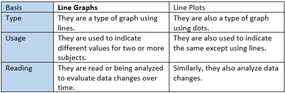
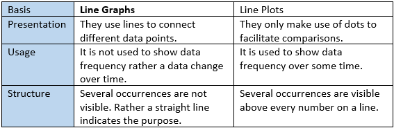
6. Line Graph VS. Line Plot
Line Graphs and Line Plots are similar as well as different in some aspects. Let’s see how in the tables given below.
Similarities
Differences
7. Line Graph Examples
Here are some Line Graph examples. Find more line graph examples.
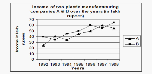
Example 1: Income of two companies A & B.
The data is shown in units if lakh rupees for presenting the income of two plastic manufacturing companies. Y-axis is represented as income in lakh rupees, whereas the x-axis is used to show the different years in which the companies earn income. Two lines are used with varying symbols over them to differentiate each other. In this example, profit is taken as a % of expenditure to make further analysis.
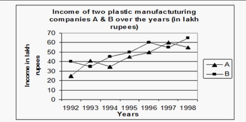
Image Source: hitbullseye.com
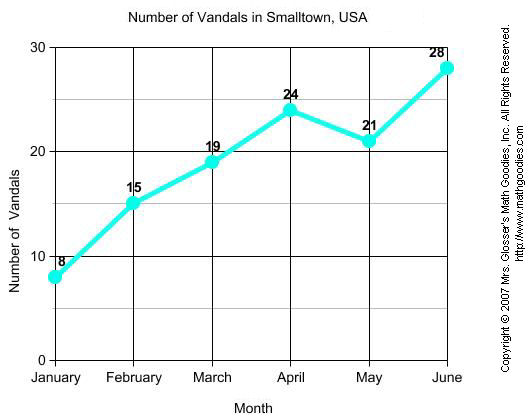
Example 2: Weight
In this single line graph, Sam's weight is the weight (kg) on the y-axis and month on the x-axis. It is a simple form of a diagram drawn to show how the weight of Sam has changed over different months from January to May. The chart shows that the weight of Sam is continually increasing each month.

Image Source: mathgoodies.com
Example 3: Number of satellites launched by different countries
In this Line Graph Example, four different countries are shown to represent the satellites launched by them over many years. The four countries presented are USA, India, China, and Japan. You can analyze this data further in finding ratios of satellites launched by different countries. So, a line graph is handy to find out other information related to the aspect.
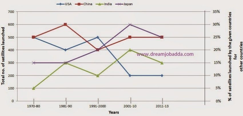
Image Source: blogspot.com
8. How to Draw a Line Graph with EdrawMax?
EdrawMax Online is one such precise diagramming tool to create a line graph if you are finding one at an online platform. Its online version is much easy to use and equipped with specific diagramming tools. We want to suggest EdrawMax Online version to create different diagrams with ready-made templates.
Factors to be considered before drawing a line graph are.
- You need to know which set of data you are going to plot on the graph.
- Give a title to your line graph.
- Think of specific data you are going to set on each axis.
- Select from different types of plotting from available templates.
- Repeat the process in case of multiple data set representation.
Open an online version of EdrawMax and sign up. The creation of an account is mandatory to access the free templates up to the creation of three projects.
Find the Library pane on the left side of the interface, then tap and hold on a block shape. Carefully drag and drop it onto the canvas displayed on the right side of the screen. To adjust the shape’s size, use the green selection handles.
Click Line and select from different free templates given below. They are freely provided up to the creation of three projects. After that, you can shift to a premium version to access more great templates with added facilities.
9. Tips on Reading and Creating Line Charts
Several tips on reading line charts successfully.
- Look at the title
- See the labeling of axes
- Check out the emerging patterns to understand the trend
- See the data values to get exact figures
Several tips on creating line charts.
- Choose the specific title showing exact information
- Take variable values in short terms to easily understand
- Do not mess with too many lines over the graph. The maximum should be four lines to facilitate comparisons.
10. Line Graph FAQ
How to make a line graph?
You can find detailed information about how to make a line graph.
What is a line graph used for?
Line graphs are commonly used to find out changes in sets of data over some specific time interval. These are very helpful for research, experiments, analyzing sales and drawing results. You can also use it to compare two or more data groups. It also helps you predict data after some time.
How do you explain a line graph?
You can explain a line graph as the graphical representation of various data sets recorded after continuous time intervals. It depicts the relationship between two or more data groups. Comparing line graphs is easy, but it gradually becomes complex as the difference grows. That is why the line graph represents data for short time intervals better compared to long time intervals.


