Area Chart: Definition, Examples & Tutorial
Create a Area Chart on Edraw.AI Online Free Free Download Free Download Free Download Free DownloadWhat is an Area Chart?
“An Area Chart is a graphical representation useful for visualizing how one or more quantity(s) can change over time, by plotting values or data points over a two-dimensional Cartesian system and joining the points with a line segment.”
It is very similar to Line Graphs. However, the area between the X-axis and the line segment in an area chart is either colored or shaded. Stacked area charts are handy for the very purpose said above: to understand how one or more quantities or variables change over time. They are helpful for us to understand various statistical measures and trends like part-to-whole comparison, trend comparison for more than one portion, a measure of change, etc.
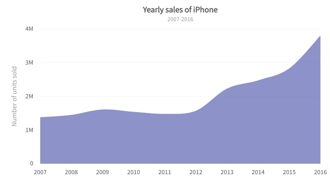
Image Source: gstatic.com
What is a Stacked Area Chart?
As I said earlier, you use area charts for part-to-whole comparisons. In such cases, we use an extension of the average area chart: the Stacked Area Chart.
In a stacked area chart, each of the parts gets represented by stacking them one above the other. The total area would give the whole, while the area under each stack would provide the same for each of the parts.
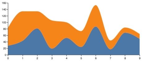
Image Source: github.io
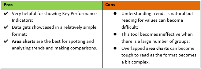
Pros & Cons of Area Charts
So that was the answer to what is the area chart, now, let us get to know about their pros and cons as well.
Look at the table below to have a better understanding:
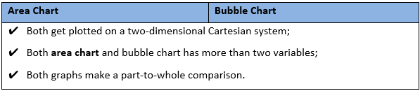
Area Chart vs. Bubble Chart
Similarities:
Differences:
What are the Components of an Area Chart?
Below are the essential components needed to draw an area chart:
-
Title
Just as the name implies, the title depicts the content illustrated in the area chart. Generally, it simplifies for the readers to get a grasp of the graph at a glance.
-
Legend
Every area chart must have a legend that shows which data category the different shadings represent so that the user does not confuse while interpreting the chart or graph.
-
Source
No matter what, it is always important to mention the source to give them a sense of recognition for collecting the data, without which the chart would have been meaningless.
-
Y-Axis
It is the vertical line of the area graph that represents the numerical value of the measurement. It generally begins with 0, and you can make as many equal divisions as needed.
-
Data
It is the most crucial element of an area chart because, without the information, your graph will make no sense. This chart can represent one set of data simultaneously.
-
X-Axis
It is the horizontal line of the area graph that represents different periods or names tallied.
Examples of Area Chart
Problem: To find the average exam scores in a Maths class;
Solution: The data is gathered and plotted with a simple area chart as follows:

Image Source: gstatic.com
Problem: To study the profits made by a chain of groceries;
Solution: The data from four different grocery outlets from the same brand is gathered and graphed as follows:
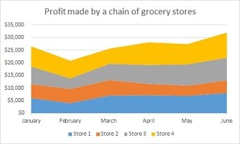
Image Source: study.com
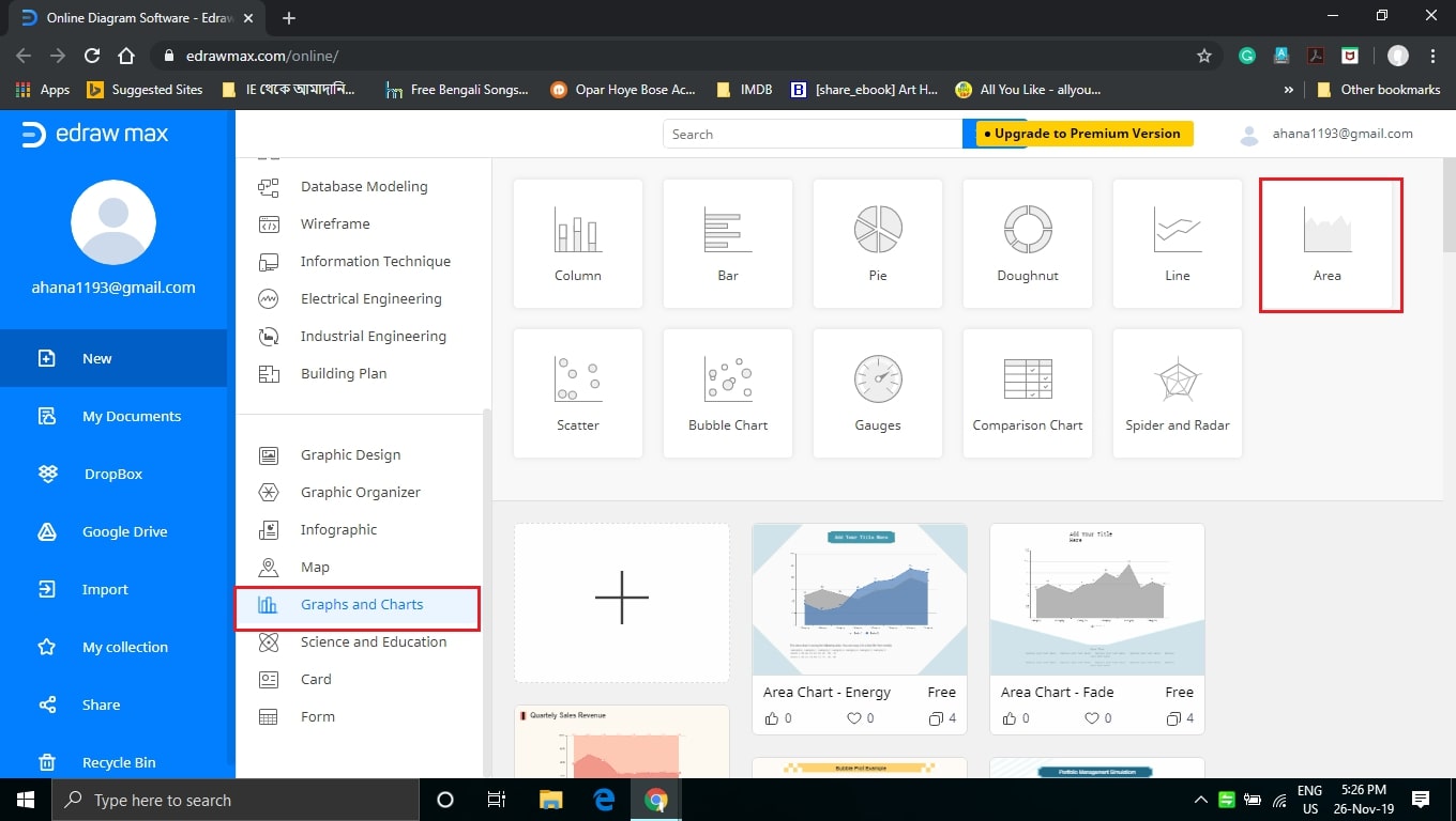
How to Create a Area Chart with EdrawMax Online?
You can quickly make a stacked area chart with the EdrawMax Online tool. It is notably the best choice for creating a hassle-free area chart that can address all of your diagramming needs. Moreover, there is no need to download or install the software on your computer.
However, please note that an area chart cannot solve all your problems. Hence, you should know its areas of application. You can only understand that when you have a clear understanding of its concept.
The next thing that you need to consider while making a professional area chart is the choice of the correct diagramming tool. You can review the EdrawMax Online tool, which has a very user-friendly interface. However, I would suggest that you take some time to familiarize yourself with the interface and take a trial.
So let us see how we can create an area chart easily:

Tips on Reading and Creating Area Charts
Reading an Area Chart:
-
Always try to locate the legend and understand the categories of data;
-
Look out for the variables along the X & Y-axes. It will help to understand what the chart wants to represent;
-
Always refer to the data table (if you have one) while reading the area chart for better interpretation.
Creating an Area Chart:
-
Always try to put the highest variable data on top thus making the chart easy to read;
-
While coloring or shading overlapping parts always try to maintain transparency so that the reader does not get confused;
-
Always begin the Y-axis from 0 because otherwise, it will become tough for you to plot the graph, let alone extrapolate any measure from it.


