Complete Guide: What is Doughnut Chart
Create a Doughnut Chart on Edraw.AI Online Free Free Download Free Download Free Download Free DownloadHave you ever seen a doughnut without a hole? Well, not, of course, as it is not possible to make such a delicious sweet fried dough without it. A doughnut chart looks very similar to a pie chart except for the center hole, which would serve as the purpose of easy analysis and reading of the diagram.
So, let’s get the answer to what is a doughnut chart?
What is a Doughnut Chart Used for?
A Doughnut Chart is an improved version of Pie Charts to eliminate the trickiness of reading pie charts. These charts are known to express the relationship of ‘part-to-whole’ where all parts represent 100% when collected together. It displays survey questions or data with a small number of comparing categories.
They enable compact and simple representation as compared to pie charts. Furthermore, the center hole can help display related information. You can use them in segments where each arc represents the proportional value connected with each piece of data.
Strengths and Limitations of Doughnut Charts
Here are some advantages/strengths of Doughnut Charts you should consider.
- They are easy to draw and have a straightforward structure.
- The different values of data in a doughnut chart can be changed or inserted according to our needs.
- You can draw them in different colors and types.
- They are more reader-friendly when comparing data between different sets.
- You need a minimum extra explanation for doughnut charts.
Here are some advantages/strengths of Doughnut Charts you should consider.
- 3-D Doughnut charts are more complex to analyze.
- The chart becomes messy in case of too many arcs or slices.
- It is challenging to determine harmful data unless remarked.
Despite these limitations, Doughnut Charts haven’t backed them out from gaining popularity and are among the standard charts used by both businesses as well as non-business professionals.
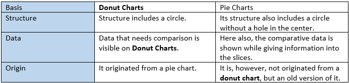
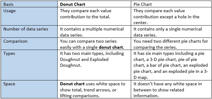
Doughnut Chart VS. Pie Chart
Although Doughnut Charts have originated from Pie Charts, they still share some differences. Given below is a comparison of both similarities and differences between both Doughnut Charts and Pie Charts.
-
Similarities
-
Differences
Examples of Doughnut Charts
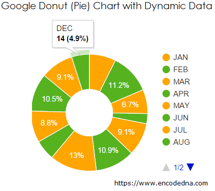
SQL Server Database service is a managed service to maintain, set up, manage, and administer SQL server. The example shows Google SQL Server Data from January to December and depicts the retrieving of data requested by other applications.
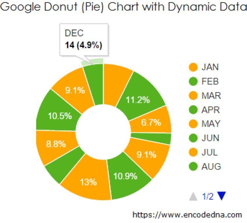
Image Source: encodedna.com
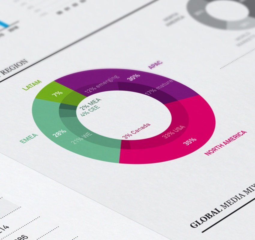
The various ways of revenue and expenditures are visible below in the categories, namely ‘Where it comes from,’ and ‘Where it goes.’ The doughnut charts makes it convenient to represent different sources of revenue as well as expenditure in various colored segments.
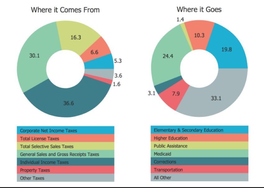
Image Source: pinimg.com
If you are simply having a project and wants to breakdown its cost, this doughnut chart example will help you get a reference. You can bifurcate various project costs such as legal, production, license, taxes, insurance, etc., into different percentages while depicting the information outside the chart.
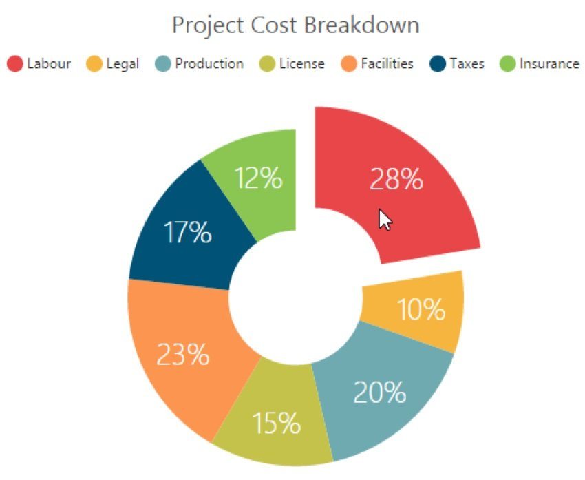
Image Source: syncfusion.com
How to Create a Beautiful Doughnut Chart with EdrawMax?
Doughnut Charts are easy to create with online tools such as EdrawMax or other alternatives available. Well, EdrawMax online is one such tool that you can use for many other purposes creation of different charts.
Here are different things you should know before drawing a doughnut chart diagram.
-
Import and prepare the data
The Doughnut or Pie Chart needs to be in a particular format. You will need to make and import the data for the presentation. It should have a header row, a column containing numerical values, and other relevant categories. Once you have prepared the essential data, you can smoothly proceed with the next stage.
-
Describe and Check
In this stage, you need to check and describe your data set to consider if any changes are required. Your data should be specific and based upon facts to describe the whole presentation.
-
Visualize
Here, you can visualize your data presented on the doughnut chart. It should have those particular symbols and types where you can show your data according to different convenient factors provided.
Steps to create Doughnut Chart with EdrawMax Online
In the very first step, you need to open the official site of EdrawMax Online. Then, you must sign up for access to different templates. The online version is free up to three projects, after which you can either delete the projects or shift to the premium version for more benefits.
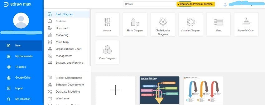
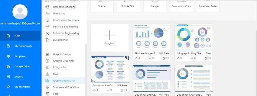
Search Doughnut Chart in the search column or click Graphs and Charts by scrolling down the side menu. This option will offer you individual graphs and charts from where you have to click Doughnut.
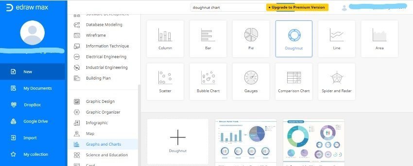
In this step, you can either create your doughnut chart or select from one of the free templates provided below in the interface. Here, you can choose from different borders and drawing shapes provided in the side menu and start editing the template as per your needs.
Tips on Making a Stunning Doughnut Chart
- Pick the right type and design of Doughnut Chart as per your needs, and the amount of data to represent.
- Sort it nicely so that it will look intuitive. The reader is first impressed with the outliners created, so ensure to make it look attractive.
- Keep consistent colors across the nodes. For instance, you can use the color of brands in case you are showing brands in your presentations.
- Try to add a tagline or legend that helps readers know what you are trying to communicate.
- Do not bombard using too many rings within the doughnuts. Along with making it difficult to interpret, it also makes it look messy and unattractive.
- Do not use doughnut charts for presenting non-relative data or simple comparisons.


