How to Create a Doughnut Chart
1. Introduction
A doughnut chartis a circular graphical representation that shows the various proportions and ratios in which different values are quantified in a data group. Doughnut charts are great for displaying the component breakdown of any given assortment of information, such as analyzing the budget allocation, or distribution of human resources in different departments, etc. In this post, we will look at a step-by-step guide on how to create doughnut charts.
2. How to Create a Doughnut Chart
Creating doughnut charts arises when you have to show the different percentages of variables/values in a collection of data. Since every section on the doughnut is drawn to reference the entire thing, it is easier for the reader to understand the division and break-up. For example, you are trying to tell your audience that 50% of the net income is due to sales of computers while 25% is from rental and 25% is due to sales of accessories. In this case, you will draw a donut and shade half of it a different color to show the percentage of computer sales. A quarter will depict the rental income, while another quarter would denote the accessory sales.
1. Determine the number of values and their percentages
The number of values decides the number of sections in your doughnut. A data category with just two values will mean a doughnut with two parts, while three values will mean three parts etc. You must note down the total number of values and their percentages before starting to draw the chart.
2. Ascertain how many layers are required
A doughnut chart can come with either a single layer or multiple layers. 'Layers' here refers to the number of rings. If a graph has to, for example, show five different layers, it would first show a small ring at the center, then one immediately outside it, and so on. Making different layers is useful to show the percentages of the same variables/values in different years or instances.
3. Open up your software and start drawing
Once you have covered the requirements and requisites, it's time to start working on the chart itself. The software and applications that you can use for free nowadays have eliminated manual drawing. In this guide, we will look at a step-by-step tutorial on how you can create doughnut charts with EdrawMax Online. If you want, open it up on your browser and follow the steps.
If the video doesn't play, please visit it at YouTube.
3. How to Create a Doughnut Chart with EdrawMax Online
You can start as a free user by default and access the basic features. To sign up, click on EdrawMax Online, and select the 'Create Account' option.
After you are signed in, go back to the homepage. On the left-most menu, you will see an option marked 'New.' This will be selected by default, but if it's not, bring your cursor over and click on it. A window will open towards the right with a list of different categories. In the 'General' tab, go down to the 'Graphs and Charts' sub-category. After clicking on it, you will see several different options, e.g., column, bar, pie, line, area, etcetera. Select 'Doughnut' and then go down to click on 'Blank Drawing'. (New > General > Graphs and Charts > Doughnut > Blank Drawing)
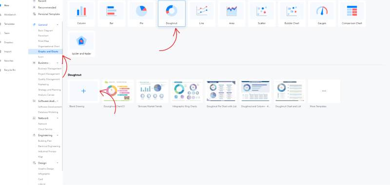
If you don't have the time to create an aesthetic-looking graphic or lack the skill for it, you can visit the template gallery and select a premade chart. Bring the template to the drawing canvas and edit it as your own. You can change the details and values according to your given data. You can also alter the color theme to make it unique and distinguished. To use a template, go to the homepage and select the 'Templates' option from the left menu. When the template gallery opens up, go through the list of categories and select 'Graphs and Charts.' Select 'Doughnut,' and you will get the assortment of premade drawings. Click on any of them and then press the 'Use Immediately' button.
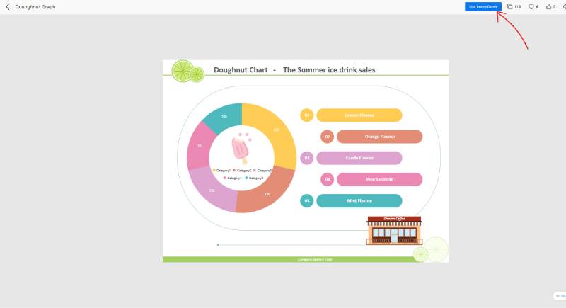
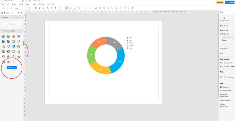
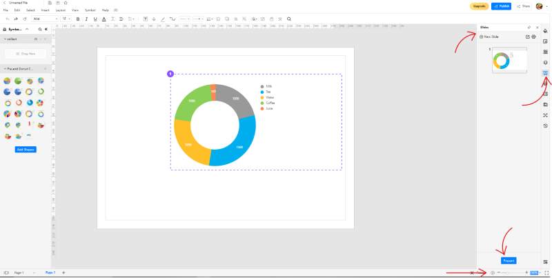
Once you are at the drawing board, you can pick a shape from the library on the left and drag it over to the canvas by making a click-and-hold gesture. If you are planning on just making a simple doughnut chart, you won't need to use a lot of shapes and icons in your work. Symbols and icons are more commonly used in blueprints and detailed schematics. But, this doesn't mean that you can't use shapes if you are drawing a doughnut. If you want to add some clip art and colorful graphics to your chart, select the 'Add Shapes' option in the library. This lets you import different sets of icons from other categories. In the above screenshot, the template has the picture of an ice lolly and a building on the bottom corner. Those are both imported icons.
There is a nifty little tool in EdrawMax called 'Themes' in the customization options. With 'Themes,' you can edit the color palette, connectors, and text in any given diagram. However, when making a doughnut chart, you can only edit the color combination. Changing the themes can be helpful if you are trying to give your drawing a unique look. When you use a template as it is, it might be a bit too obvious that you are using someone else's premade work. While there is nothing wrong with that (since it is the purpose of a template gallery), some people may prefer to give their charts a touch of their own.
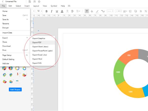
Since EdrawMax Online is web-based, your work is constantly saved to the cloud. If the window or tab closes, you can open the application again to instantly resume where you left off. On the other hand, if you are trying to bring the drawing in a shareable, viewable, and editable form, you can use the 'Export' feature. This perk is available for paid users only, and it lets you save your work offline in a format of your choice. Popular file types supported by EdrawMax include .docx, .xlsx, .pptx, PDF and SVG.
For some more active and spontaneous collaboration, you can use the presentation features offered by EdrawMax. You can press the play icon at the bottom right of the screen, next to the 'Focus' button, to enter the slideshow mode. With a slideshow, you will get your drawing at the center of your display without the surrounding tabs and menus. This is handy if you want to share your diagram with other people without downloading it first. You can also convert your drawing into customized slides. An excellent thing about making slides with EdrawMax is that you can decide what part of the canvas to include and what to leave out.
4. Expert Tips for Making Doughnut Chart
Don't make a lot of sections
Technically, you can create as many sections in a doughnut chart as you want. The problem is, as the number increases, the slices will get smaller and smaller. The labels will get difficult to read, and the whole thing will become a mess. If you are dealing with something with around 6-7 values, you can use a doughnut and get away with it. But if there are more, you should opt for a clustered column chart or a bar graph instead.
Use bright and contrasting colors
To represent the different portions, don't use different shades of the same color. Go wide and use contrasting hues so that your reader can easily understand the data without having to squint at your drawing. In the above screenshots, you may have noticed that various colors like blue, yellow, green, orange and gray were used.
Don't confuse them with a pie chart
A pie chart is not the same thing as a doughnut chart. The latter is the shape of a ring viz. with space in the center, while the former is a fully-filled circle.
5. Key Takeaways
Hopefully, after reading this post, you will have a better idea of what a doughnut chart is and how to make a doughnut chart. The software is easy to use, and it comes with a galore of different perks and features. Even if you are a complete rookie, you can come up with doughnuts like a professional. Find more doughnut charts examples.