Free Editable Pyramid Examples
We use pyramid charts to visualize data hierarchically. We can classify data in a progressive order with a pyramid chart based on its importance. As a pyramid is similar to a triangle, we can create various sections of different sizes going from bottom to top in it. We can use each section to represent data in a hierarchy. From the pyramid chart examples down here, you can learn about its types and uses.
1. What Is a Pyramid
A pyramid chart is a triangle divided into sections that graphically represent data based on hierarchy. A pyramid chart is an essential tool for business management and marketing as it represents data and items based on their quantity or order gradually. As the size of each section decrease from bottom to top, it is best suited to visualize data in a ranking. From each example of pyramid chart down here, you will find out its importance in classifying data in a pecking order. It is best to make presentations and reports.
2. Examples of Pyramid
There are various layouts of pyramid charts that you can use, and the format that suits you best depends on the type of data you represent. Creating a pyramid is easy, but you should keep a few things in mind when using pyramid charts in presentations and reports. The size of a section in a pyramid only refers to its width, and its height doesn't matter. Please look at each example of pyramid chart below to pick the one you need. If you want to make a perfect presentation using pyramid charts, you have to make sure that you are using a suitable pyramid layout.
 |
 |
 |
| Pyramid Diagram | Diagram of Food Pyramid | Pyramid Scheme Diagram |
 |
 |
 |
| Healthy Diet Pyramid Diagram | Great Pyramid Diagram | Energy Pyramid Diagram |
 |
 |
 |
| Pyramid Diagram Template | Blank Pyramid Diagram | Ecological Pyramid Diagram |
Example 1: Pyramid Diagram
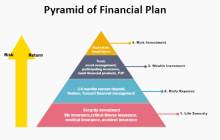
This is an example of a financial plan pyramid diagram. There are four sections in the pyramid, and each section represents a different data segment. At the base, we have a life security investment, and it includes life insurance, illness insurance, and any other health-related insurance with the lowest investment risk. The second section covers the daily expense, and the one above covers the wealth increment. At the top, we have risk investment, and you can see that as the return moves up from the bottom to the top, the risk factor is also going up.
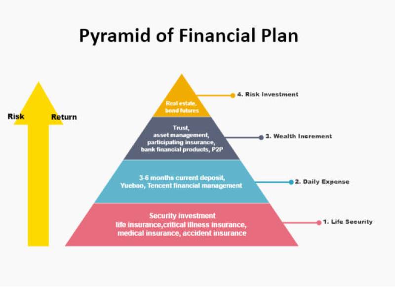
Source:EdrawMax Online
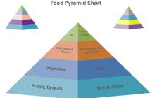
Example 2: Diagram of Food Pyramid
This is a food pyramid chart example that uses a 3d similar layout to represent sub-sections of each section in the pyramid. This type of chart is suitable for adding slightly related data items at the same level. You can tell the general idea behind this pyramid with a single glance, even if you are not familiar with pyramid charts. It makes it easy to understand the concept behind each data ranking based on its hierarchy. At the base, we have food that we eat the most. On the top, we have sweets and oils that increase fat and are not suitable for healthy people.
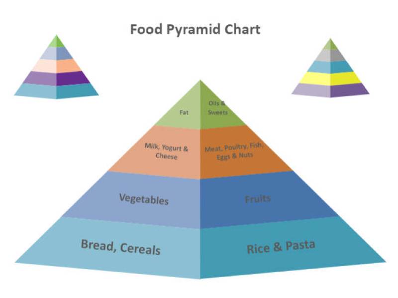
Source:EdrawMax Online
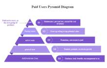
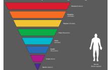
Example 3: Pyramid Scheme Diagram
This example visualizes a paid use analysis using a pyramid diagram. Suppose you want to add details or labels outside the pyramid for a better explanation. In the fifth section, we have active users here for trial or benefits. In the fourth and third sections, we have users who came from promotions and became a general users. Next, they converted to a paid plan and became active users. There are only paying users in the second section, and at the top, we only have core users. You can see that the number of users is decreasing as we move from the trial period to paid and core users.
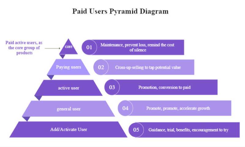
Source:EdrawMax Online
Example 4: Healthy Diet Pyramid Diagram
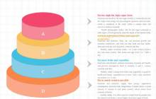
This is an example of a pyramid chart for a healthy diet. Its layout is different from other pyramid charts as there is nothing written inside the sections instead of the label pointers. The structure is similar to circles stacked in a big to small hierarchy. Each circle represents a section, and the alphabet in the areas indicates the labels on the right side. With each tag, you can see that there is a set of instructions for a healthy diet from common to critical. You use this chart to add many details to the chart.
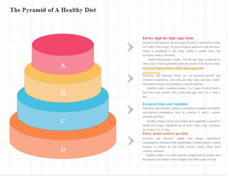
Source:EdrawMax Online
Example 5: Great Pyramid Diagram
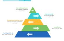
This pyramid example showcases a creative layout of a pyramid diagram, as you can see that each section points a little outwards to indicate the labels and each side. It represents a self-actualization chart for someone. We have the most basic needs at the base, such as food and water. Above that, we have security needs to keep ourselves safe. Moving another step, we have relationship needs such as family and friends. In the second section, we have esteem needs to achieve something. At the top, we have self-fulfillment by making headway in our careers.
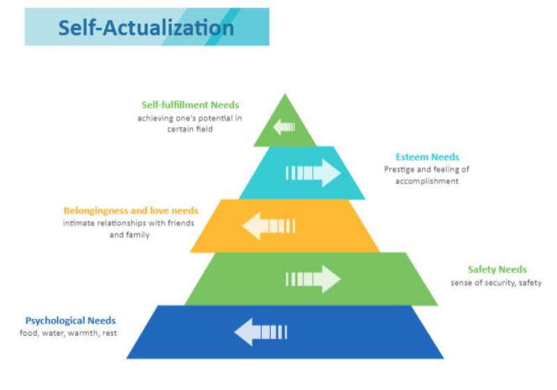
Source:EdrawMax Online
Example 6: Energy Pyramid Diagram
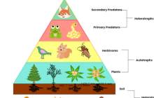
This is an example of a food chain or energy transfer pyramid diagram. These types of charts are commonly found in school books to make students understand the food chain concept. We got soil and organisms underground at the base, such as roots and decay devours. In the fourth section, we have plants. Above that, we got herbivores who feed on plants. We got the primary and secondary predators at the first and second levels. Each section illustrates how every living organism survives and gets energy or food.
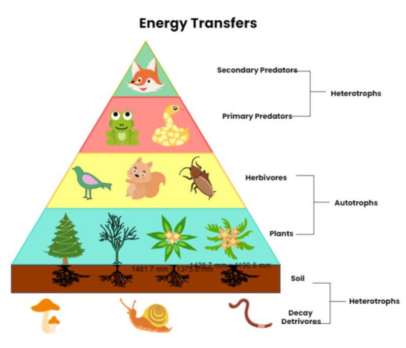
Source:EdrawMax Online
Example 7: Pyramid Diagram Template
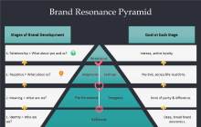
This is an example of a brand resonance pyramid diagram. You can use it as a template when making presentations for introducing new products in the market or business management. As you can see, that there are many sections in the diagram outside of the pyramid chart that indicates each chart section. At the left of each area, we got the reason behind the items listed in the pyramid. On the right side, we have the projected results.
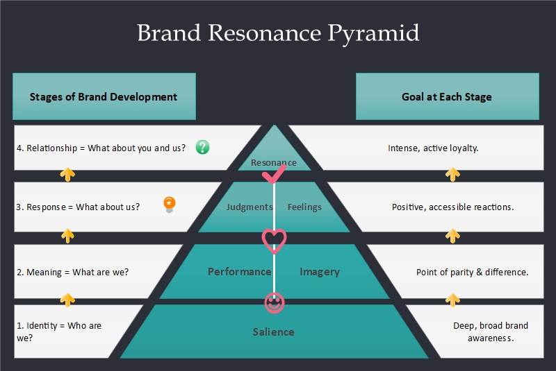
Source:EdrawMax Online
Example 8: Blank Pyramid Diagram
This is a blank pyramid diagram that illustrates the concept of taxonomy in biology. It has a creative layout as different colors represent each section, as there is nothing written inside. On the right side, we have names of each data segment adjacent to related sections in the pyramid. It is an inverted triangle, but that doesn't mean that it is not a pyramid diagram. At the top, we got the domain moving down to the kingdom until it reached species.
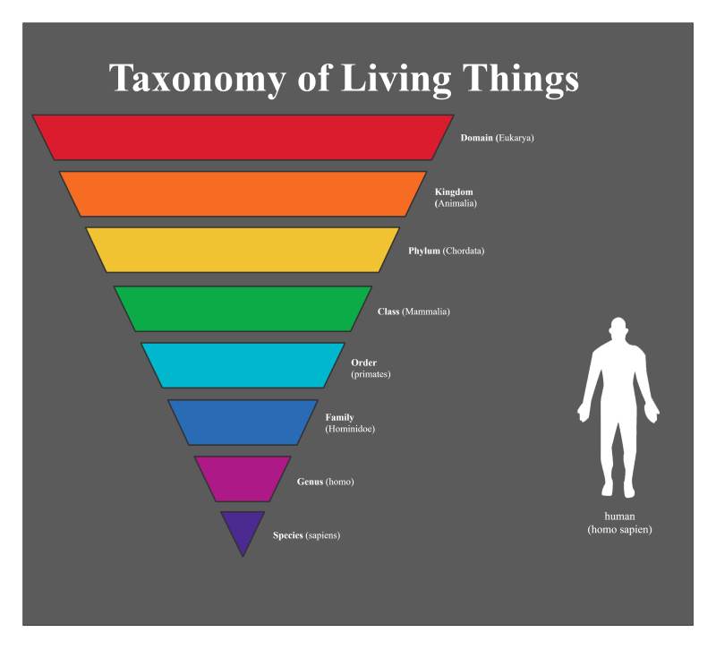
Source:EdrawMax Online
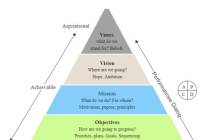
Example 9: Ecological Pyramid Diagram
This is an ecological pyramid diagram example. It showcases the taxonomy of deployed strategies by any organization or business to reach their goal. It illustrates methods based on a hierarchy of each plan being tangible at the start, gradually becoming aspirational. At the base, we got the actions that are a must for the strategy to succeed. Above that, we got the objective of how the strategy will proceed. We got missions to do on the third and second levels and a vision of the goal. At the top, we got the beliefs of our strategy.
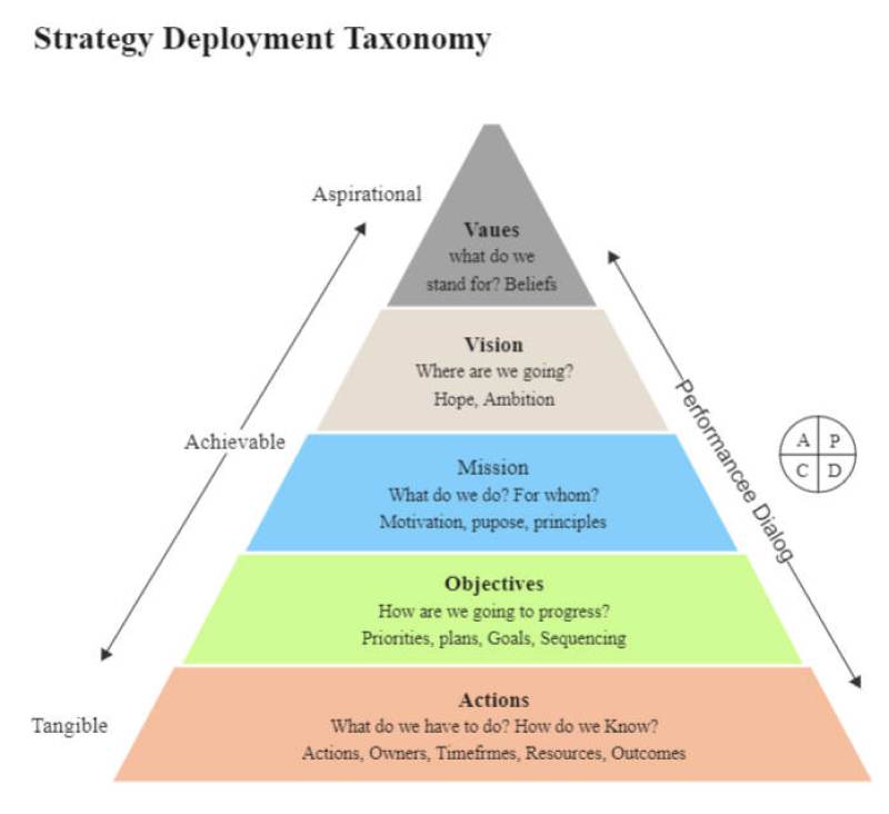
Source:EdrawMax Online
3. Online Pyramid Graph Maker
The basic concept of a pyramid chart is simple, but when you are making your chart, you can change the logic of your idea by using the wrong layout or hierarchy. The only way to create a perfect pyramid diagram is to use the best online pyramid graph. We recommend EdrawMax Online, and it gives you many customization tools and options to make your chart presentable and easy to understand. You can create your graph using professional templates, and it makes every step easy to create a diagram in no time. It also comes with a vast collection of templates, icons, and symbols that you can use in your chart.
4. Key Takeaways
We use pyramid charts to illustrate data segments and ideas in a hierarchical structure. It is similar to a triangle divided into sections that progressively represent items based on their size. Each example of pyramid listed above gives you an idea of multiple layouts and ways to create a pyramid chart. Pyramid diagrams are best for business management, classifying data items, and planning strategies. You can easily create a pyramid graph with EdrawMax Online, and it comes with a comprehensive template library and creative editing tools that will help you create a perfect diagram. Find more pyramid diagram examples in the template community.