How to Creatively Make a Pie Chart Online
Create a Pie Chart on Edraw.AI Online Free Free Download Free Download Free Download Free DownloadWhat is a Pie Chart
(Pie chart), also known as circle charts, are a kind of circular graph to illustrate numerical proportions and are used extensively in teaching, presentation and data analysis.
It helps users show proportions and percentages of each category, by dividing a whole circle into proportional slices. The bigger a proportional slice is, the more percentage it will represent.
When you need to visualize your data using a pie chart, the data should:
- Only have one series.
- Not contain zero or negative values.
- Not have too many categories, otherwise, the small slices will be hard to read.
When to Use a Pie Chart
Pie charts are perfectly suitable for helping readers and viewers quickly understand the proportional distribution of your data. Therefore, when you need to compare the data of each category more intuitively and your data meets the requirements for making a pie chart, it will be a good choice to use a pie chart and insert it into your document or presentation file.
If you want to know how to create a pie chart in a creative way, you can go through the below section.
How to Make a Pie Chart Online
Want to make a pie chart online, but don’t know any available choice? Here, with (EdrawMax Online), you are able to make a professional or stunning pie chart on your browser anytime and anywhere. Besides, you also have to prepare your data in advance and better save it in a worksheet.
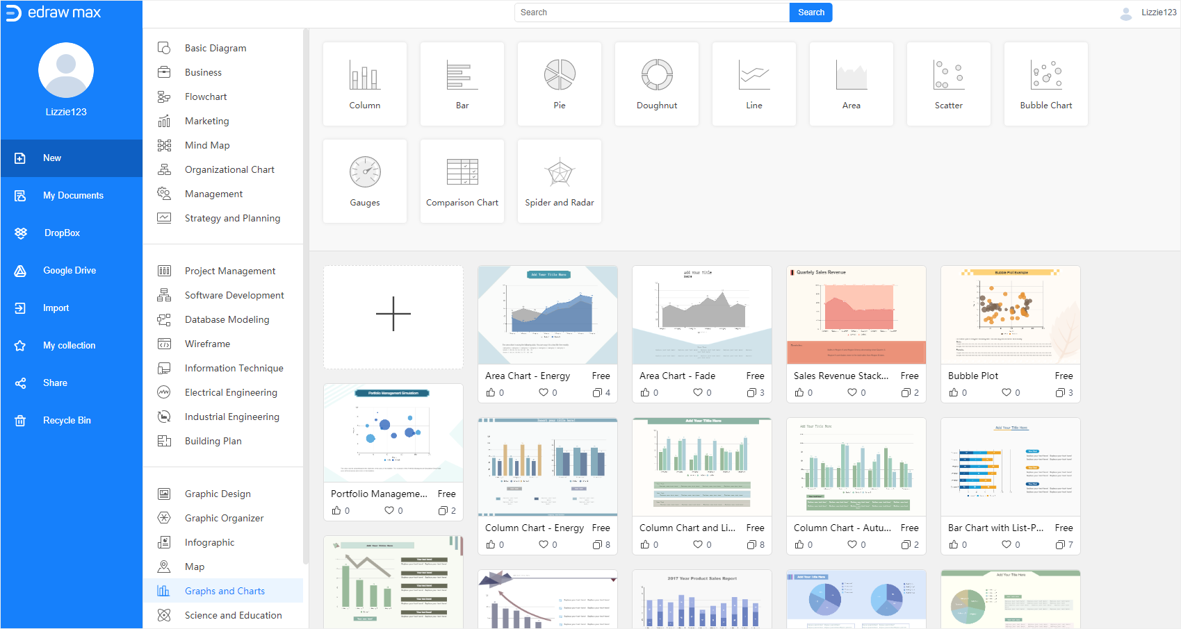
Now enable EdrawMax, click on the plus icon in the Graph and Charts template gallery, then we can start from scratch and make a pie chart on a blank drawing page.
Follow the steps below and learn how to make a pie chart with EdrawMax Editor.
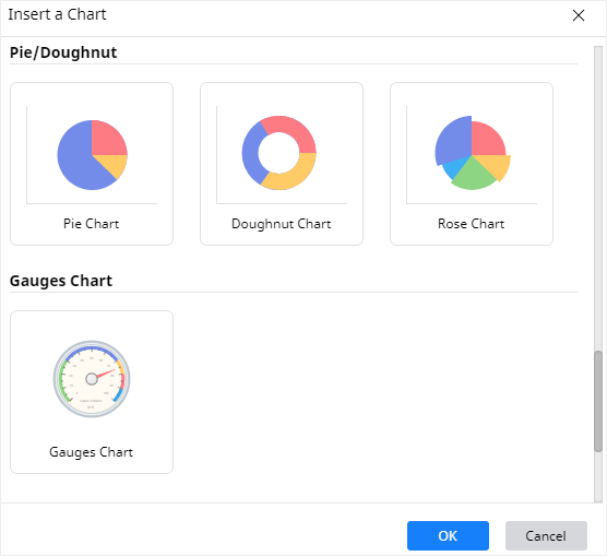
Step 1 Insert an Example Pie Chart
Unlike (making a pie chart in Excel), you have to select Insert > Chart and find Pie Chart in the Insert Chart dialog box at first.
When you successfully insert a pie chart with example data into the canvas, you can try to replace the data with yours.
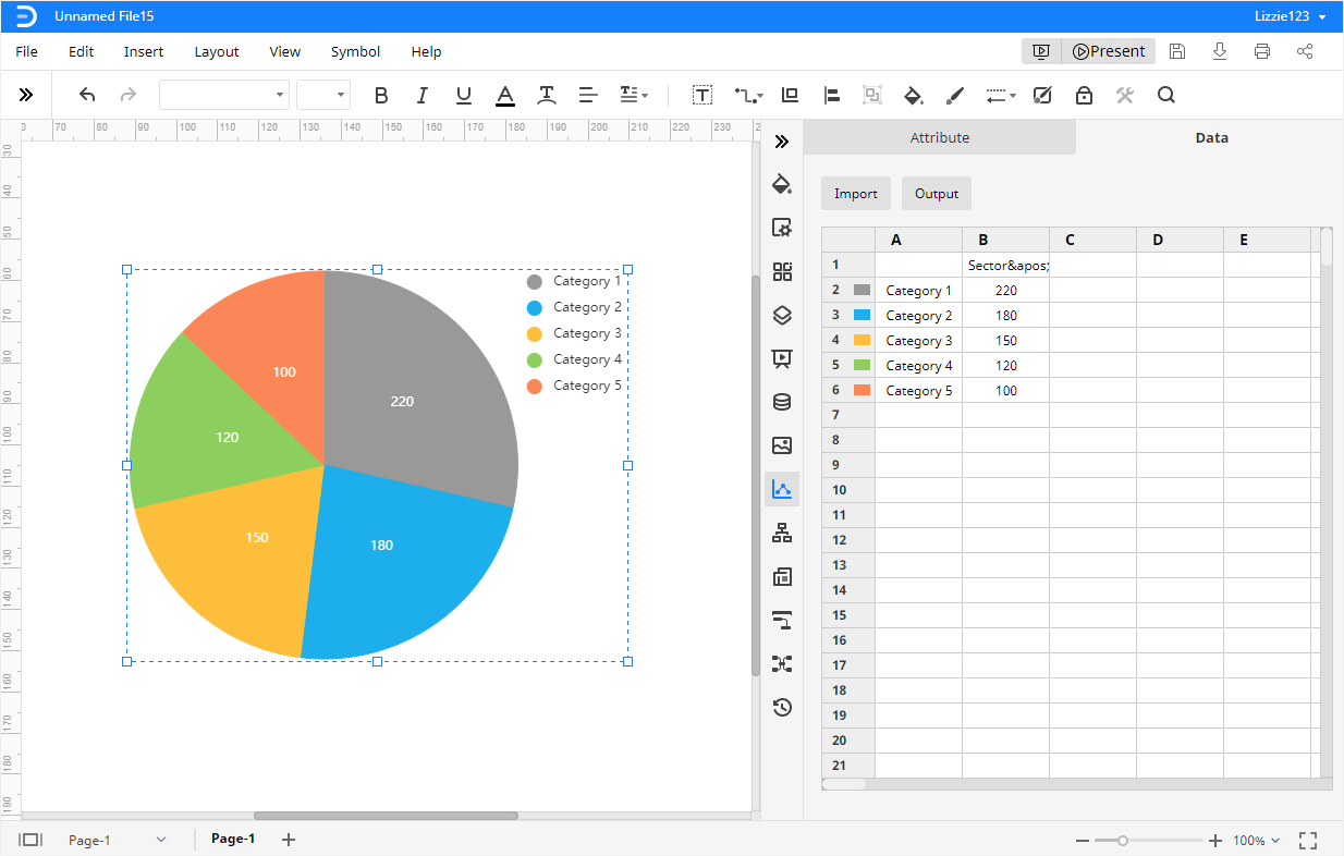
Step 2 Replace the Pie Chart Data
The only place where you can replace or input chart data in EdrawMax is the Chart (Data) pane. Well, how to get there? Select the pie chart, and you will see the Chart icon shining on the right sidebar, then click on the icon to open the pane.
Paste or type your data into the embedded worksheet but the data should be placed in the same way as the sample data. If you can’t input data manually, you can also choose to import the data by importing the file (XLSX and CSV).
Like magic, the moment you finish inputting the data and click Enter, the example chart will automatically change in seconds and turn into your pie chart.
Step 3 Save or Export Your Pie Chart
Once the pie chart is finished in EdrawMax Online, you may wonder where to save your document or how to export your pie chart.
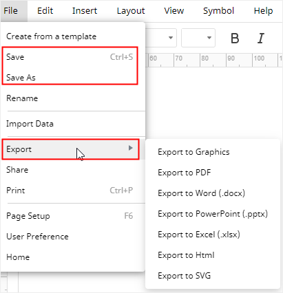
When you click the Save button or press Ctrl + S, EdrawMax Online will save your document in your personal cloud, which is provided by edrawmax. You can switch to My Document on the Home page and search files on it.
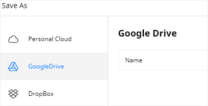
In addition, you can click the Save as button, then you can choose to save your pie chart in 3 different places, including Personal Cloud, Google Drive and Dropbox, which can help you access the pie chart in the cloud and easily share with others.
More importantly, when you complete the pie chart, you can also export it as different file formats. Therefore, the pie chart can be inserted into another file and also compatible with other chart editors.
How to Customize Your Pie Chart
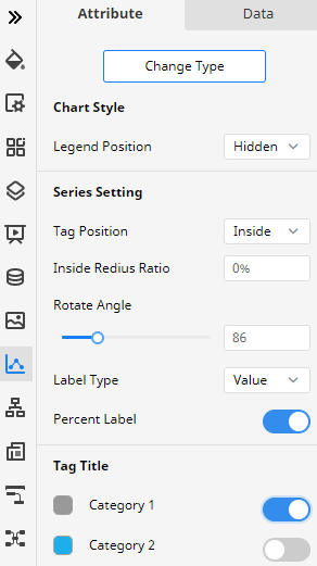
But how to make your pie chart look more special or specific? The answer is to change its style and format and customize your pie chart as you want. In EdrawMax Online, most of the editing tools to customize your pie chart exist in the Chart (Attribute) pane, where you can:
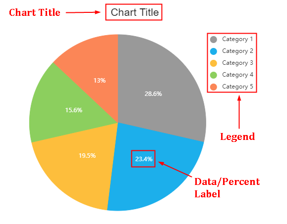
- Add the percentage labels by checking the Percent Label
- Change legend positions by choosing one on the Legend Position
- Change slice colors by clicking the color button next to the category and selecting one on the drop-down menu.
- Change chart types by selecting one on the Change Type
- Make an exploded pie chart by switching on the button under the Tag Title
Examples of Pie Charts or Pie Diagrams
Except for the simple pie chart shown above, EdrawMax Online also provides different themes of pie chart examples. You can look at the below examples, choose the suitable one and make your pie chart based on it.
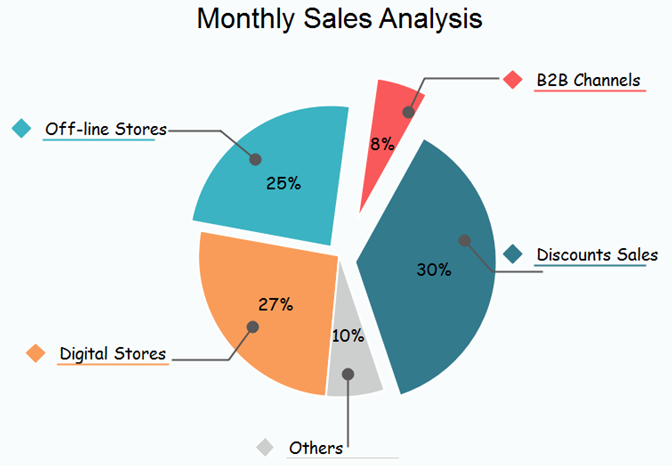
This pie chart template shows the analysis result of monthly sales from a company. Because the slices are separated from each other, this diagram can also be called as an exploded pie chart.
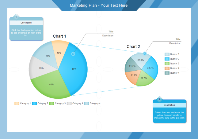
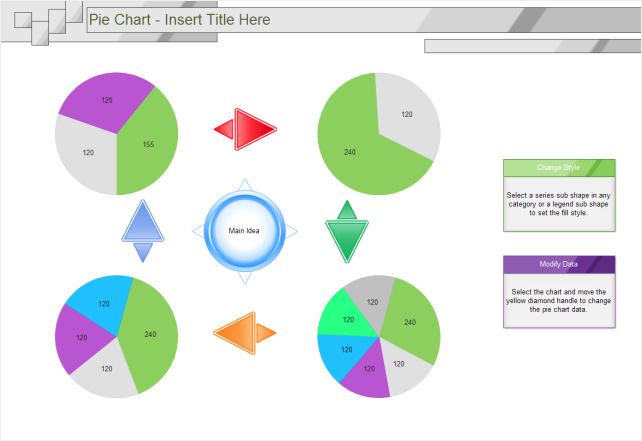
The second pie chart template shows a collection of pie diagrams and for example, you can use it to analysis the dynamic changes of market shares for an industry of certain products, or you can use it to record what takes your time in different periods.
The third pie chart template belongs to another type of pie charts – Pie of Pie, which takes some values from Chart 1 and combines them in Chart 2 to make them more readable and easier to recognize.