How to Make a Doughnut Chart in Excel
When you need to display something with a pie chart, but you also want to demonstrate the changes of the data, a Doughnut chart will help you make it. This article will give you a detailed instruction on how to make an aesthetic Doughnut chart in Excel.
How to Make a Doughnut Chart in Excel
Step 1: Input Data into the Worksheet
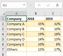
Enable Excel 2016, open a new worksheet and input labels and data. In this example, we choose to add the data of the companies and their market shares in 2 years.
Step 2: Create Your Doughnut Chart
Select the datasets of the company names and the market share in 2018 on the worksheet firstly, there are cells A2: B7.
Go to Insert tab, find Charts groups on the ribbon and click the pie icon  to open the drop-down menu so that you can choose the desired Doughnut chart.
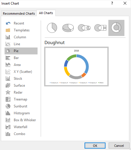
In another way, click Recommended Charts button on Insert tab to open Insert Charts window, then click the Doughnut chart icon and see the pre-made template.
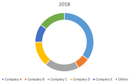
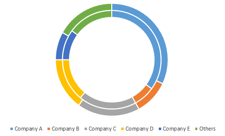
After clicking OK, the Doughnut chart will look like this:
Step 3: Adjust Your Doughnut Chart
In order to add another rim on the Doughnut chart and compare the data in different years, you need to:
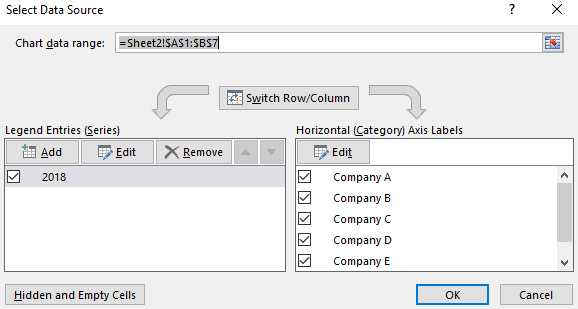
- Right-click on the chart area and choose Select Data in the context menu, or click to select the whole chart and click Select Data button on the Design tab.
- The Select Data Source window will show up on the worksheet. Click the Add button under Legend Entries (Series) to open the Edit Series dialog box.
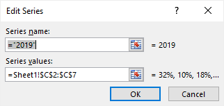
- In the Edit Series dialog box, select the second data range and enter the series name (in this case C2 : C7). Click OK to go back to the Select Data Source window.
- And you can select Series1 and click Edit button under Legend Entries (Series) to modify the series name. Here is the result of the modification.
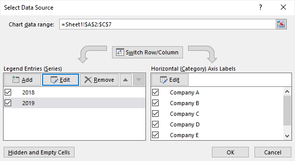
- The resulting doughnut chart should look like this:
Step 4: Customize Your Doughnut Chart
To change the chart title, you can double-click on Chart Title and type the new name on the textbox.
To change the size of the hole in the doughnut chart, right-click on one of the rims, choose Format Data Series in the context menu to open the Format Data Series pane.
Then drag the slider under Doughnut Hole Size: the smaller the percent number is, the bigger the hole will be.

Step 5: Move Your Doughnut Chart
To move your Doughnut chart into another place, you can need to select the Doughnut chart at first, then click Move Chart button on Design tab or the contextual menu of Chart Area.
Then, you will see the Move Chart window to ask you to choose where to place your Doughnut chart.
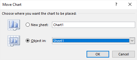
If you choose New Sheet, the doughnut chart will be moved to a new sheet called Chart1 and the pie chart will be on the center of the sheet; if you choose Object in, you can choose to move the the doughnut chart into another worksheet.
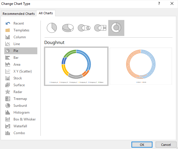
Step 6: Change Chart Type
Find Change Chart Type button on Design tab or the contextual menu of Chart Area. Next, the Change Chart Type window will appear on the worksheet. Then you can choose any other type of charts or graphs.
When you are satisfied with the new chart through the preview thumbnails, click OK so that you can change the graph type quickly.
How to Make a Doughnut Chart in EdrawMax
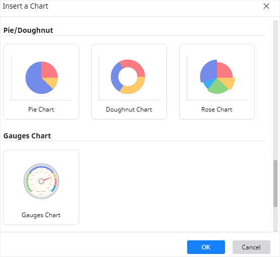
Step 1: Select Chart Type
When you open a new drawing page in EdrawMax, go to Insert tab, click Chart or press Ctrl + Alt + R directly to open the Insert Chart window so that you can choose the desired chart type.
Here we need to insert a basic doughnut chart into the drawing page, so we can just select “Doughnut Chart” on the window and click OK.
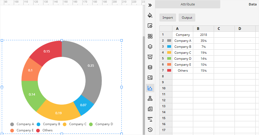
Step 2: Create Your Doughnut Chart
After you select the desired doughnut chart type and click OK, the example doughnut chart will appear on the drawing page. You can click Chart icon ![]() on the right sidebar to open the Chart pane.
on the right sidebar to open the Chart pane.
Then you need to import or enter the data for making the doughnut chart. EdrawMax supports users to import xlsx or csv files.
Go to Data pane, click Import, find the data file in the local storage and click Open. Then you will see the data that you want to use appear on the Data pane, and at the same time, the doughnut chart on the drawing page will be also changed according to the imported data.
Here in this example, we choose to copy and paste the sample data on the Data pane. And the doughnut chart shown on the canvas has an instant change when the data is entered into the table.
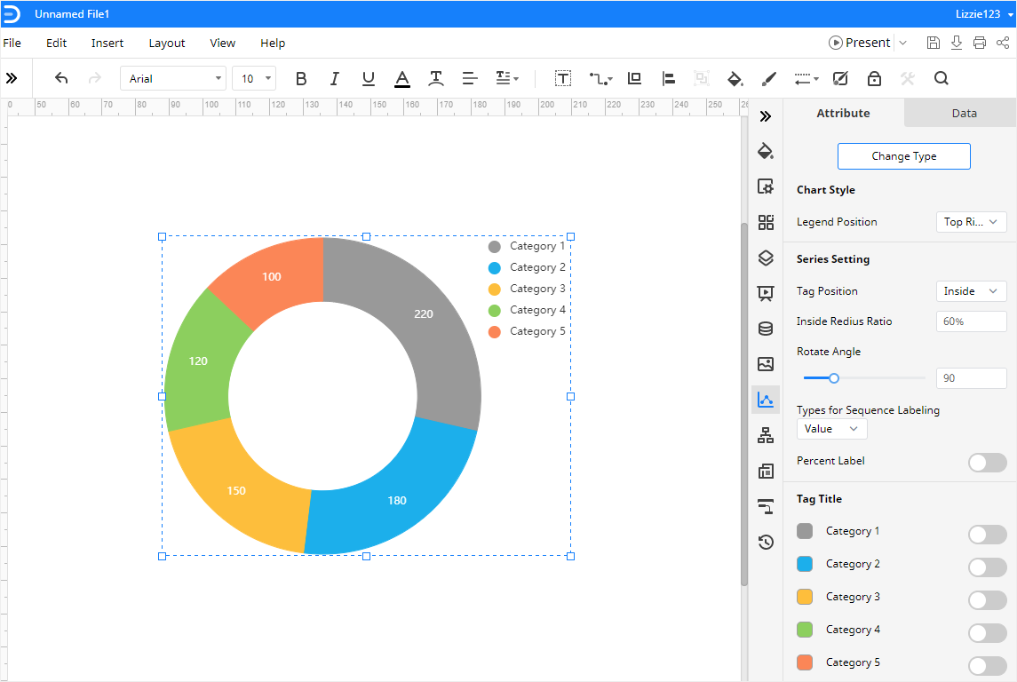
Step 3: Format Your Doughnut Chart
On the Attribute pane, you can change the format and various attributes of the doughnut chart with various options, including Chart Style, Series Setting, Tag Tittle, and Data Format.
If you don’t like the color of any part on the rim, you can go to find Tag Title, click the color icon next to the label and choose the desired color on the drop-down menu.
If you want to see the percent labels of each part of the doughnut, click Percent Label on the Attribute pane to add the percent numbers on the chart.
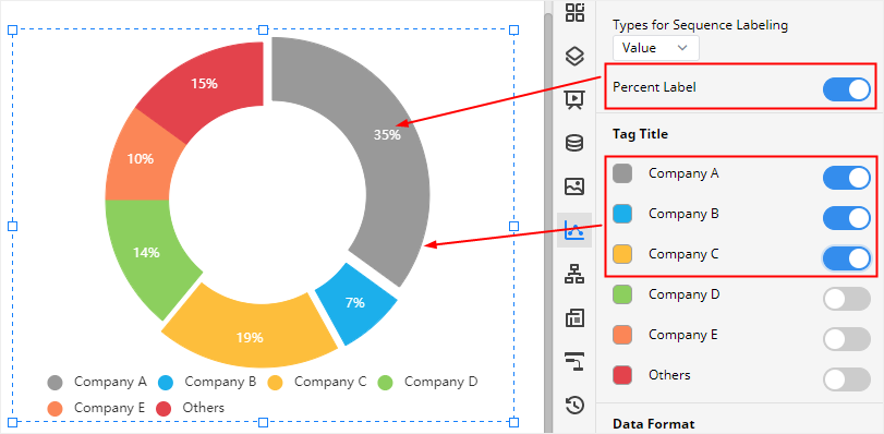
What’s more, if you want to see some parts of the doughnut chart separate from the center point, you can click the corresponding labels under Tag Title menu. You can see the effect on the below picture.
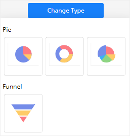
Step 4: Change Chart Type
In addition, EdrawMax also supports users to change chart types.
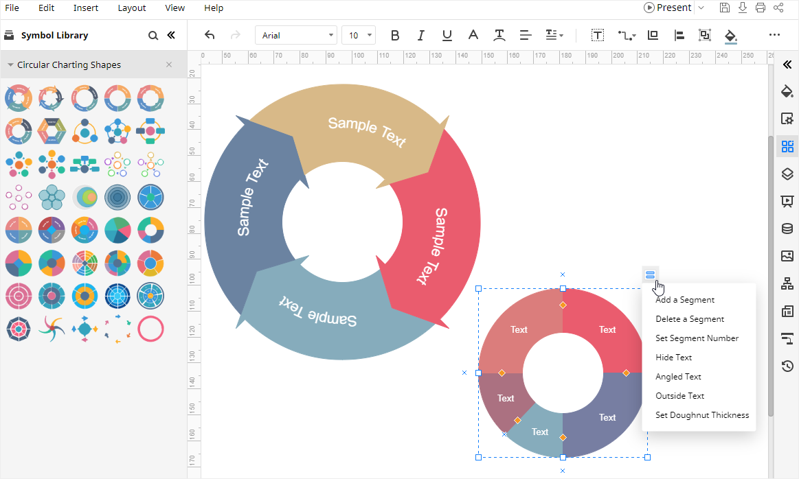
Step 5: Create Smart Circular Shapes
Go to click the icon of Symbol Library to open Library, find and check Circular Charting Shapes under Diagrams category and click OK, so the symbols of Circular Charting Shapes will be added into the Library pane.
After that, you can choose the desired shapes, then drag and drop them onto the canvas as you like. With the various drawing and formatting tools in EdrawMax, you can import the data and make beautiful charts to fit your requirements.
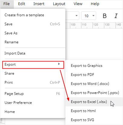
How to Export an EdrawMax Chart as Excel File
When you finish making a doughnut chart in EdrawMax Online, you are also able to save and export the chart as an Excel file.
Go to File tab, click Export > Export to Excel, and EdrawMax will automatically save and download the created doughnut chart as an Excel file. Then you can get a doughnut chart in Excel format and all the Microsoft Office files exported from EdrawMax are editable.
Therefore, with the help of EdrawMax, you can easily and efficiently share and transfer your graphs and charts made by EdrawMax with your colleagues or friends who may not use EdrawMax before.
In addition, you and your friends or partners are able to edit and modify the exported doughnut chart in Microsoft Excel (only for 2013 or above version) directly.