How to Make a Scatter Plot in Excel
The scatter plot is an ideal graph choice for finding out the relationship between two sets of data. In this tutorial, we will walk you through how to make a scatter plot in Excel with step-by-step instructions.
How to Make a Scatter Plot in Excel
Step 1: Input Data into the Worksheet
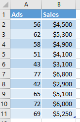
The first thing you need to do is to input the datasets into the worksheet. In this example, we will analyze the relationship between the numbers of ads and the resulting sales. Since the volume of the data isn’t large, we can enter the data manually.
Otherwise, you need to import the data from external sources into Excel. Here we’re using Excel 2016.
Step 2: Create Your Scatter Plo
Select the data range of ads and sales on the worksheet firstly, there are cells A2: B11.
Go to Insert tab, find Charts groups on the ribbon, click the scatter plot icon  to open the drop-down menu, then you can click the thumbnail and insert the basic scatter plot on the worksheet.
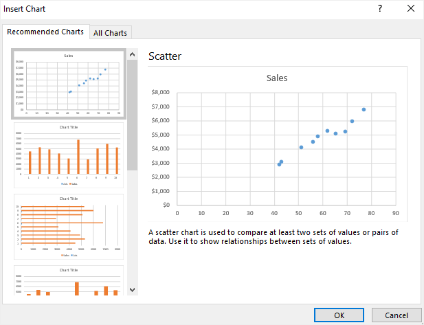
Apart from this, click Recommended Charts button on Insert tab to open Insert Charts window. In Insert Charts window (All Charts), you can also choose suitable line graph types and select the desired format.
After clicking OK, the scatter plot will be inserted into the worksheet and may look like this:
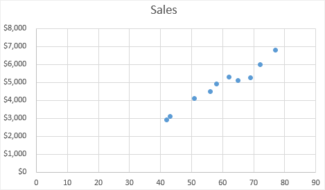
The scatter plot shows us the common result that the added numbers of ads seems to connect with increasing sales.
Step 3: Add a Trendline on the Scatter Plot
Adding a trendline to the chart will make it more readable and clear. To do this:
- Click to select the scatter plot;
- Go to Design tab, click Add Chart Element button to open its drop-down menu, or click the floating plus icon, check Trendline;
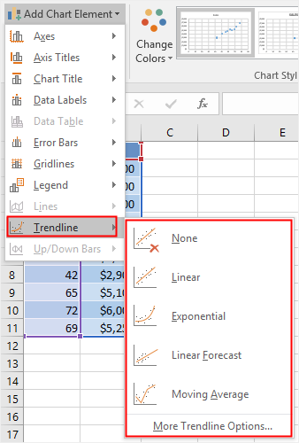
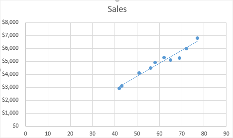
- Choose the desired trendline option for the scatter plot. In this case, we add a linear trendline into the chart and now the scatter plot looks like:
Step 4: Customize Your Scatter Plot
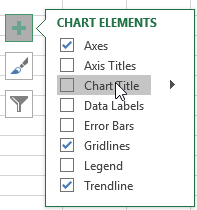
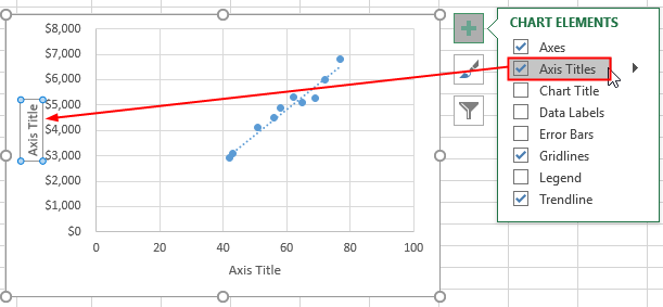
As you can see, nearly each element of a scatter plot is customizable in Excel. You can easily change or delete the chart title, add axis titles, modify the chart styles or colors, and so on.
- To change the chart title, the simplest ways is to double-click on the textbox of the chart title and type the new title on it.
- To delete the chart title, you can click the floating plus icon or Add Chart Element button to open the chart element menu and cancel the selection of Chart Title.
- To add axis titles, you need to open the chart element menu in the same fashion as you delete the chart title. You can check Axis Titles in the menu of the floating icon, or select to add axis titles under Design tab.
- To change the style or color of the chart, you can select the chart first, choose the desired chart style and color under Design tab.
Step 5: Move Your Scatter Plot
To move your scatter plot into another place, you can need to select the scatter plot at first, then click Move Chart button on Design tab or the contextual menu of Chart Area.
Then, you will see the Move Chart window to ask you to choose where to place your scatter plot.
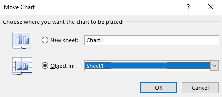
If you choose New Sheet, the scatter plot will be moved into a new sheet called Chart1 and the scatter plot will be on the center of the sheet; if you choose Object in, you can choose to move the scatter plot into another worksheet.
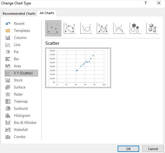
Step 6: Change Chart Type
Find Change Chart Type button on Design tab or the contextual menu of Chart Area. Next, the Change Chart Type window will open on the worksheet. Then you can choose any other type of charts or graphs for the change.
Here you can replace the basic scatter plot with other kinds of scatter plots, such as Scatter with Smooth Lines and Markers, Scatter with Smooth Lines and Scatter with Straight Lines.
How to Make a Scatter Plot in EdrawMax
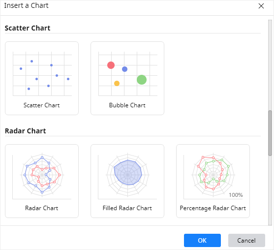
Step 1: Select Chart Type
When you open a new drawing page in EdrawMax, go to Insert tab, click Chart or press Ctrl + Alt + R directly to open the Insert Chart window so that you can choose the desired chart type.
Here we need to insert a basic scatter plot into the drawing page, so we can just select “Scatter Chart” from the window and click OK.
Step 2: Create Your Scatter Plot
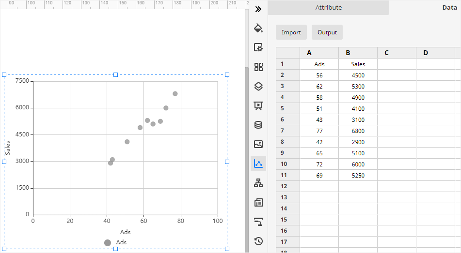
After you select scatter plot type and click OK, the example scatter plot will show up on the canvas. You can click Chart icon ![]() on the right sidebar to open the Chart pane.
on the right sidebar to open the Chart pane.
Then you need to import or enter the data for making the scatter plot. EdrawMax supports users to import xlsx or csv files.
Go to Data pane, click Import, find the data file in the local storage and click Open. Then you will see the data that you want to use appear on the Data pane, and at the same time, the scatter plot on the drawing page will also be changed according to the imported data.
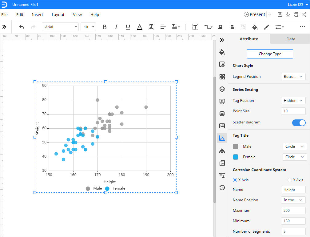
Step 3: Format Your Scatter Plot
On the Attribute pane, you can change the format and various attributes of the scatter plot with various options, which include Chart Style, Series Setting, Tag Tittle, and Cartesian Coordinate System.
In the group of Cartesian Coordinate System, you are able to change the axis name, their positions, and the bounds of axis values.
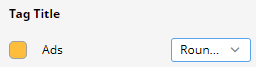
If you don’t like the color or style of the dots, you can go to find Tag Title, click the color icon or next to the label or the option box and choose the desired color and marker on the drop-down menu.
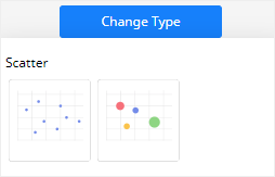
Step 4: Change Chart Type
In addition, EdrawMax also supports users to change chart types. You can transform the scatter plot into a bubble chart.
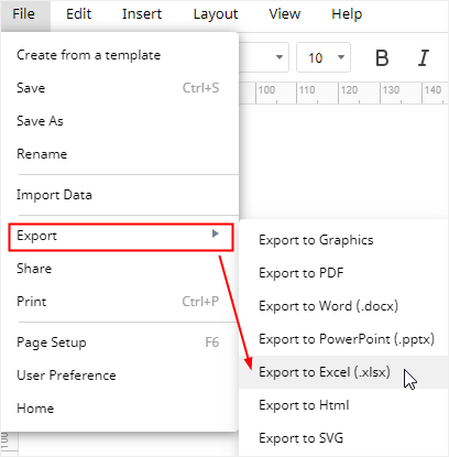
How to Export an EdrawMax Chart as Excel File
When you successfully make a scatter plot in EdrawMax Online, you are also allowed to save and export the chart as an Excel file.
Go to File tab, click Export > Export to Excel, and EdrawMax will auto-save and download the completed scatter plot as an Excel file in your computer. Then you can get a scatter plot in Excel format and all the Microsoft Office files exported from EdrawMax are editable
It will be easy and efficient for users to make and export charts and graphs in EdrawMax and you can also share and transfer your graphs and charts made by EdrawMax with your colleagues or friends who may not use EdrawMax before.
In addition, you and your friends or partners are able to edit and modify the exported scatter plot in Microsoft Excel (only for 2013 or above version) directly.